
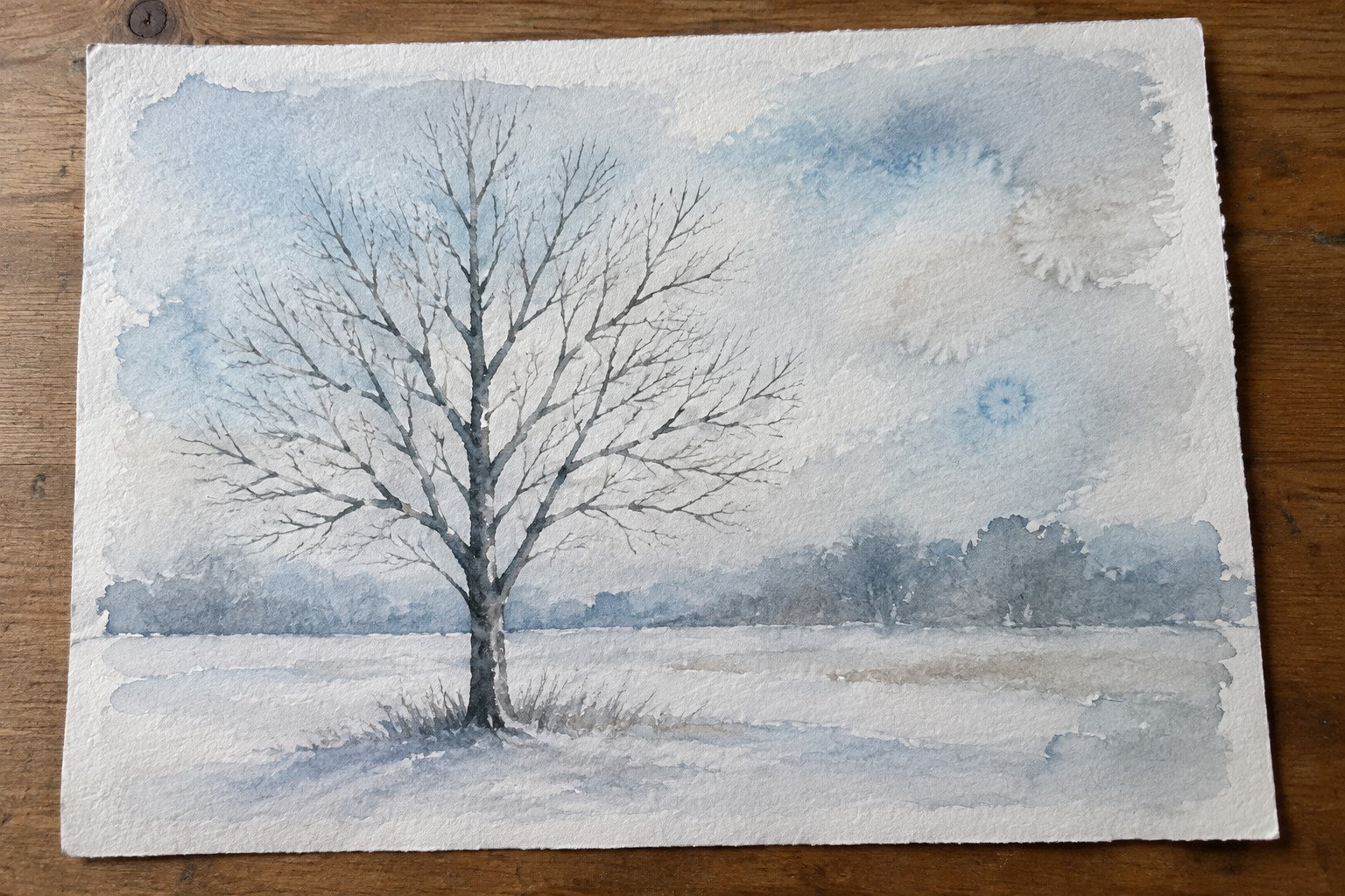
I have always liked painting trees in watercolor because the layers can build up slowly without getting muddy.
Transparent washes let the light come through and give the branches a softer look.
Over the years I have tried different ways to keep the colors light and still show some depth in the foliage.
Here are twenty ideas that focus on that approach.
They are simple enough to try on a quiet afternoon.
Winter Tree with Layered Transparent Sky Washes
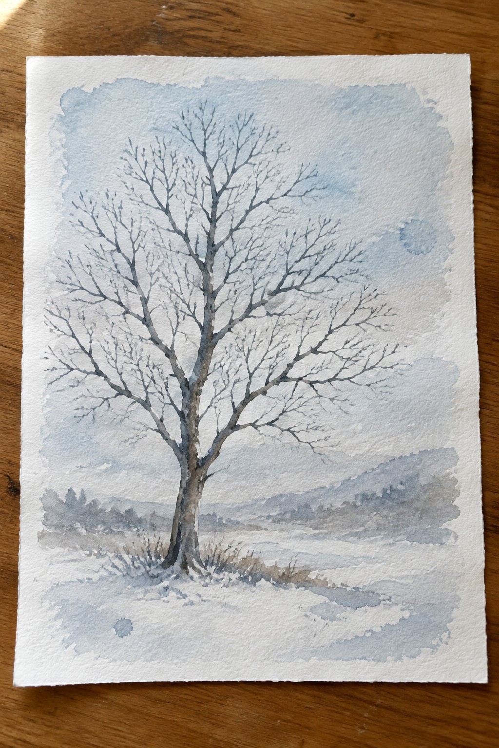
A bare tree against a pale sky built from soft transparent washes makes a strong seasonal landscape idea. The branches create natural contrast through negative space while the distant hills and foreground stay simple to keep attention on the tree itself. This approach works well when you want to practice wash control without crowding the paper with too many details.
What makes this idea useful is how the light washes let you build atmosphere quickly before adding the trunk and branches. The open sky area gives room to experiment with subtle color shifts or even a faint moon shape without complicating the rest of the painting. You could easily swap the snow for grass or change the sky tone to fit other seasons while keeping the same tree structure. For practice this keeps things focused on wash technique and branch shapes rather than complex foreground work.
Layered Transparent Washes for Woodland Trees

A woodland scene made from overlapping transparent washes lets the colors build depth through the tree canopies rather than through outlines or heavy detail. The main idea is to drop lighter yellow greens into still-wet areas of blue green so the edges stay soft and the light appears to filter through the leaves. Simple vertical trunks and a loose ground plane keep the composition balanced while the foliage carries most of the visual interest.
What makes this idea useful is how little drawing is required before the washes begin, so the focus stays on brush control and timing. The same layout works for other seasons if you swap the palette for cooler tones or add a few warmer accents at the edges. For practice, the repeated tree shapes let you test different moisture levels side by side on one sheet without starting over each time.
Transparent Washes for a Centered Autumn Tree

The core idea uses overlapping transparent washes of warm oranges, reds, and yellows to form a full canopy on a single tree. Loose leaf shapes let the colors blend naturally while the dark trunk anchors the composition. This seasonal tree approach works because the washes create depth and variety without tight outlines or extra background elements.
What makes this idea useful is the centered layout that stays readable even at smaller sizes. You can swap in cooler tones for spring or winter versions or trim the falling leaves to simplify further. The same wash layering also translates well to a quick series of four seasonal trees for wall display or practice pages.
Moonlit Tree Silhouette With Reflective Water
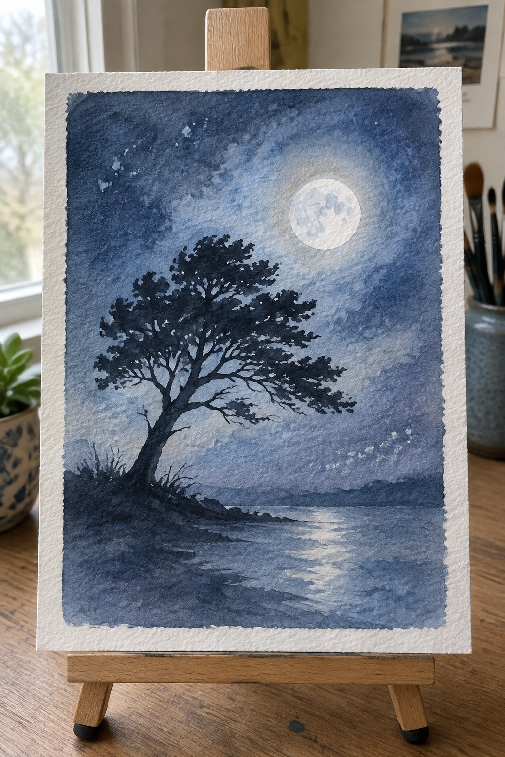
A landscape idea built around a dark tree silhouette against a glowing full moon lets the transparent blue washes in the sky do most of the atmospheric work. The bright circle of the moon and its soft reflection on the water create the main contrast, while the tree shape and shoreline stay simple and solid. This approach belongs in the landscape category and shows how limited values plus one strong light source can carry the whole scene.
The composition does a lot of the work here because the tree and its reflection give instant structure without needing fine detail. You can adapt the idea by changing the moon’s size, shifting the blue tones cooler or warmer, or moving the shoreline higher or lower to suit different paper sizes. For practice this kind of subject helps you concentrate on clean wash edges and negative space around the branches. It would also translate well into a small series by repeating the same layout with different moon phases or slight changes in water ripples.
Heart Shaped Tree Canopy in Layered Washes

A heart shaped tree works by building the canopy from loose clusters of transparent washes rather than individual leaves. The overlapping pink, coral, and peach tones create soft transitions that let the heart form naturally through color and shape. This approach fits decorative tree painting because the bold silhouette stands out while the light washes keep the overall look simple and open.
What makes this idea useful is how the heart shape gives you a clear target without requiring tight control over every edge. You can change the color palette to match seasons or room colors and still keep the same loose wash method. The simple trunk and minimal ground keep the focus on the canopy, so the painting stays quick to finish and easy to adapt for cards or small wall pieces.
Lone Tree with Soft Wash Landscape

A single tree painted with loose foliage and a dark trunk serves as the clear focal point in this landscape idea. Broad transparent washes build the sky, distant hills, and golden fields, letting the tree stand out through contrast in value and detail. The off-center placement and receding layers of color create depth while keeping the overall composition simple and open.
What makes this idea useful is how the tree shape can be adjusted in size or species without changing the wash approach. You can swap the field colors for different seasons or times of day while keeping the same layout. For practice, the idea works well because it trains control over light washes and edges without requiring complex details. It also adapts easily to vertical formats or smaller studies where the tree remains the main element.
Misty Birch Grove Using Layered Transparent Washes

The core idea is to paint a stand of birch trees by building up soft transparent washes that create atmospheric depth without hard edges. Vertical trunks with simple dark markings provide structure while the washes suggest foliage, mist, and distance through overlapping layers of cool blue-gray tones. This landscape approach keeps the focus on how light washes can define space and form rather than on detailed rendering.
What makes this idea useful is how the limited trunk shapes let you concentrate on wash control and value shifts instead of complex drawing. You can easily adjust the number of trees or push the background washes cooler or warmer depending on the season. The same layout works for quick studies or larger pieces, and the soft transitions make it a strong candidate for Pinterest because the misty effect reads clearly even at small sizes.
Hanging Lanterns from Tree Branches
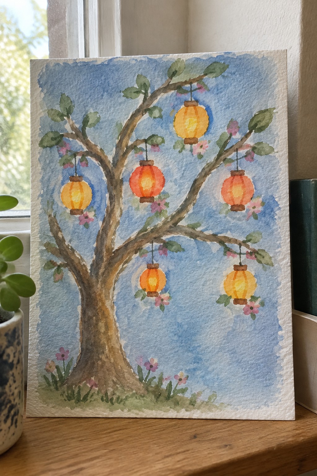
A tree with multiple hanging lanterns creates a strong focal point by repeating rounded glowing shapes at staggered heights along the branches. The idea works well because the lanterns vary slightly in size and color temperature while the loose blue wash behind them unifies the whole scene without competing for attention. This approach falls into decorative art, where the main interest comes from the contrast between the dark branch structure and the bright suspended forms.
What makes this idea useful is how simple it is to change the number or spacing of the lanterns to fit different paper sizes. The transparent background wash lets you focus first on getting the branch layout right before adding color, and you could easily swap the lantern shapes for other repeated elements like fruit or ornaments. For practice, this kind of subject helps you work on balance and negative space without needing a lot of fine detail.
Coastal Pine with Layered Ocean Washes
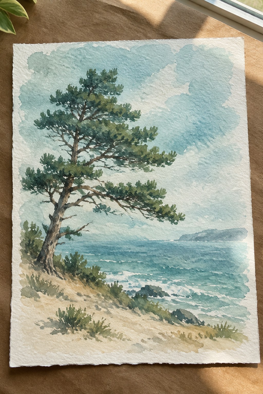
A single windswept pine tree placed on a sandy rise makes a strong focal point for a landscape built around transparent washes. The idea centers on letting the sky and sea develop through overlapping light layers while the tree’s foliage gets darker, more opaque strokes to separate it from the background. This creates a clear division between the open water and the solid mass of the tree without needing heavy outlines or extra detail.
What makes this idea useful is how the tree’s angled shape naturally leads the eye toward the horizon, so the composition stays balanced even if the washes vary in intensity. The limited color palette of blues and greens means you can swap in different tree shapes or adjust the water’s tone without repainting the whole scene. For practice, this setup works well because the large wash areas build confidence quickly while the tree gives you a chance to work on texture and edges.
Tall Trees Framing a Winding Forest Path

A forest path lined with tall trunks gives a clear landscape structure that relies on transparent washes rather than fine detail. Varying the trunk widths and spacing creates natural depth, while the path acts as a leading line that pulls the eye through lighter background layers. This setup fits the transparent wash approach because soft overlaps and value shifts handle the foliage and light without needing heavy outlines.
The composition does a lot of the work here by using repeated vertical shapes that stay simple to sketch. You can adapt it easily by changing the wash colors for spring or autumn tones or by tightening the crop to focus just on the trunks. For practice, this kind of scene builds layering skills while staying forgiving on exact shapes, and it translates well to medium-size paper for wall pieces.
Cherry Blossom Tree with Layered Sky and Petal Washes

A cherry blossom tree painted with soft transparent washes lets the pink blossoms and pale blue sky blend naturally while the paper stays visible underneath. The rounded flower clusters sit against a simple trunk and a thin strip of grass, with a few loose petals drifting down to add movement without cluttering the page. This approach works as a seasonal tree painting where the washes handle both background and blooms in the same light layers.
What makes this idea useful is how the washes keep the sky and petals connected without extra steps. You can change the pink tones to match different seasons or crop the view tighter for smaller paper sizes. The scattered petals give the composition breathing room that works for quick studies or cards. For practice, the limited color range makes it easy to repeat with small adjustments to the trunk angle or petal density.
Stacked Circle Trees Using Layered Washes
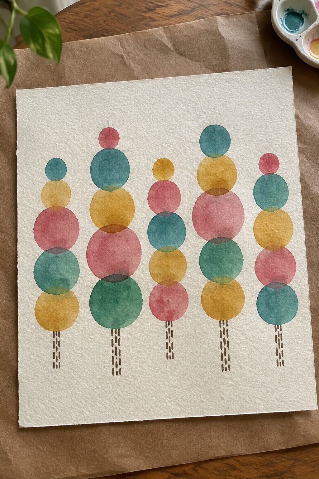
This idea builds stylized trees by stacking overlapping circles in different colors, letting the transparent layers create new shades where they meet. The vertical arrangement keeps the focus on the rounded forms, while short dashed lines at the base suggest trunks without adding extra detail. It fits into the decorative or abstract category and works as a simple way to practice wash control and color mixing on a single sheet.
The composition does a lot of the work here because the repeated shape makes the layout easy to balance without measuring. You can swap in seasonal colors or change the number of trees to fit smaller paper or greeting cards. For practice, this kind of subject helps you focus on edge control and overlap effects rather than drawing accuracy. The clean spacing also makes it quick to scan and recreate from a photo on your phone.
Weeping Willow Landscape Built with Layered Transparent Washes
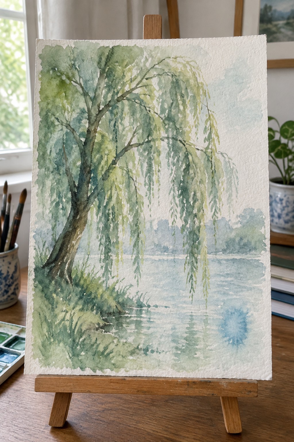
A landscape idea that places a single weeping willow as the focal point, with its long branches stretching over still water to create natural reflections. The composition relies on soft, overlapping washes in greens and blues to shape the foliage and suggest depth without hard lines or heavy detail. This approach fits the transparent wash category well because the tree’s hanging form guides the eye downward into the water area.
What makes this idea useful is how the loose structure lets you practice building color gradually while keeping edges soft. You could adapt it by shifting the palette toward autumn tones or cropping tighter around the trunk and branches for a simpler version. The background stays minimal on purpose, which helps the tree and its reflection stay the main focus without extra elements competing. For wall pieces, this kind of scene works because the vertical lines of the tree balance the horizontal water.
Treehouse Anchored in Layered Canopy Washes

A treehouse placed within a large tree works as a landscape idea built around transparent washes that let the structure stay sharp while the foliage stays soft. The main concept uses overlapping light layers of green to suggest depth and volume in the canopy without filling every space. This keeps the wooden platform and ladder as the clear focal point against a pale sky and distant hills.
The composition does a lot of the work here by using the vertical ladder to guide the eye and balance the off-center house. You can adapt it by changing the wash colors to cooler tones for a different season or tightening the foliage shapes for a more graphic look. For practice this subject helps you test how much detail the house needs before the washes start to compete. It also scales well for smaller studies or larger pieces meant for wall display.
Lakeside Tree Reflection Using Broad Washes
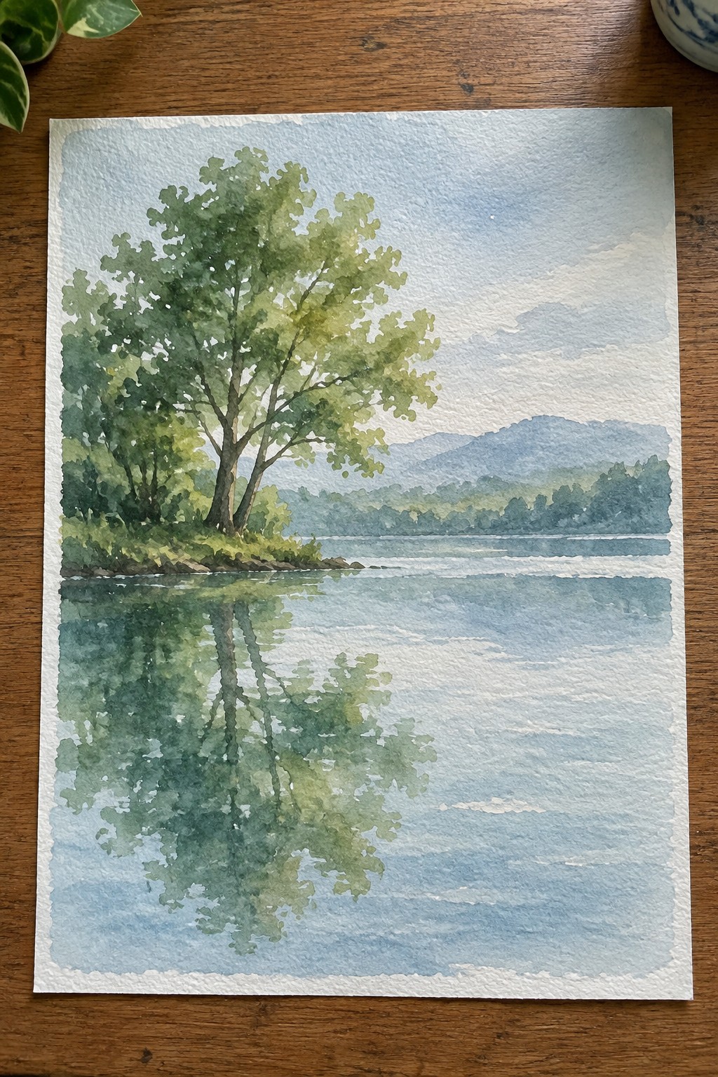
A single tree placed near the water’s edge creates the main focal point while its reflection extends the vertical interest downward. This landscape idea relies on soft horizontal bands for the distant hills and sky to keep the eye moving across the scene rather than getting stuck on details. The transparent layers let the paper show through in the water and upper sky, which gives the whole piece a light, open feel without heavy buildup.
The composition does a lot of the work here because the reflection fills the lower half without requiring extra elements. You can easily change the tree color or hill tones to match different seasons or times of day. For practice, this setup helps you work on controlling wash edges where the tree meets the water while keeping the background simple. The balanced layout also translates well to larger paper sizes if you want something for a wall.
Overlapping Snowy Pines Built with Layered Washes

A winter forest idea like this relies on transparent washes to create soft edges and depth across multiple evergreen shapes. The main trees sit forward with stronger color and snow accents while smaller, lighter versions fade into the background haze. This approach works as a seasonal landscape that keeps the focus on simple overlapping forms rather than fine detail.
The composition does a lot of the work here by using one taller tree as the anchor and letting the rest recede naturally. You can adapt it easily by shifting the background tone or reducing the number of mid-ground trees for a quicker version. For practice, this kind of subject helps you test wash control and value changes without tight drawing. It would translate well to a small wall piece or a series where you vary the snow coverage on each tree.
Negative Space Tree on a Gradient Wash
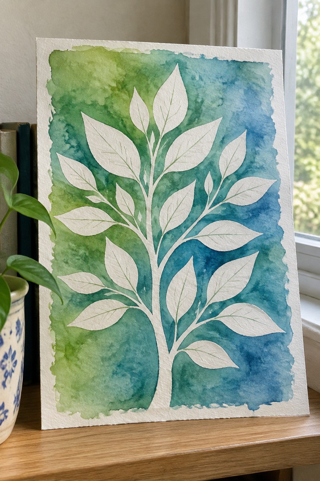
This painting idea centers on a tree where the trunk and leaves stay as clean white paper while a transparent green-to-blue wash fills the background. The composition relies on strong contrast between the reserved white shapes and the layered color behind them, which keeps the tree crisp without needing fine detail work on every leaf. It falls into the decorative nature category and works especially well when the wash is allowed to blend softly at the edges.
The composition does a lot of the work here because the background wash creates the mood and depth while the tree stays simple. Changing the wash colors lets you shift the piece from spring greens to deeper autumn tones without redrawing the tree. This approach stands out on Pinterest because the high contrast reads clearly even in small thumbnails, and the same layout scales easily from a quick practice piece to a larger wall-ready painting.
Lone Tree Silhouette in Layered Sunset Washes

A single tree shape placed against a sky built from stacked transparent washes creates the core idea here. The washes move from light orange at the top through stronger reds into cooler purples near the bottom, with the low sun and dark tree shape providing the main contrast. This approach belongs to landscape painting where the background carries most of the color work and the subject stays simple.
The composition does a lot of the work here because the tree needs only basic shape control while the washes handle the mood. You can adapt the same layout by changing the tree outline, shifting the color order, or cropping the horizon line lower for a different balance. For practice, this kind of subject helps you focus on even wash coverage and clean edges around the silhouette. It would also translate well to a small canvas or a greeting card size without losing impact.
Squirrel Perched on a Branch with Loose Foliage
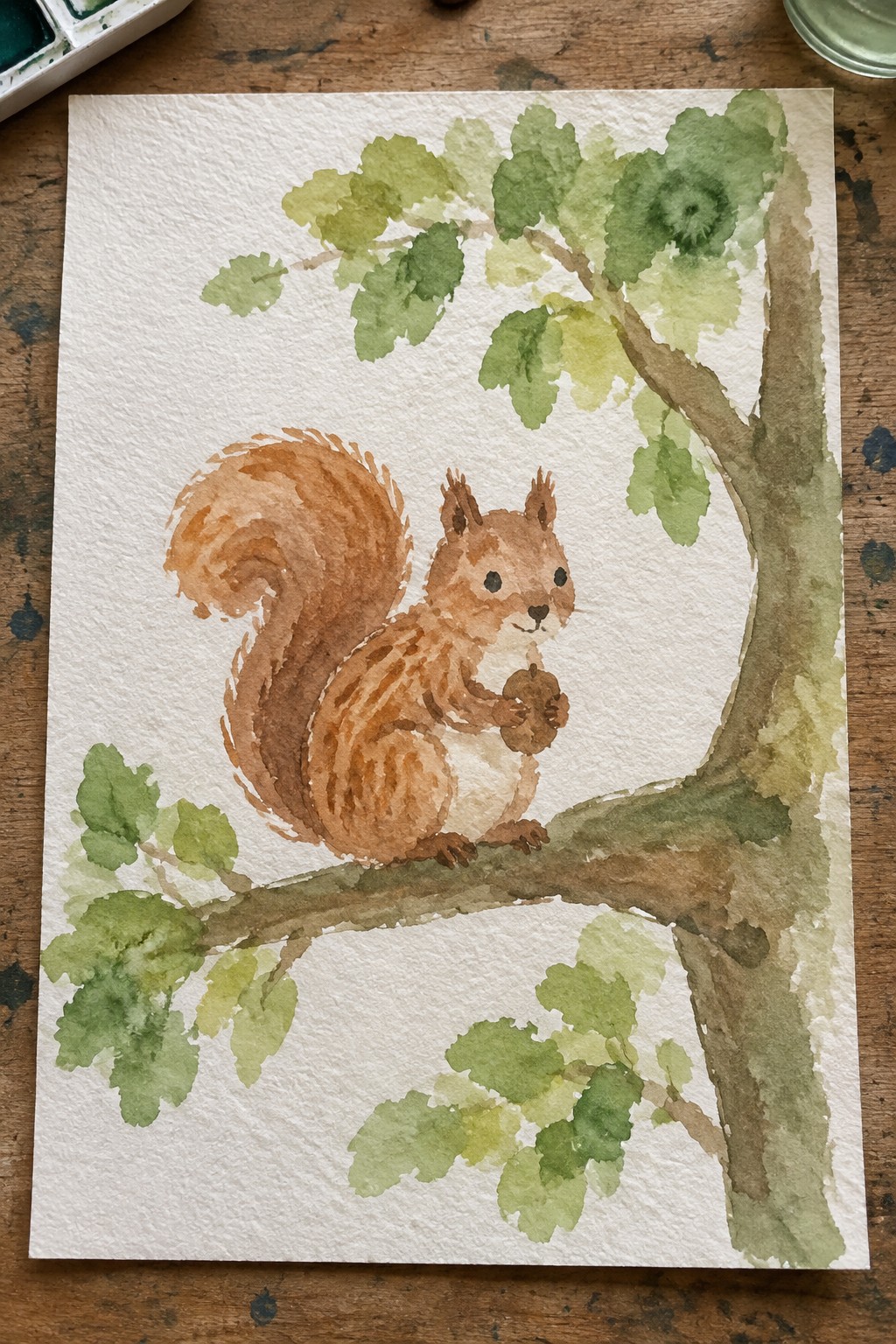
A squirrel holding an acorn makes a strong central subject for a tree painting when paired with minimal branches and soft green washes. The idea relies on transparent layers for the leaves and branch so the animal stands out against the white paper. This keeps the focus on the creature while the foliage frames it without crowding the space.
What makes this idea useful is the clear focal point the squirrel provides, which helps beginners decide where to place the main shapes first. The branch layout is easy to simplify or extend, and the loose leaf washes can be swapped for different seasons by changing the green tones. A painting like this works especially well for practice pieces or small decorative prints because the white background reduces the amount of detail needed overall.
Winter Tree with Cardinal on Bare Branches
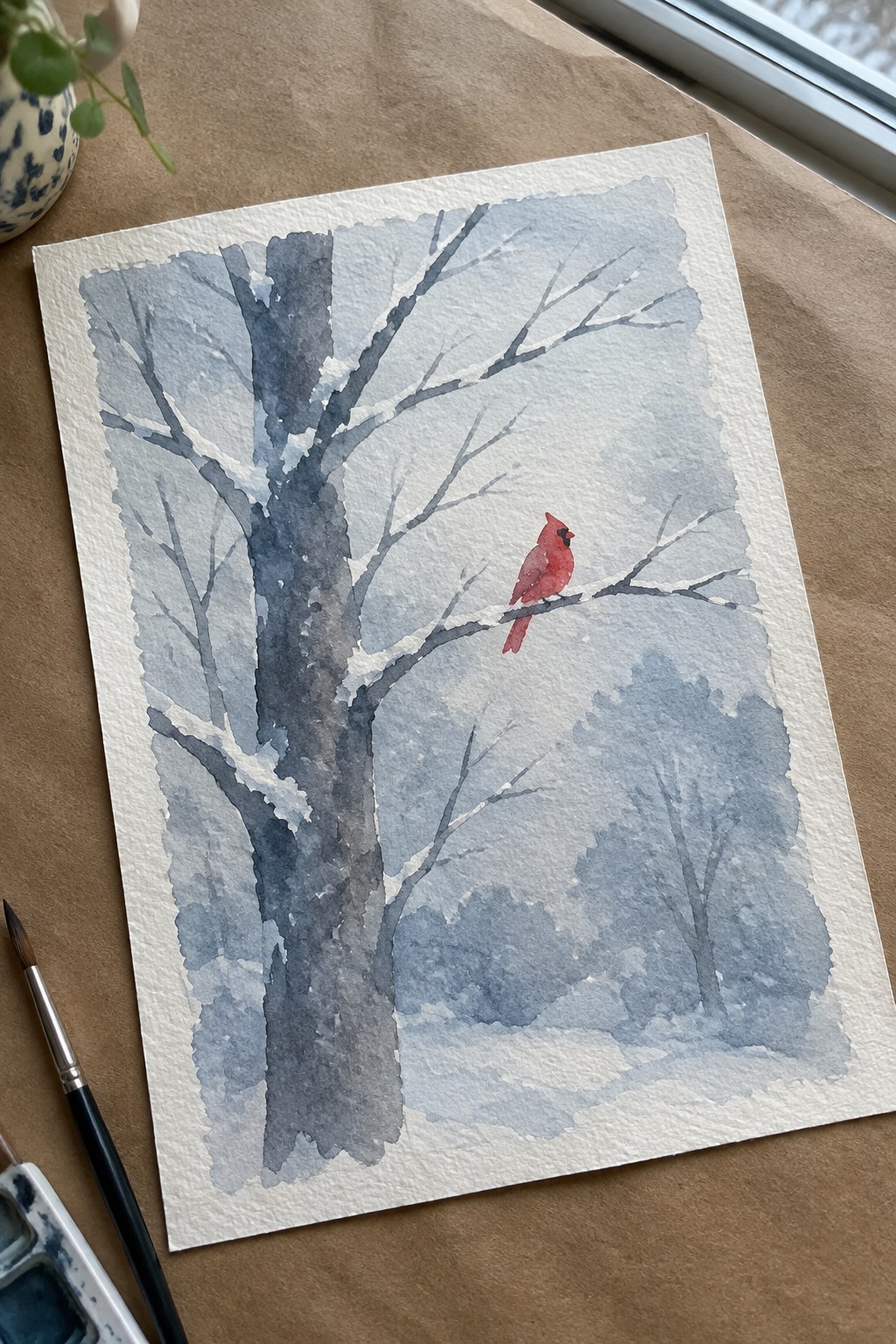
A winter tree painting built from layered transparent washes in cool blue-grays creates soft depth in the trunk and distant foliage while keeping the branches light and delicate. The idea centers on placing a single red cardinal on a mid-level branch to give the eye a clear focal point against the muted background. This seasonal landscape approach works because the washes handle most of the atmosphere, leaving the bird as the only warm accent and keeping the overall composition balanced without extra detail.
What makes this idea useful is how the limited color palette makes it easy to adapt for different light conditions or seasons by swapping the bird color or adjusting wash strength. The off-center tree and single accent keep the piece from looking empty while staying simple enough for regular practice. For wall art or cards, the format scales well to smaller sizes since the washes stay readable even when reduced. You could also drop the bird entirely and test the same washes on just the tree and background.
Frequently Asked Questions
What paper and brushes are recommended for watercolor tree paintings built around transparent washes? Cold pressed watercolor paper with a weight of at least 140 pounds works best because it handles multiple layers without buckling while letting the transparency shine through. Use round brushes in sizes 6, 10, and 14 for broad washes on foliage and a smaller rigger brush for fine branches. These tools support the light, layered approach shown in the 20 ideas without overpowering the delicate color buildup.
How do I keep transparent washes from turning muddy when painting different tree species? Start with very diluted pigments and let each layer dry completely before adding the next. Limit yourself to two or three colors per wash and avoid mixing complementary colors on the paper. For evergreens or deciduous trees in the ideas, apply a pale base wash first, then build subtle variations in value rather than adding too many hues at once.
What techniques help create depth in tree foliage using only transparent washes? Apply a light overall wash for the sky holes, then add slightly stronger but still transparent layers for mid-tones and shadows. Tilt the paper to let the paint flow naturally into branch shapes. This method appears throughout the 20 ideas to suggest volume without opaque paint, giving the impression of light filtering through leaves.
How can beginners adapt the transparent wash ideas for seasonal tree variations? Begin with a very pale wash in the appropriate temperature, such as cool blues for winter or warm yellows for autumn. Once dry, add a second transparent layer to suggest seasonal color shifts while keeping the underlying paper visible. Practice on small studies first so the layers stay luminous rather than heavy.
What is the best way to correct or lift areas in transparent wash tree paintings? While the wash is still damp, gently blot with a clean, damp brush or paper towel to lift color without disturbing the paper surface. For dried areas, use a soft eraser or a small amount of clean water on a brush to soften and lift. This keeps the transparent quality intact and matches the light, airy look emphasized in the collection of ideas.