
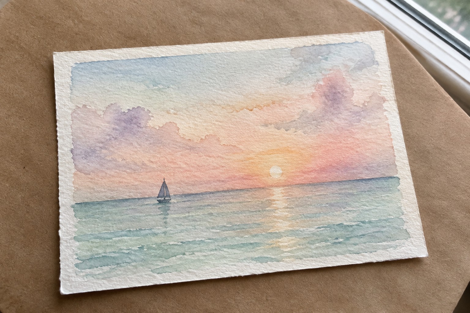
I have been painting small seascapes on and off for a while now and I like how they fit into a regular day without taking over everything.
These pieces stay simple and I usually work on them when I have an hour or two free.
I put together twenty ideas that I have tried myself or sketched out in my notebook.
They cover different times of day and weather but nothing too complicated.
Small formats let me experiment with colors without worrying about big mistakes.
Lone Sailboat at Sunset
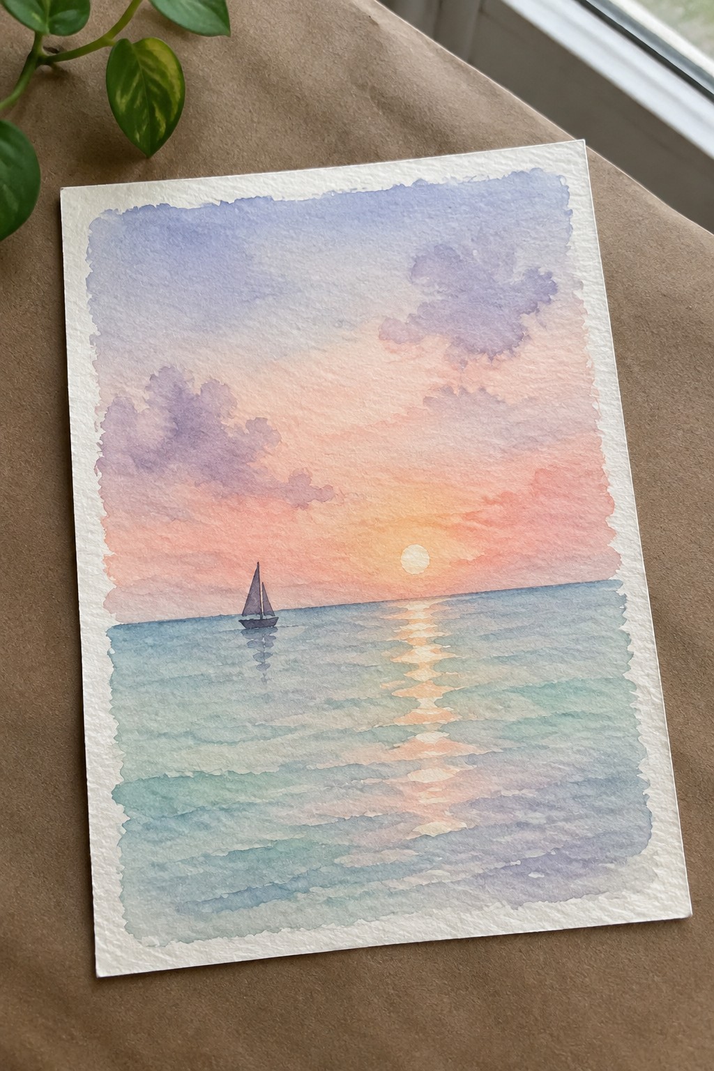
A small sailboat placed off-center against a wide ocean horizon forms the core of this seascape idea, paired with a low sun and its straight reflection running down the water. The sky uses a simple gradient from cool purple at the top through warm peach and orange near the horizon, while the sea stays in softer blues and greens to keep the focus on the light path. This approach works as a straightforward landscape study that relies on color bands and one small vertical shape rather than complex details.
The composition does a lot of the work here because the reflection line gives instant structure and guides the eye without extra elements. You can easily swap the boat for a different small shape or shift the sky colors for morning or dusk versions while keeping the same layout. For practice or quick decor pieces, the limited subject matter keeps the painting fast to finish and makes it easy to repeat at different sizes.
Curling Wave in Cool Blues
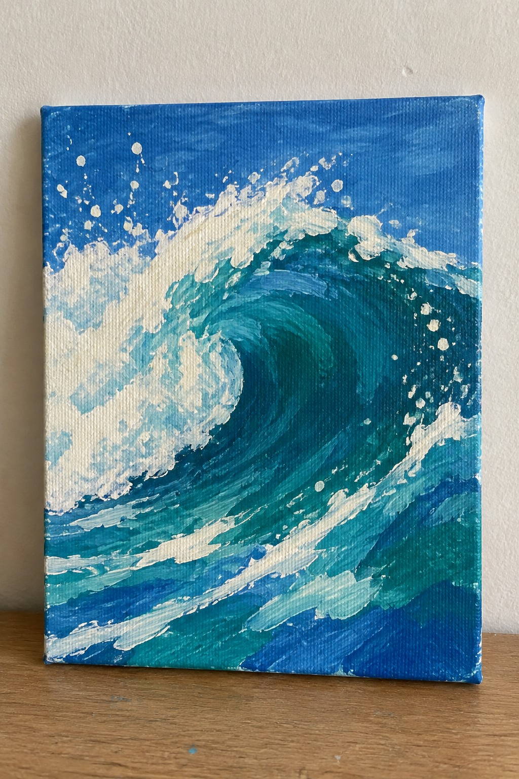
A curling wave that fills most of the canvas creates a strong focal point through its curved shape and contrast between deep teal water and bright white foam. The idea centers on capturing water in motion using layered brushstrokes and scattered white marks to suggest spray without adding extra elements. This approach works as a straightforward seascape study that keeps attention on the wave form itself.
What makes this idea useful is how the limited palette and square format let you focus on blending and stroke direction without overcomplicating the scene. The small size suits quick practice sessions or testing color mixes before scaling up. You could swap in different shades of blue or add a thin horizon line if you want a slightly wider view. The clear action of the wave also helps it stand out in a collection of ocean paintings.
Cliff-Sided Cove with a Lone Boat
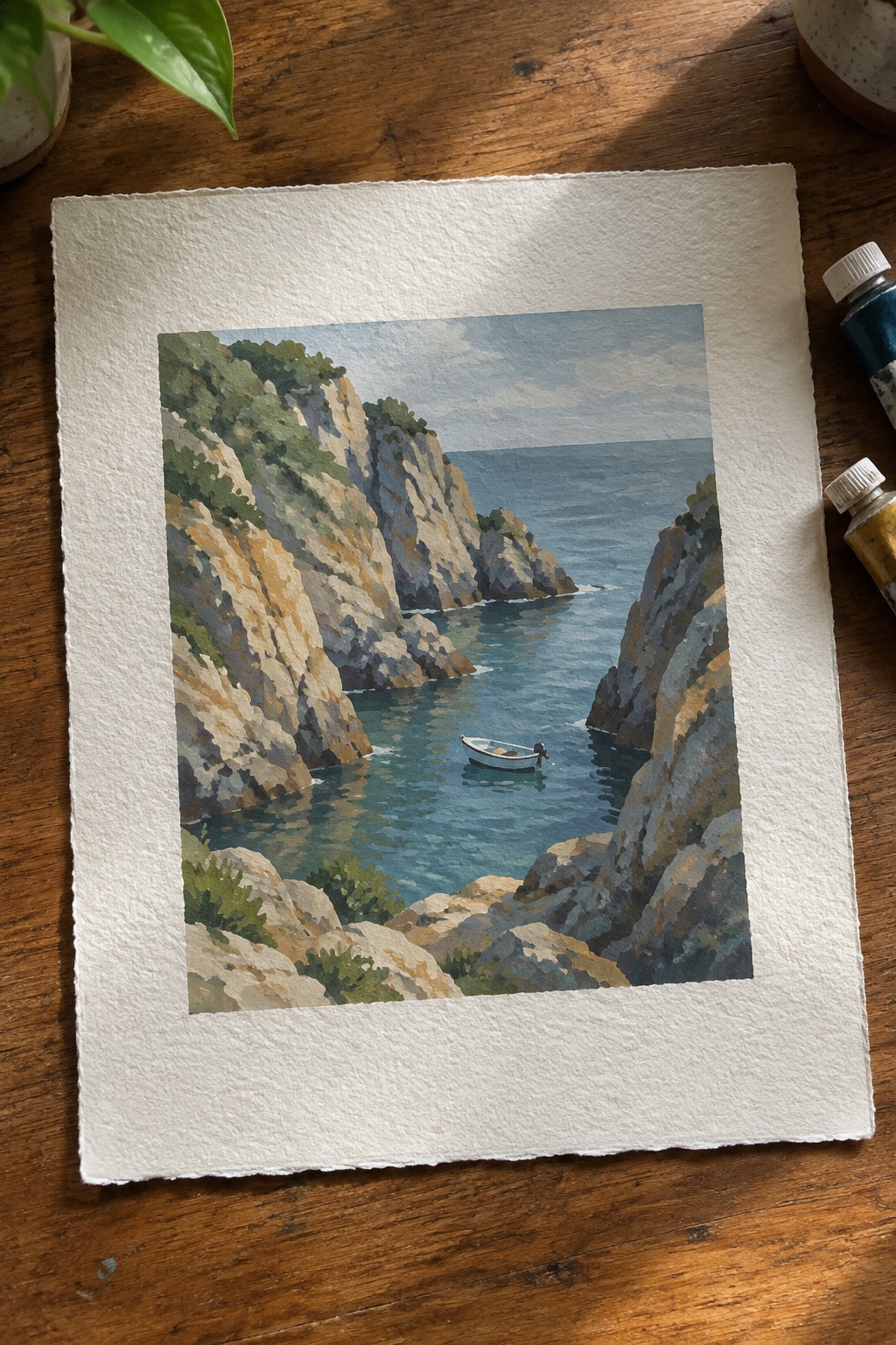
A narrow cove seascape uses tall rocky cliffs on both sides to frame a single small boat floating on calm blue water. The idea centers on the contrast between the solid, angular rocks and the open stretch of sea beyond, which keeps the composition balanced in a small square format. This landscape approach works because the cliffs naturally lead the eye inward while the boat sits at the right scale to hold attention without competing elements.
The composition does a lot of the work here by creating depth through overlapping shapes and a simple division of rock, water, and sky. You can adapt it easily by adjusting the boat color, softening the rock edges, or shifting the water to a deeper teal. For practice, this kind of subject helps with building rock textures and water reflections while staying contained enough to finish in one or two sessions.
Moonlit Beach with Shell-Strewn Shore
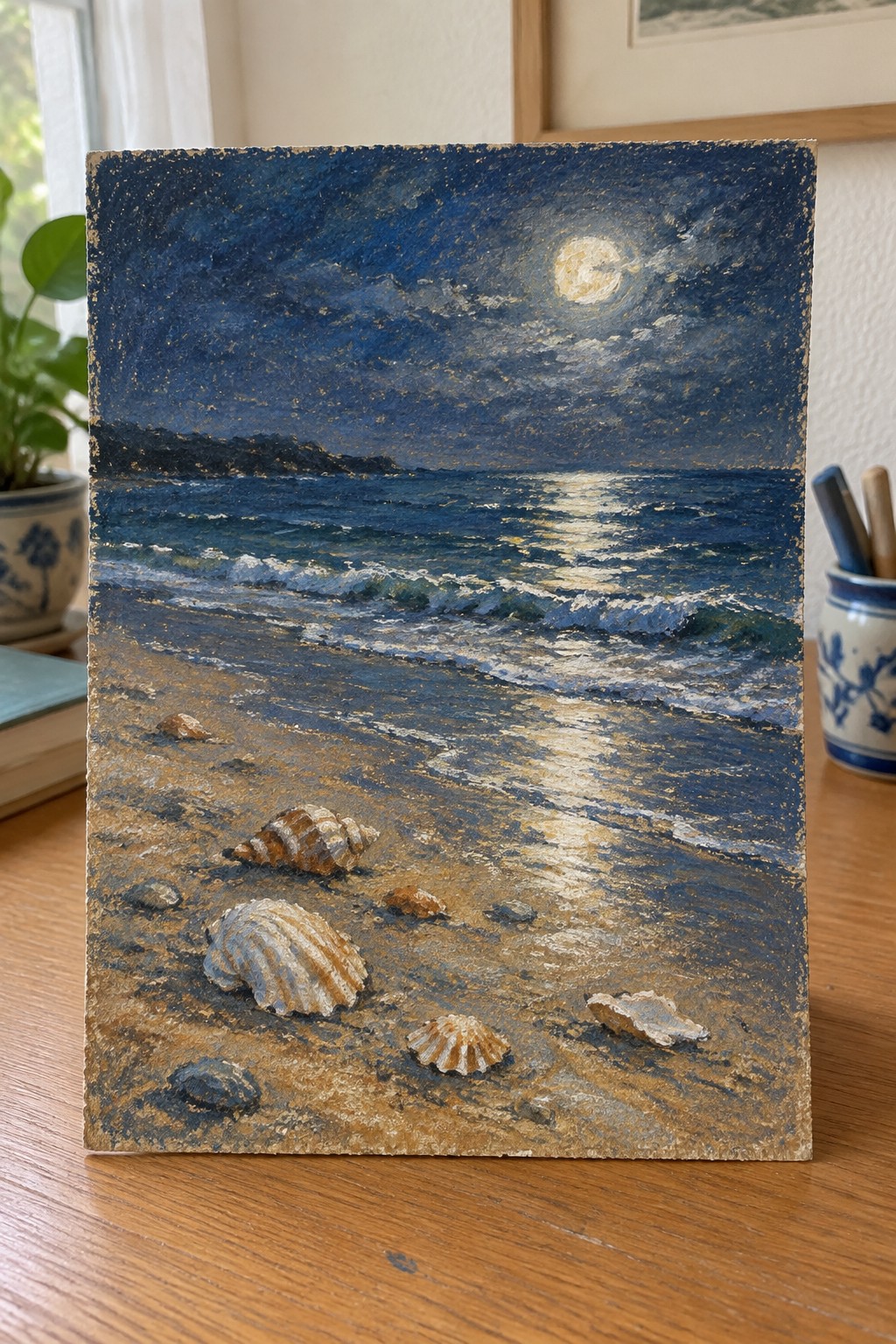
A compact night seascape idea focuses on a moonlit ocean where the bright reflection runs across the waves and meets a sandy foreground. The scattered seashells and pebbles create a simple, textured base that leads the eye toward the water without crowding the space. This fits the landscape category and works through strong light contrast against the dark sky and distant hills.
The composition does a lot of the work here by letting the moonlight path carry the main interest across a small surface. A painting like this works especially well for small formats because the limited size keeps the focus on the light and a few shell shapes rather than needing lots of detail. You could swap the moon for a sunset or change the shell arrangement to make it your own. For practice, this kind of subject helps with reflections and texture without requiring a large canvas.
Starfish Resting on a Shallow Ocean Floor

A painting idea like this centers on two starfish placed at different angles across a simple underwater setting with scattered rocks and soft patches of seaweed. The loose washes of blue and green create the sense of shallow water while the starfish stay as the main points of interest through warmer tones and clearer edges. This approach works as a small marine life study that fits easily into a seascape series.
What makes this idea useful is the clear focal points created by the starfish against a softer background, so the composition stays readable even at a small size. You can swap one starfish for a shell or reduce the number of rocks if you want to simplify further. The color choices also transfer well to other small ocean pieces since the muted tones keep attention on the main subjects without extra layers.
Beach Scene with Striped Umbrella Focal Point
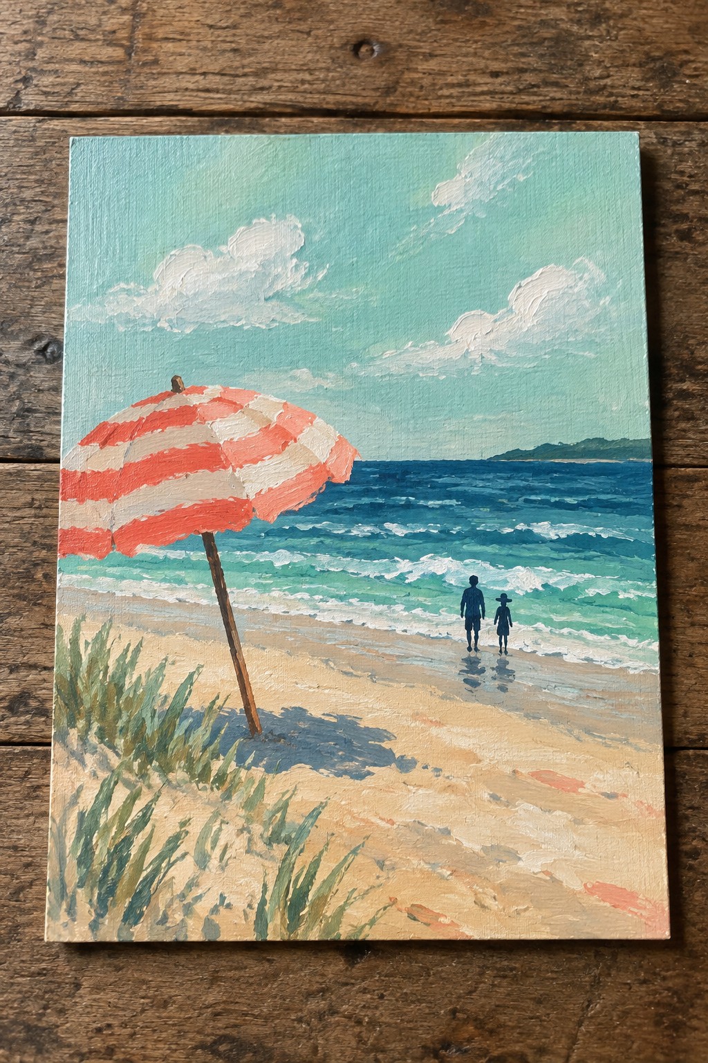
A small seascape idea built around a bold striped umbrella placed off-center works well because it gives the viewer an immediate anchor while the rest of the canvas stays open. The umbrella leads the eye across the sand toward the water, where a few small figures and breaking waves suggest scale without extra detail. Horizontal bands of sand, turquoise water, and pale sky keep the layout simple and balanced for a compact canvas.
The composition does a lot of the work here since the umbrella handles the main color contrast and draws attention right away. You can change the stripe colors or swap the figures for different silhouettes to personalize it without changing the overall structure. This kind of subject suits quick studies because the shapes stay large and the palette uses only a handful of tones. It also works as a straightforward wall piece on small canvases where the umbrella stands out against the blues.
Cliffside Lighthouse Seascape
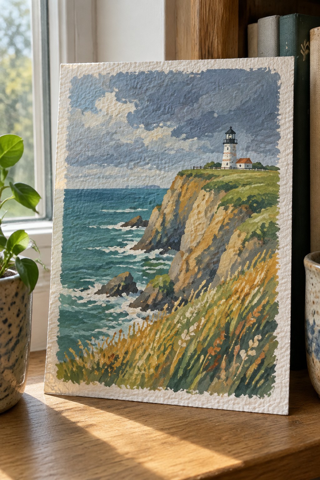
A lighthouse on a steep coastal cliff gives a clear seascape painting idea that combines sky, water, and land in one balanced frame. The idea works by placing the structure near the top edge so the eye travels down the rocky drop to the waves and rocks below. This landscape approach uses the slope of the cliff and the stretch of foreground grass to add depth while keeping the overall layout simple enough for a small canvas.
The composition does a lot of the work here by using the cliff edge as a natural divider between sea and sky. You can adapt it by changing the sky to clear blue or swapping the grass colors for a different season. For practice, this subject helps with painting both moving water and textured land in the same piece without needing too many details. It would also translate well to a quick study or a small wall piece that fits standard frames.
Minimalist Horizon Seascape with Silhouetted Land

This painting idea stacks horizontal color bands to suggest sky, sunset, water, and deeper ocean in a compact format. The orange middle band creates a strong focal point against the surrounding blues, while the jagged black shapes break the line between the warm and cool sections. The composition stays effective because the limited shapes and flat color areas keep attention on the horizon without extra detail.
What makes this idea useful is how simply you can change the width of each band or swap the silhouette shapes for different coastlines or islands. The color palette makes this easy to adapt by shifting the orange toward pink or keeping the blues for a cooler mood. For practice, this kind of subject works well when you want to focus on clean edges and color placement rather than complex brushwork.
Seagull on a Weathered Post
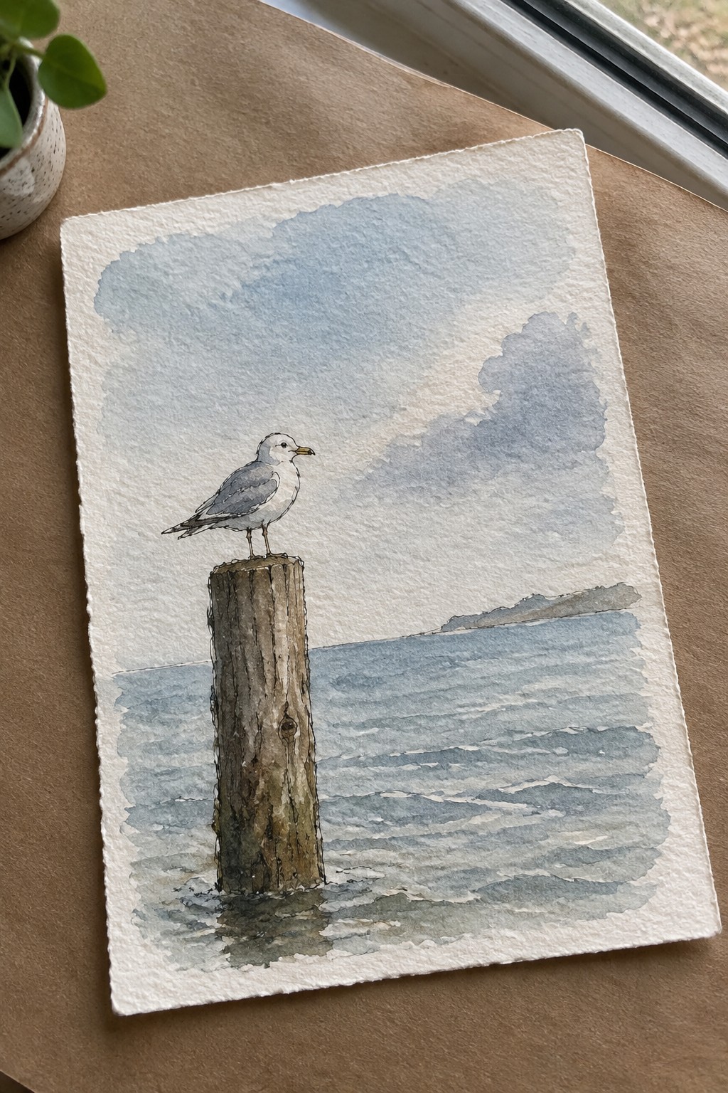
A lone seagull standing on a wooden post in open water forms a clean focal point for a small seascape. The idea keeps the subject simple by placing the bird and post against horizontal water lines and a soft sky, which lets the eye rest on the main shapes without extra detail. This approach fits the animal-in-landscape category and works especially well when the post sits slightly left of center.
What makes this idea useful is how few elements you need to carry the scene. You can change the sky tone or swap the bird for a different shore species while keeping the same layout. The straight water strokes and limited color range also make it a good option for quick practice pieces or small wall art that still reads clearly from a distance.
Dramatic Crashing Waves in a Compact Seascape
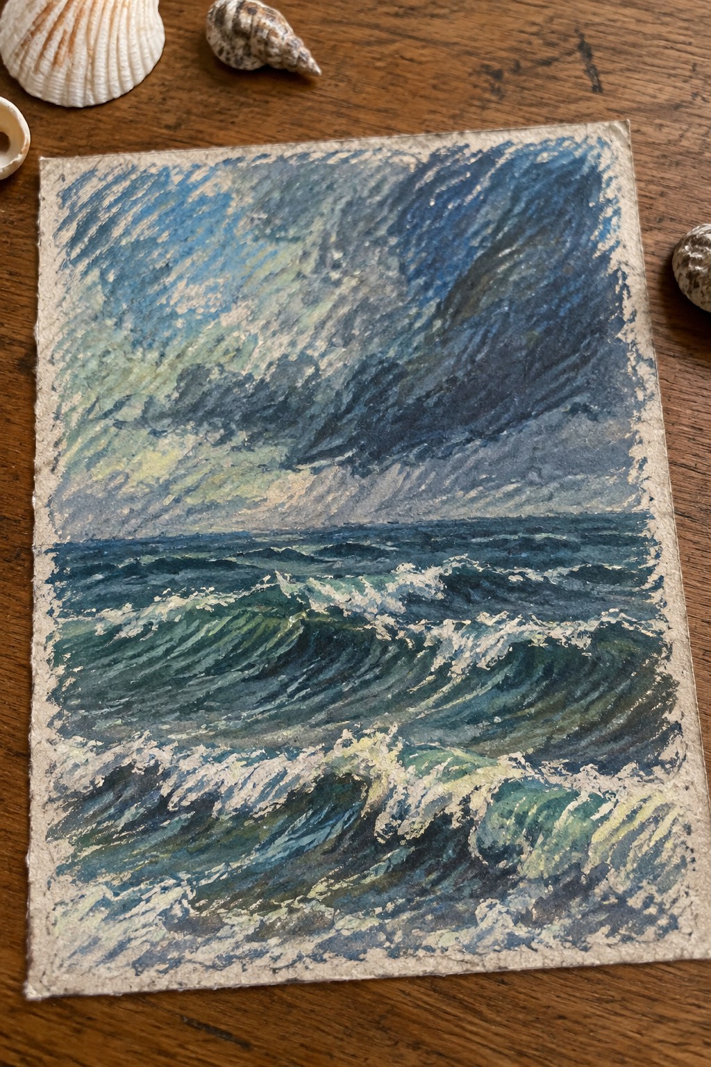
A small seascape built around churning waves and a heavy sky gives you a direct way to study water movement without needing a large canvas. The idea centers on layering darker blues and greens in the lower half to show depth in the swells, while keeping the sky active with directional strokes that echo the water below. This keeps the whole piece balanced even though the wave action takes up most of the space.
What makes this idea useful is how the limited size forces you to focus on brush direction and foam placement instead of filling empty areas. You can easily shift the palette toward cooler tones for a calmer version or reduce the number of wave crests if you want a faster study. For practice, the clear horizon line and stacked wave shapes make it simple to repeat with slight changes in color or angle.
Rowboats Moored Along a Wooden Dock

A straightforward seascape idea that centers on three small rowboats in primary colors tied to a short wooden pier. The boats sit at slight angles on bright turquoise water, with simple white stripes and reflections that keep the surface lively without needing complex detail. A distant shoreline with a couple of buildings and a clear yellow sun completes the scene while leaving most of the space open.
The composition does a lot of the work here by using the dock as a strong foreground anchor and letting the ropes create natural leading lines across the water. This setup works well for small canvases because the main shapes stay simple and the color choices stay bold. You could easily swap the boat colors, shorten the dock, or drop the distant buildings if you want a quicker version. The limited palette also makes it a practical choice for testing how reflections and water tones interact on a compact surface.
Sunset Gradient with Silhouetted Islands
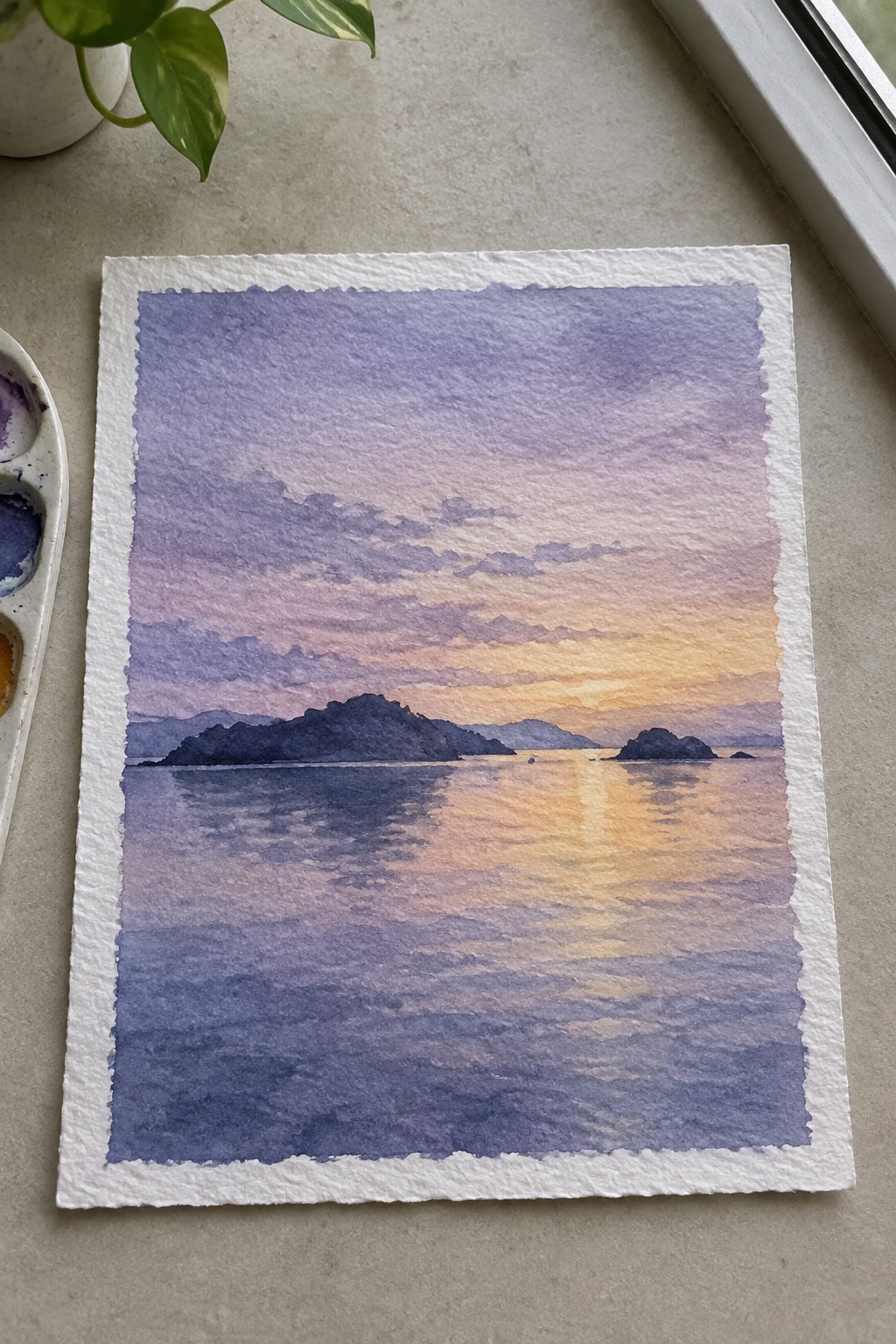
A compact seascape idea built around a smooth sky gradient that shifts from cool purple through pink into warm orange, mirrored directly in the water below. Simple dark island shapes sit along the horizon line to create contrast and break up the horizontal flow without adding detail. The approach fits the small-format landscape category because it relies on broad washes and clear value separation rather than fine elements.
The composition does a lot of the work here by using only a few large shapes and a strong light-to-dark contrast that reads clearly even at small sizes. You can swap the sky colors for different times of day or seasons while keeping the same layout and reflection pattern. For practice, this subject lets you work on even washes and soft blending without needing to manage complex edges or textures. The same idea also works well as a quick study or as one piece in a set of similar horizon paintings.
Stacked Scalloped Waves in Alternating Color Bands

This painting idea builds a small seascape from horizontal rows of scalloped wave shapes painted in a repeating sequence of coral, teal, cream, and mustard. The sun sits in the upper corner as a single round accent rather than a focal point. The pattern relies on consistent wave edges and limited color blocks to create movement across the surface without needing detailed rendering.
What makes this idea useful is the repeating wave row, which lets you paint one or two practice bands and then continue the same shape down the canvas. The color sequence mixes warm and cool tones so it reads as ocean layers while still working as a graphic pattern you can shift to other palettes. For small-format work, the approach keeps the layout simple enough to finish in one session and easy to repeat on additional canvases with different color orders.
Wave Breaking Over Rocky Outcrop
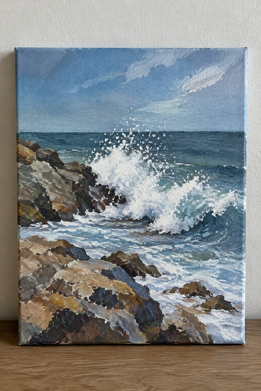
A wave crashing against dark coastal rocks creates a focused seascape idea centered on motion and contrast. The painting places the white foam and splash in the middle of the frame, with layered rocks in the foreground and a simple horizon line holding the background steady. This setup works as a small-format study of water texture against solid shapes, using a limited palette of blues, greens, and earth tones.
The composition does a lot of the work here by anchoring the eye on the point of impact while the rocks give the scene clear structure. A painting like this works especially well for practice because the rocks can be simplified into basic blocks and the foam built up with quick brushstrokes. The color palette makes this easy to adapt by swapping in warmer sunset tones or cooler morning light. For wall art, something like this stands out on Pinterest when kept to a modest canvas size that still shows the energy of the wave.
Palm Tree Reflection at Sunset
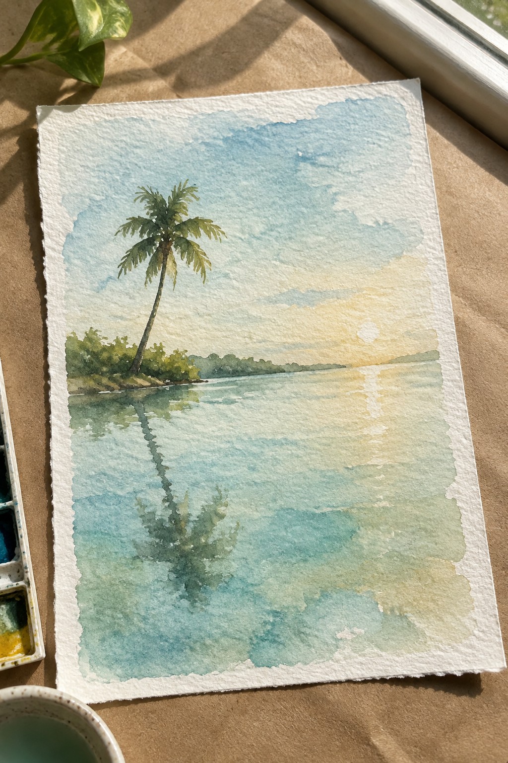
A single leaning palm tree next to a quiet shoreline gives this seascape its main focus. The idea centers on using the water reflection to repeat the tree shape and create balance without extra details. A gentle sky gradient from blue to warm yellow, plus the low sun, keeps the whole piece simple while still feeling complete for a small format.
The composition does a lot of the work here by placing the tree off-center and letting the open water fill the rest of the space. You can adapt it by changing the sunset colors to cooler tones or keeping the tree as a silhouette if you want less detail. This kind of layout works especially well for practice because the shapes stay basic and the reflection gives you a clear reason to try soft blending. For wall pieces or sharing, the strong vertical line of the tree against the horizontal water makes the idea read clearly even at small sizes.
Stacked Seagulls Over Calm Water
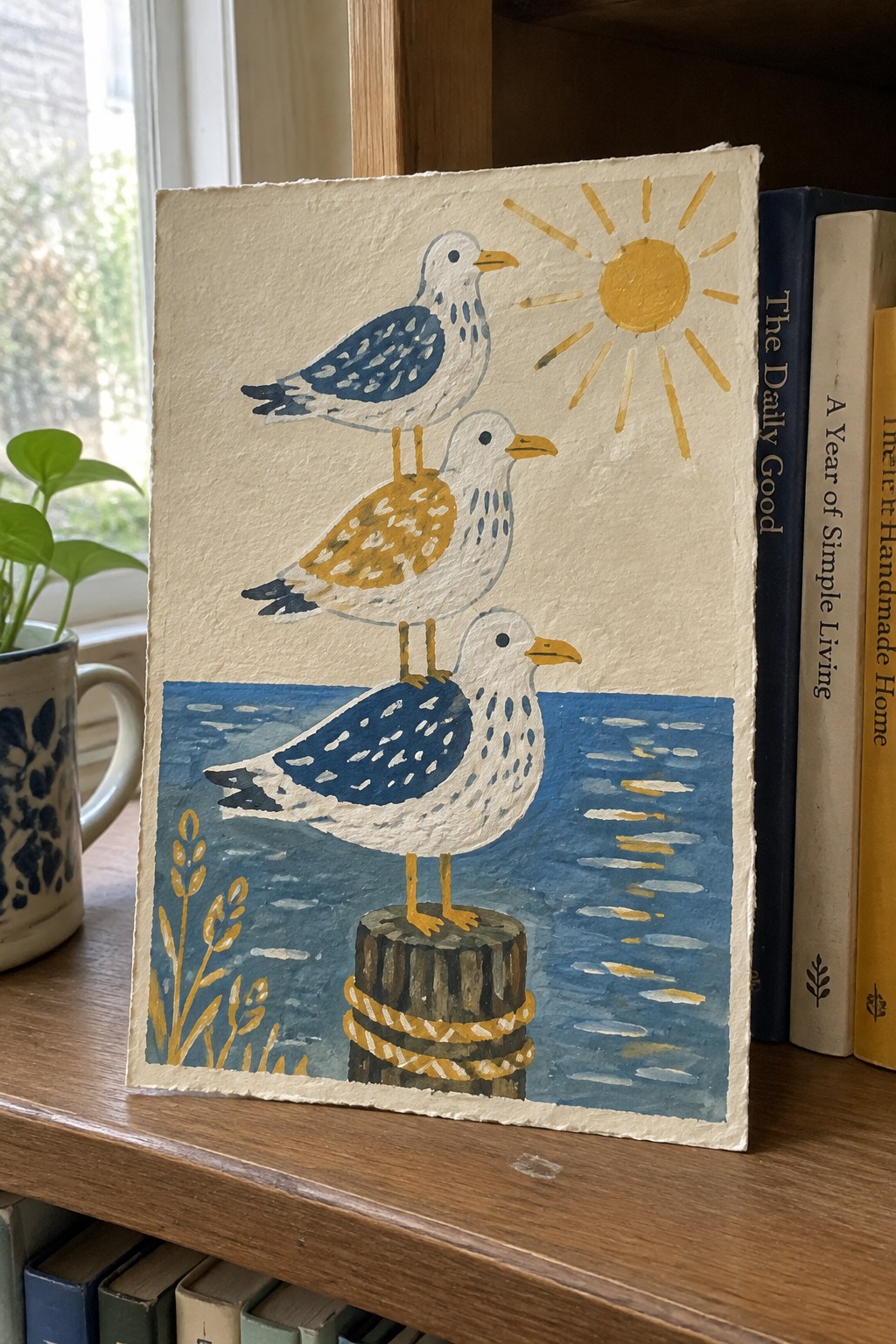
A vertical stack of three seagulls balanced on a single wooden post in the water forms the core idea here. The painting uses a simple seascape setup with the birds as the main subject, placed against flat blue water and a clear sky area that holds a yellow sun. The composition works because the birds decrease in size as they stack upward, creating clear layering while the post anchors everything in the lower half of the frame.
What makes this idea useful is how the centered subject leaves plenty of room for small format sizes without crowding. The limited color palette of blues, whites, and yellows makes it easy to swap in different water tones or adjust the sun size for variety. This kind of animal subject works especially well for practice pieces or quick decor since the shapes stay readable even if the details stay loose.
Cliffside Sunset with Distant Sailboats
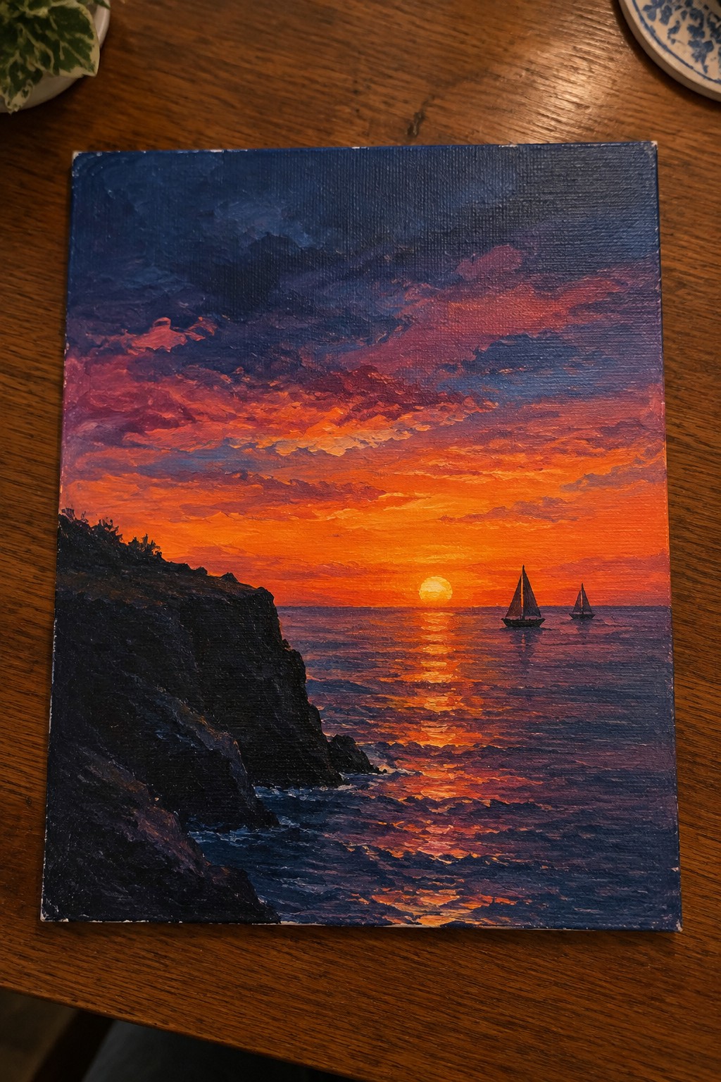
A sunset seascape viewed from a rocky cliff works well as a small-format ocean painting because the strong contrast between the dark foreground and the bright horizon creates instant depth. The idea centers on a glowing sky reflected across the water with two small sailboats placed to the right to balance the composition without crowding it. This landscape approach keeps the focus on color and light rather than intricate details.
What makes this idea useful is how the simple placement of the cliff on one side naturally frames the scene and leads the eye toward the horizon. The color palette stays easy to adapt since you can shift the oranges and reds to suit different sunset moods or even quieter evening tones. For practice or wall art, the sailboats add scale without requiring much detail, so the same layout works whether you keep it loose or add more texture to the waves.
Stormy Lighthouse Seascape
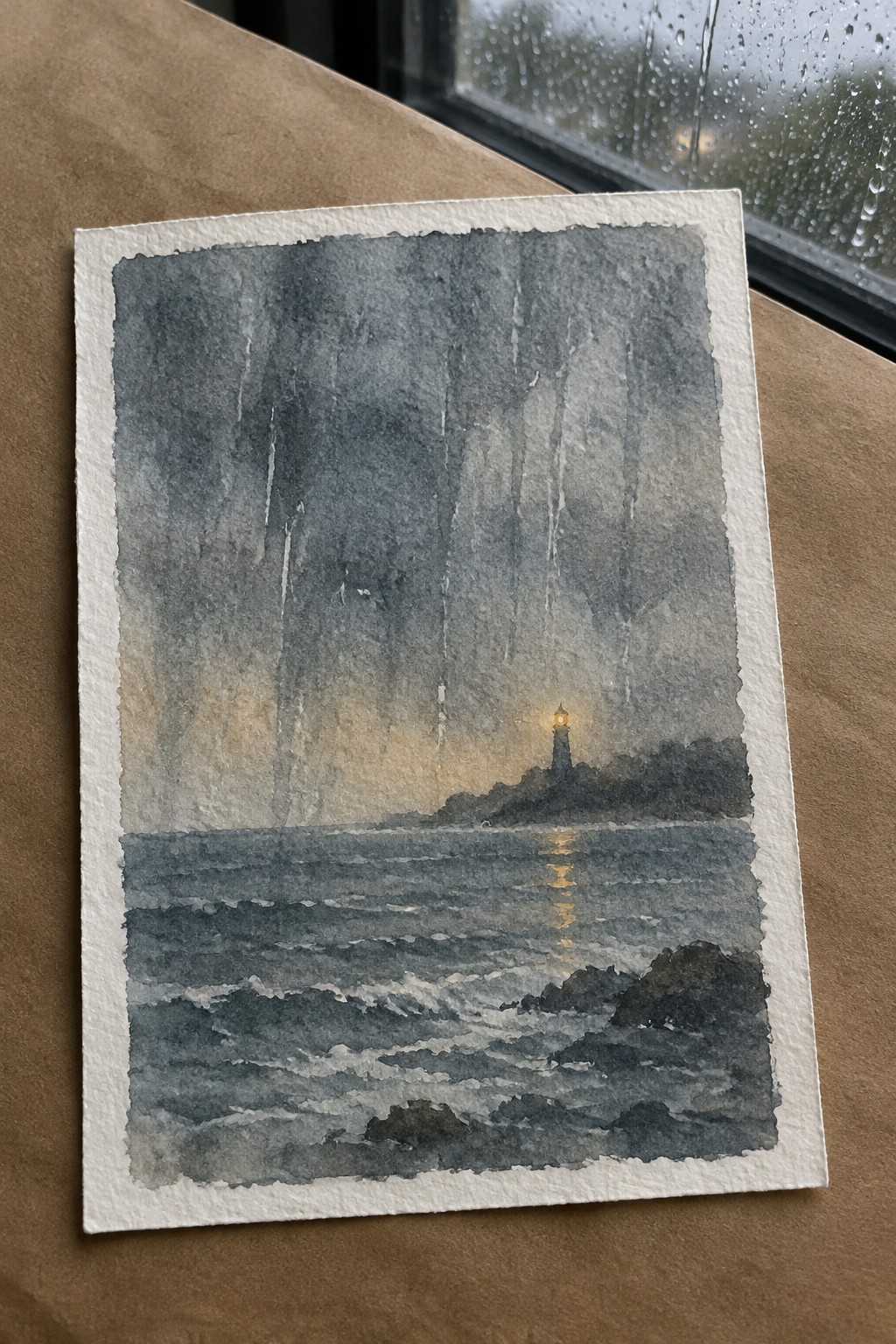
A compact stormy seascape built around a single lighthouse beam cutting through rain and dark water makes a strong ocean painting idea. The vertical rain lines and the horizontal sweep of waves create a clear focal point where the light hits the surface, keeping the whole piece readable even at small size. This approach fits the dramatic landscape category, where weather and a single light source do most of the visual work.
The composition does a lot of the work here by using the rain streaks to pull attention straight to the beacon. You can simplify the waves or shift the palette toward cooler tones if you want a calmer version, or keep the dark contrast for a bolder result. For small-format pieces this subject works well because it stays effective with limited detail and translates easily to sketchbook practice or quick studies.
Seashells Scattered Along a Receding Tide
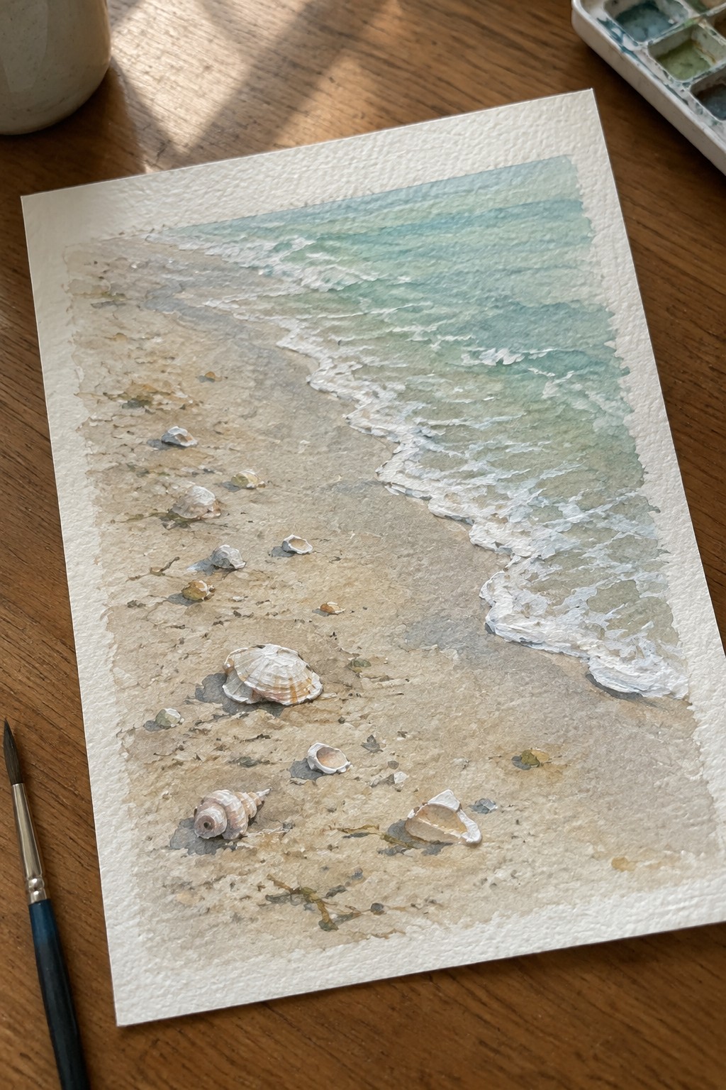
A small seascape idea that places a handful of seashells across wet sand where the water meets the shore. The composition uses a diagonal shoreline to lead the eye from the clustered shells in the foreground out toward the gentle waves. Soft blue-green washes for the water contrast with the muted sand tones, keeping attention on the shells as the main focal points without overcrowding the scene.
What makes this idea useful is how the natural shoreline curve organizes the layout so the shells feel placed rather than random. A painting like this works especially well for small formats because the limited number of elements stays easy to balance. You could simplify it further by reducing the shell count or adjust the water colors to match a different coastline. For practice, this kind of subject builds skill with layering transparent washes and suggesting texture through minimal detail.
Night Ocean with a Glowing Water Trail

A seascape idea built around a dark night ocean where a curving line of bright dots creates a path across the water toward a low silhouette of land. The concept uses a limited palette of deep blues against a single light accent to keep the focus on the movement of that glowing trail, with a small crescent moon placed high to balance the composition. This type of painting sits in the landscape category and works by letting simple shapes and contrast carry the scene instead of fine detail.
The composition does a lot of the work here by guiding the eye along the path without extra elements. A painting like this works especially well for small-format pieces since the narrow color range makes it fast to lay down and easy to adjust. You could swap the moon for more scattered lights or change the dot color to match a different time of year while keeping the same basic layout.
Frequently Asked Questions
What surfaces work best for creating small-format seascapes? Small canvases or panels measuring around 5 by 7 inches or 8 by 10 inches provide an ideal starting point. Use stretched canvas, wood panels, or watercolor paper treated with gesso for better paint adhesion. These surfaces hold detail well without warping and allow quick drying times which suits the compact scale of ocean scenes.
How do I select a color palette that brings ocean paintings to life? Begin with a limited set of blues, greens, and neutrals such as ultramarine, cerulean, and titanium white. Add touches of warm tones like burnt sienna for sand or rocks to create contrast. Test mixes on a separate sheet first to ensure harmony, and layer thin glazes for depth in water areas while keeping the overall scheme simple to avoid overwhelming the small format.
What techniques help paint realistic waves on a tiny canvas? Focus on directional brushstrokes with a small round or fan brush to suggest movement. Start with darker base layers for the water and build lighter highlights on wave crests using dry brushing. Keep details minimal since space is limited, and use a fine liner brush for foam edges. Practice on scrap material to control paint consistency and prevent muddiness.
How can I generate 20 distinct ocean painting ideas without repetition? Vary elements like time of day, weather conditions, or viewpoints such as close-ups of tide pools versus distant horizons. Incorporate seasonal changes, different marine life, or abstract interpretations of light on water. Sketch quick thumbnails in a notebook to explore combinations and rotate focal points between sky, waves, and shorelines for fresh results each time.
What tips ensure success when displaying these small seascapes? Choose simple frames that complement the artwork without overpowering it, such as thin black or natural wood options. Hang pieces in groups of three or five at eye level for visual impact. Protect them with UV-resistant glass and avoid direct sunlight to preserve colors. Rotate displays seasonally to keep the collection engaging in a home or studio setting.