
I’ve been trying out different ways to paint flowers without making them look too realistic and it’s changed how I work on my pieces.
Some days I just want something simple to focus on and these ideas have helped me get started without overthinking it.
I put together a list of approaches that felt useful in my own practice and might work for others too.
Mixing loose shapes with color has been one thing I keep coming back to when I paint.
It keeps the process enjoyable without needing a big plan every time.
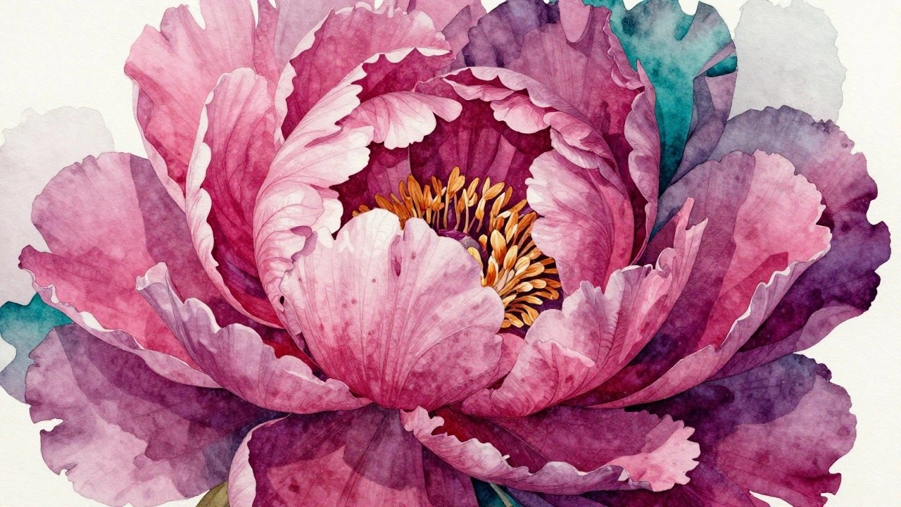
Watercolor Peony with Layered Petals and Bright Center
A single large bloom fills most of the frame, built from overlapping petals in varying pinks and magentas that radiate outward from a dense cluster of orange stamens. The idea focuses on using soft color transitions within each petal while keeping the center sharp and vivid to pull the eye inward. Deep teal and muted purple leaves sit beneath the flower, creating a natural base that balances the warmer tones above without competing for attention.
What makes this idea useful is the clear focal point that guides the whole composition, so you do not have to invent extra elements. The color split between the pink petals and teal foliage is easy to adapt by swapping in other contrasting pairs like purple and olive or coral and navy. For practice, you can start with the petals alone and add the leaves later, or crop the view tighter if you want a simpler version for cards or small canvases. This kind of bold single-flower layout tends to grab attention on mood boards because the scale and color contrast read clearly even in a thumbnail.
Radiating Floral Close-Up in Warm Tones
A strong central flower with petals spreading outward in layers forms the core idea here. The composition relies on a radial layout and a warm yellow-to-orange palette against cooler background tones to create contrast and depth. This approach works as a straightforward floral study that emphasizes shape repetition and color blending over intricate detail.
What makes this idea useful is how the centered arrangement handles most of the visual interest on its own. You can scale it down for smaller canvases or adjust the petal colors to match a different room palette without changing the basic structure. The background keeps the focus on the flower while adding subtle contrast. For practice, this kind of subject helps build confidence with layering and edge control before moving into more abstract versions.
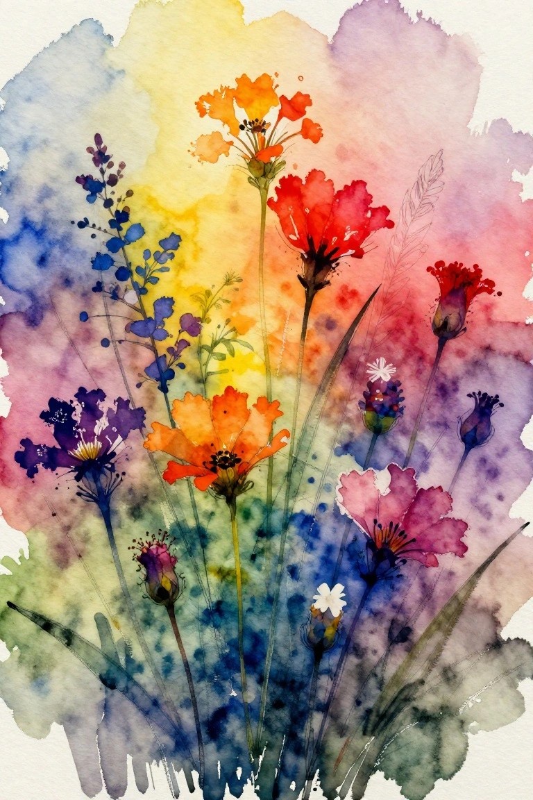
Overlapping Abstract Florals in Warm and Cool Contrast
This painting idea uses a dense cluster of abstract flowers built from loose overlapping shapes in coral, orange, and red against a deep blue field. The composition works by letting the warm blooms push forward through simple layering while the cool background fills negative space and creates separation between forms. It belongs to abstract floral work where color temperature contrast and varied petal outlines do most of the visual heavy lifting.
What makes this idea useful is how the blue background lets you build the piece quickly with broad washes and scattered marks instead of tight detail. The color palette adapts easily if you swap the corals for other warms or shift the blue to a different dark value. For practice, start with just four or five blooms and add more layers as you go. This kind of high-contrast floral cluster also translates well to larger wall pieces because the shapes read clearly from a distance.
Layered Abstract Flower with Radiating Petals
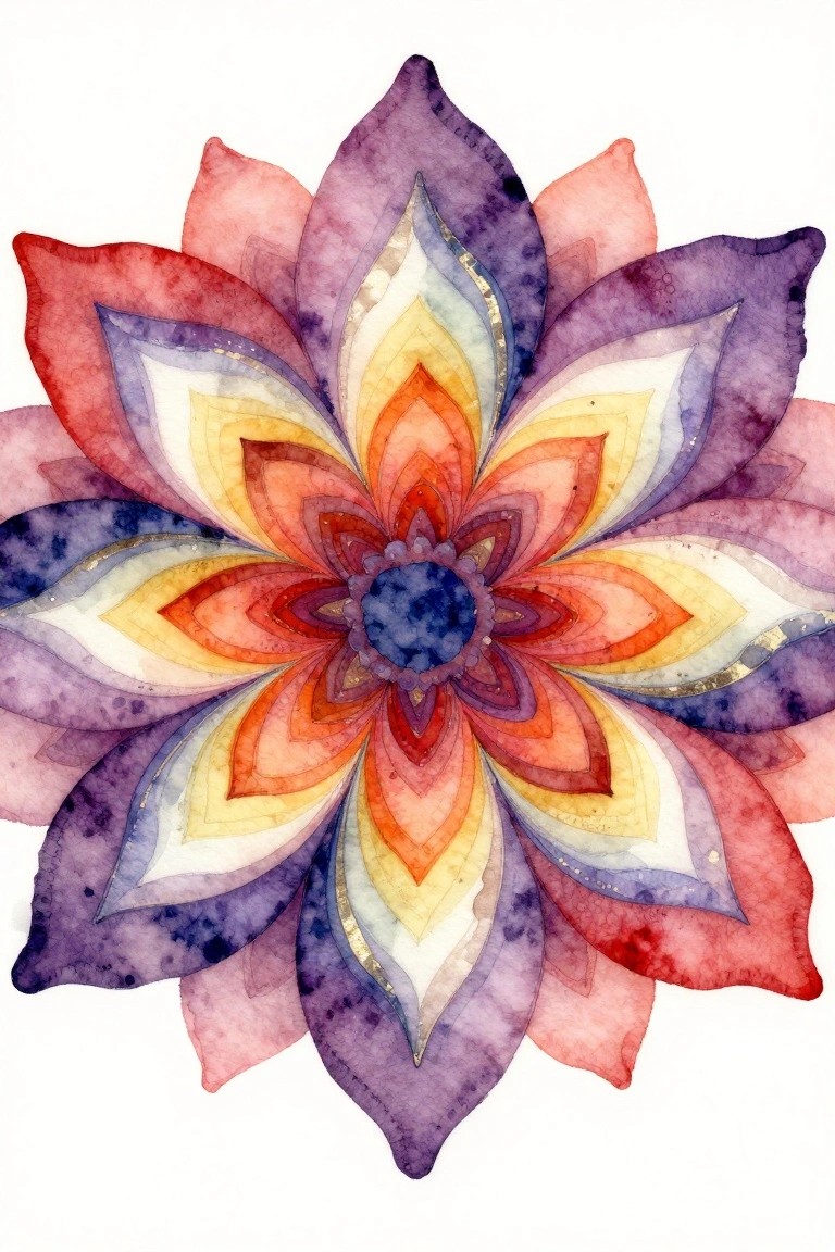
An abstract floral idea built around a central bloom made of overlapping pointed petals that grow in size as they move outward. The composition relies on a radial layout with a tight cluster of inner petals surrounded by larger outer ones, using a color shift from warm oranges and reds near the middle to cooler purples and blues at the edges. This approach keeps the focus on shape repetition and color blending rather than realistic flower details.
The repeating petal forms make it straightforward to paint in stages by starting with the center and working outward. You can easily change the palette to cooler tones for a different mood or simplify the outer layers if you want a quicker version for practice pieces. For wall art, the balanced circular shape holds attention well on its own without extra background elements.
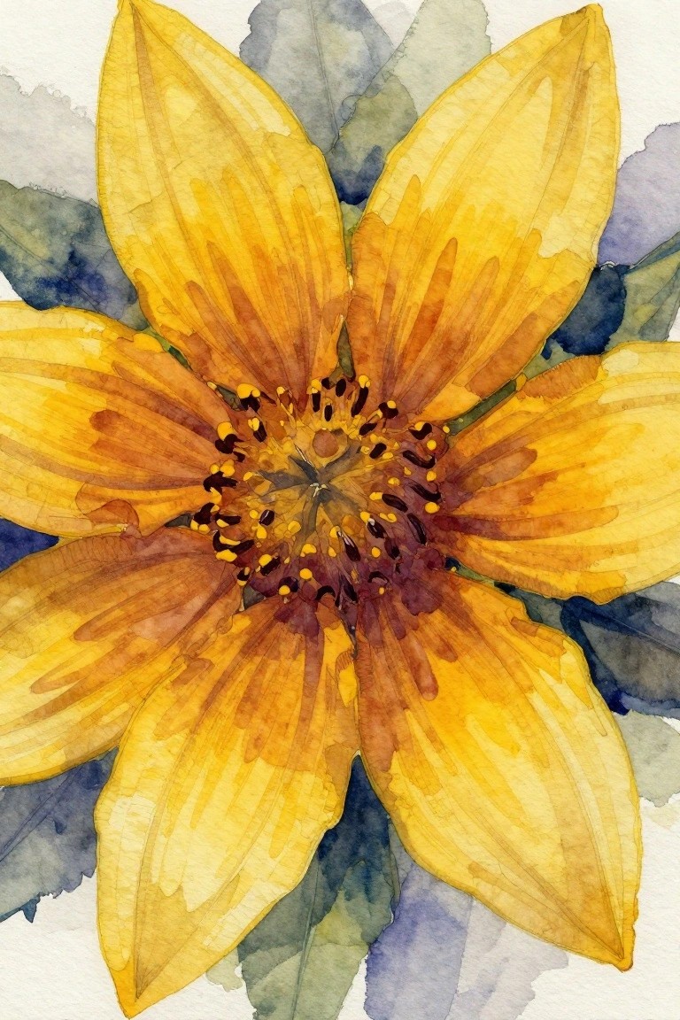
Close-Up Sunflower Studies with Strong Center Contrast
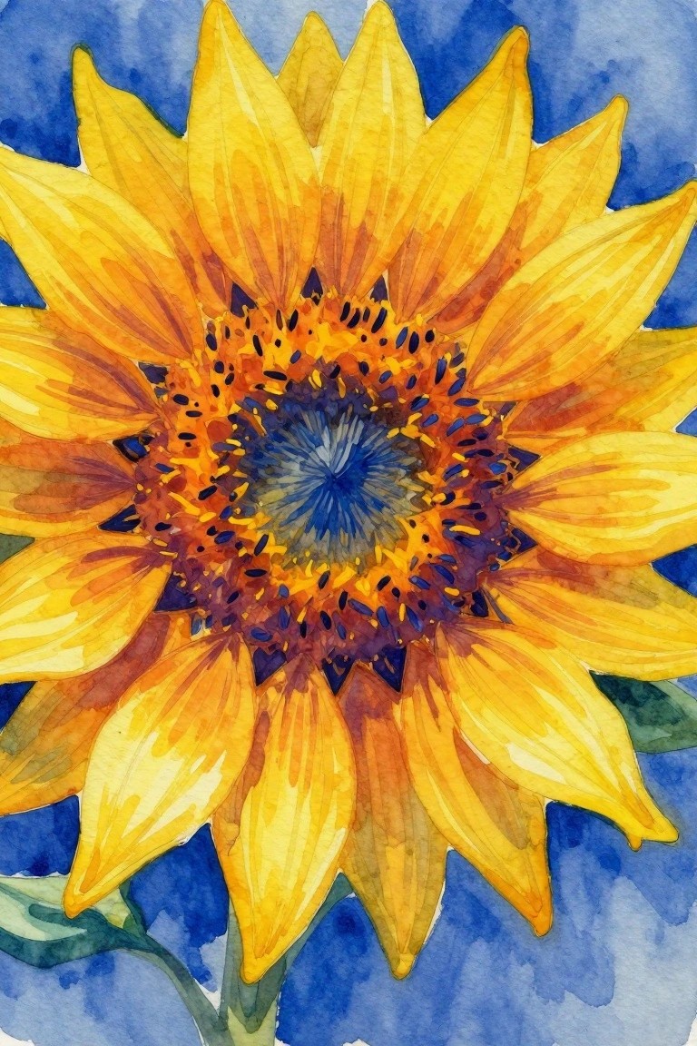
A sunflower painted from a direct overhead angle works well as a floral idea because the radiating petals create natural movement that leads straight into the center. The composition stays effective through the sharp color shift from bright yellow outer petals to the darker, mixed orange and blue tones in the middle, which keeps the focus tight on one area. This approach fits standard floral painting practice where the subject fills most of the frame and the background stays simple.
The composition does a lot of the work here by using the natural petal shapes to guide the eye without needing extra elements. A painting like this works especially well for testing color mixing in the center while keeping the outer petals straightforward. You can adapt it by cropping tighter on the middle for a more abstract version or by swapping the blue background for a warmer tone if the piece needs to match a different room. For practice, this kind of subject gives clear structure without requiring complex perspective.
Layered Lotus with Soft Petal Blends
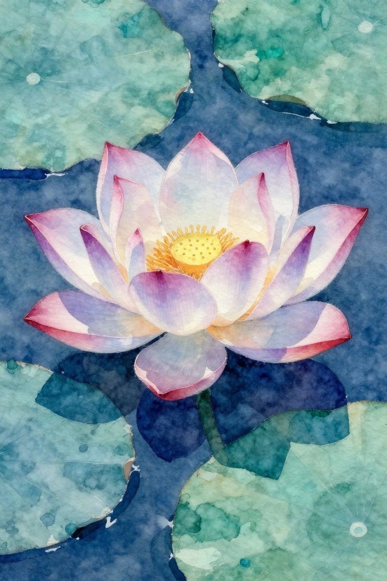
A lotus flower painting idea centers on building a single bloom with overlapping petals that shift from pale pink to deeper purple around a textured yellow center. The composition keeps the flower as the clear focal point while lily pads create irregular shapes around the edges to suggest water without filling every space. This floral approach works because the loose color transitions and negative space around the bloom keep it from feeling crowded or overly stiff.
What makes this idea useful is how the round pads and open water areas let you practice wet-on-wet blending without needing precise outlines. You could swap the pinks for cooler blues or shrink the flower to fit a square format for different wall placements. For practice, this kind of subject helps you test how much detail to add to the center before the rest of the piece starts to compete.
Layered Rose with Saturated Red Watercolor Petals
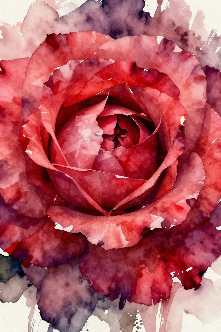
A rose painting idea built around a tight spiral of overlapping petals works well when the colors stay within a narrow range of reds and deep purples. The composition gains strength from the inward focus created by the petal edges, while the outer shapes stay loose and broken so the eye stays on the center. This approach sits comfortably in abstract floral work where the goal is strong color and simple shape rather than fine detail.
What makes this idea useful is how the single-subject crop removes the need to invent background elements. The color palette makes this easy to adapt by shifting the reds slightly warmer or cooler depending on the pigments you already have. For practice, this kind of subject lets you work on wet-on-wet blending and hard edges in one small area without committing to a full bouquet. You could also enlarge the canvas and let the outer splashes run farther if you want a bigger statement piece for a wall.
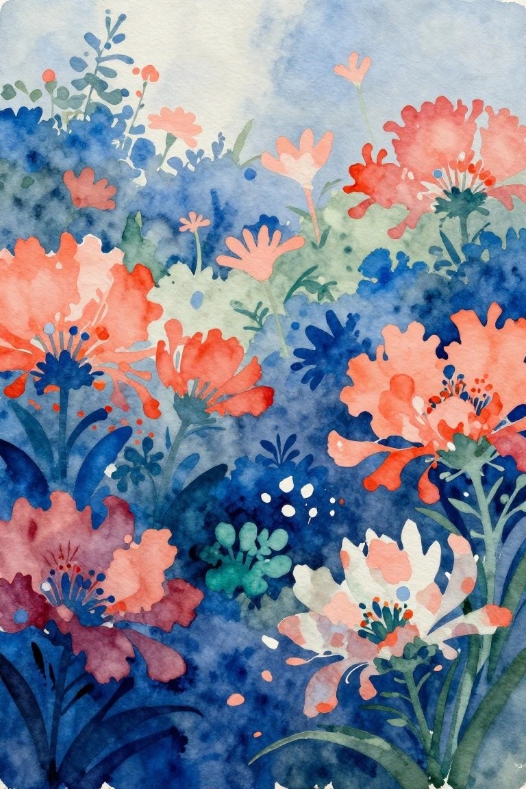
Gradient Washed Abstract Florals
This painting idea uses a loose abstract floral approach where different flower shapes are placed across a soft color gradient background that shifts through blues, yellows, oranges, and pinks. The composition works by balancing clusters of blooms at varying heights with open space, letting the washes create natural color connections between the flowers. It belongs in the abstract floral category since the focus stays on color flow and shape variety rather than precise details.
The composition does a lot of the work here by using the background gradient to suggest both placement and color choices for the flowers. You can adapt it easily by changing the gradient to match a specific room or season while keeping the same scattered layout. This kind of painting idea stands out on Pinterest because the bright transitions catch attention even in a small preview. For practice, start with fewer flowers and build up the layers once the washes are dry.
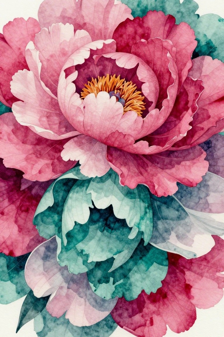
Layered Peony in Coral Watercolor
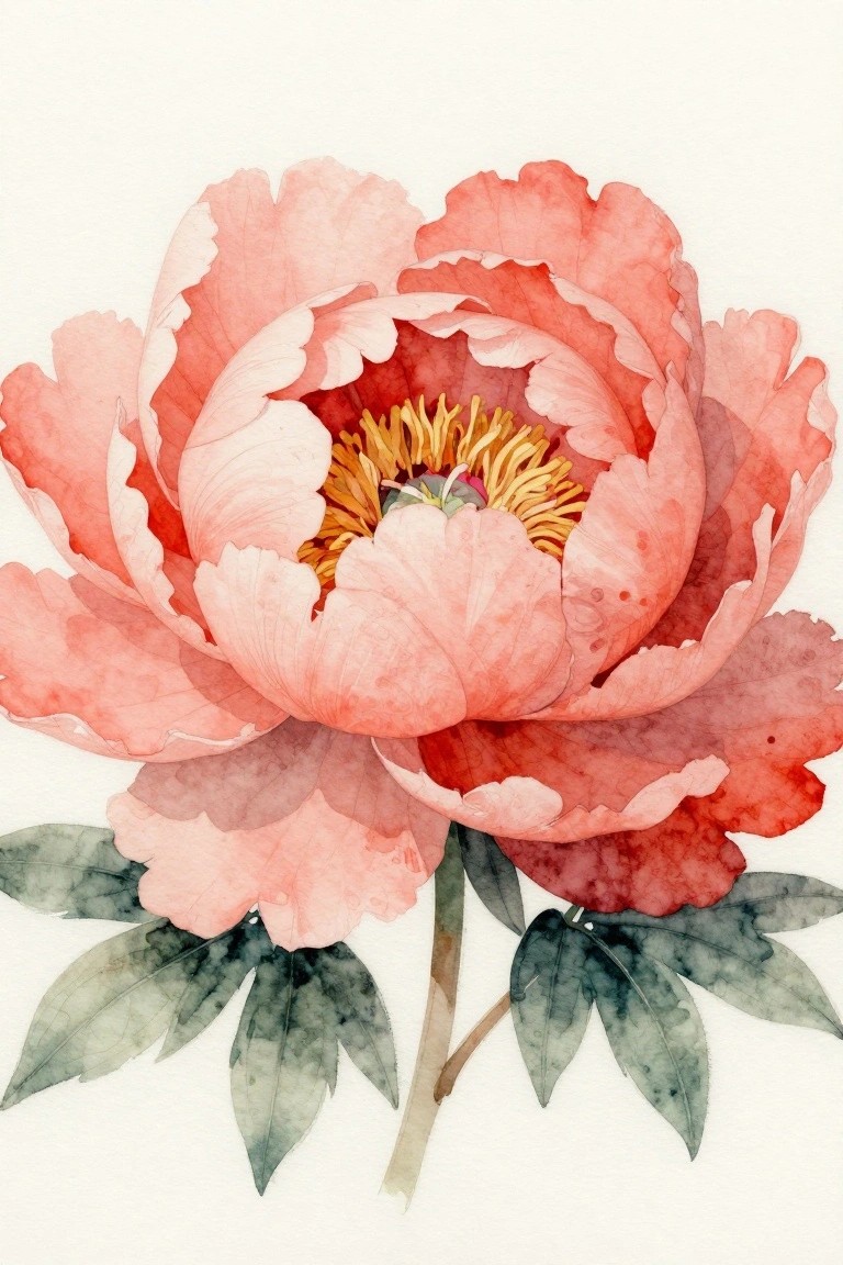
A large single peony works as a painting idea when the petals are built in overlapping layers of soft coral, pink, and red washes. The dense yellow stamens at the center pull attention inward and give the whole piece a clear focal point. This type of floral study fits still life practice because the rounded petal shapes and gradual color blending create interest without extra background elements.
The composition does a lot of the work here by filling most of the frame with the flower itself. You could simplify the petal count or change the color mix toward peach or deeper red to match different rooms or seasons. For wall pieces, the same idea scales well if you keep the background clean and let the layered edges stay soft.
Loose Watercolor Poppy with Bold Petals
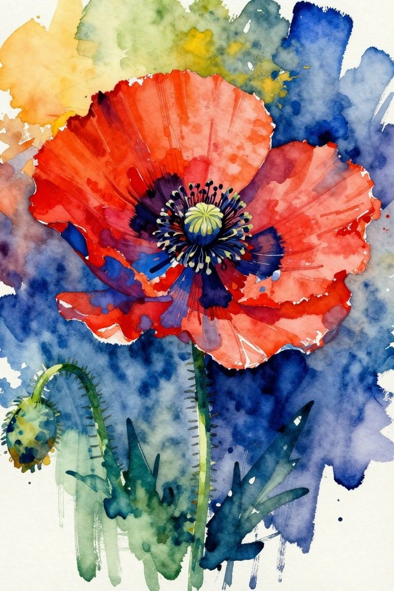
A single oversized poppy painted in bright red with a dark center makes a strong focal point when paired with loose blue and green background washes. The idea centers on letting the flower dominate while the soft surrounding colors keep the overall look light and open. This approach fits the floral category and works through simple contrast rather than complex detail.
The composition does a lot of the work here by keeping the background loose so the petals stay the main event. You can adapt the same layout by swapping the red for another bright hue or shrinking the flower to fit a smaller canvas. For practice, this kind of subject helps you focus on shape and color placement without needing precise realism. It would also translate well into a larger wall piece if you keep the background even more minimal.
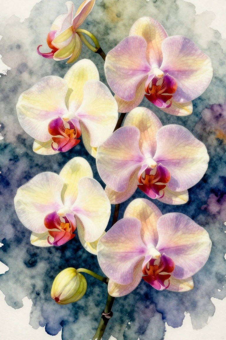
Watercolor Orchids with Teal and Gold Accents
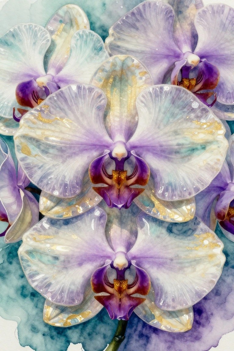
Orchids make a strong subject for a floral painting when you focus on overlapping petals and soft color transitions. This approach uses a cool palette of purples, whites, and teal with scattered gold highlights to create contrast and keep the centers as the main point of interest. The symmetrical layout and gentle blending give the flowers a sense of depth while still leaving room for the background to show through.
What makes this idea useful is how the negative space around the blooms handles most of the composition work. You can scale it down to a single flower for a card or expand it across a larger sheet by adding more stems at the edges. The gold details are easy to add last with a fine brush or even a gel pen, so the same layout works whether you want a quick study or a finished piece for wall decor. For practice, this subject helps with wet-on-wet blending without requiring tight control over every edge.
Abstract Florals with Warm Overlaps and Dark Stems
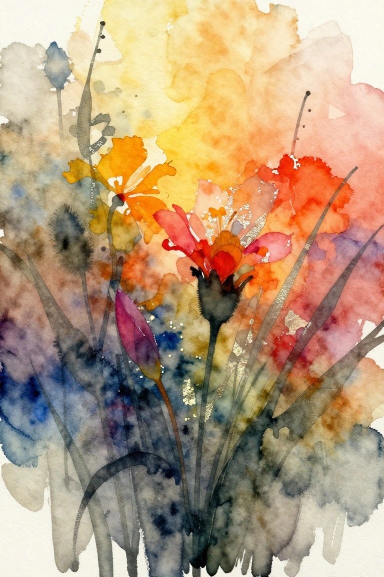
Loose abstract flower paintings gain energy from letting warm colors like orange, red, and yellow bleed into each other across the paper. Placing darker stems and buds against those bright areas creates strong contrast that holds the composition together. This approach fits the abstract floral category because it relies on shape, color blending, and negative space instead of precise outlines.
The color palette makes this easy to adapt by swapping in cooler tones or softer pastels for different seasons. A painting like this works especially well for practice because the loose style lets you focus on layering without worrying about perfect edges. For wall art, the scattered layout and bold blooms help it stand out when pinned on Pinterest. You could scale it down for greeting cards or keep the background simple to make the flowers the clear focus.
Scattered Daisies on a Deep Background
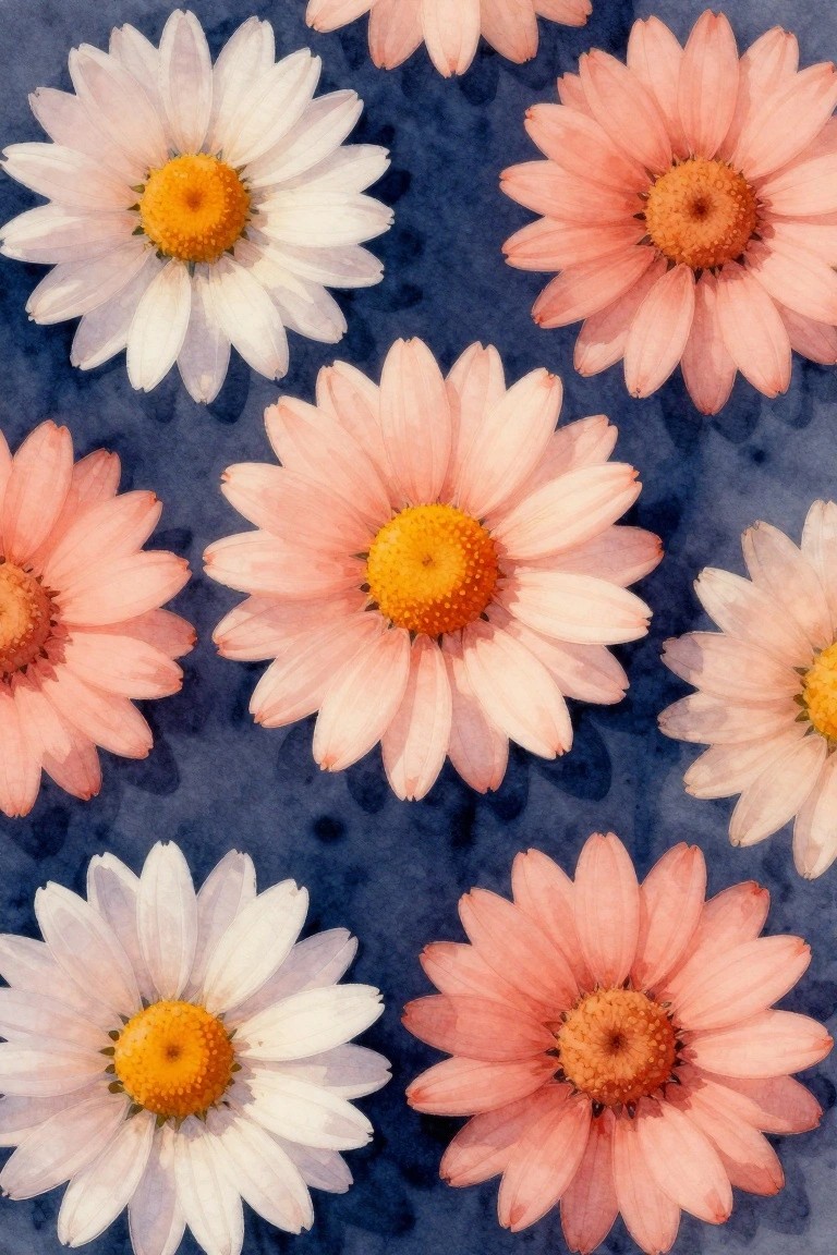
A simple way to build a floral painting is to repeat the same daisy shape several times across the canvas while switching between white and soft pink petals. The dark blue ground makes the light flowers stand out without needing extra detail or shading. Keeping the centers bright yellow and letting some blooms sit partially off the edges gives the whole piece a casual, repeating pattern that still feels balanced.
What makes this idea useful is how little planning the layout actually needs. You can start with one flower, add others at different angles, and stop whenever the spacing feels right. The color swap between pink and white keeps it from looking too repetitive if you want to make a larger version or turn it into a repeating print. For practice, this kind of subject works well because the shapes stay basic while the contrast does most of the visual work.
Grid Patterns Mixing Citrus Slices and Abstract Flowers
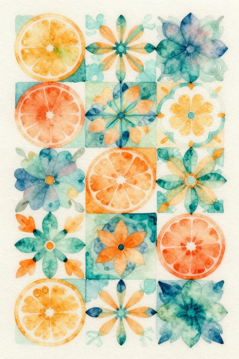
This painting idea uses a grid layout to pair citrus slices with stylized flowers in matching squares. The approach mixes food and floral elements into a decorative pattern where each tile shares the same warm orange and cool teal palette. The repeating structure and simple shapes keep the composition balanced while letting the contrast between round fruit sections and pointed petals create visual interest.
What makes this idea useful is how the grid format lets you add or remove tiles without changing the overall look. You could paint just four squares for a quick study or expand it across a full page for a larger piece. The limited color scheme makes it simple to adapt with different fruits or blooms while keeping the same clean, patterned effect. For practice or wall art, the setup stands out on Pinterest because the tiles read clearly even at thumbnail size.
Bold Blooms Layered Over Loose Green Backgrounds
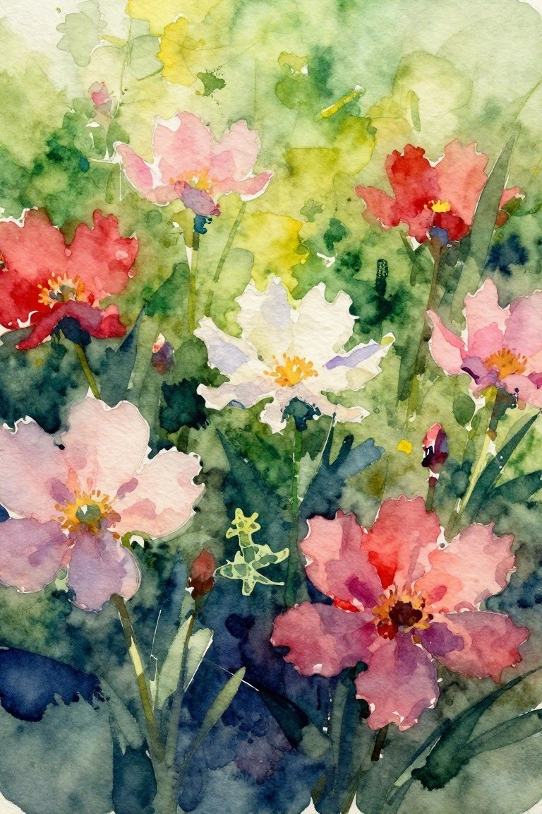
This painting idea uses clusters of overlapping flowers in reds, pinks, and whites set against a soft wash of greens and blues. The approach relies on varied bloom sizes and angles to create depth while keeping the background loose and unfussy. It fits the floral category and works well because the strong color contrast lets the flowers stand out without needing crisp edges or fine detail.
What makes this idea useful is how the muted background handles most of the work in separating the blooms. You can adapt the palette to cooler tones for a different season or crop the layout tighter for a smaller canvas. The same loose layering also translates easily to acrylic if you want more control over the edges. For practice, this kind of subject rewards quick color studies rather than perfect shapes.
Orchid Cluster in Soft Pastel Tones
Painting several orchids together on one stem creates a balanced floral composition that fills the space naturally. The idea uses gradual color shifts across the petals in yellow, pink, and purple to keep the focus on the flowers while a dark background adds contrast without extra details. This type of work fits into the floral category as a realistic yet softened study that relies on overlapping shapes for depth.
What makes this idea useful is the way the stem and bud placement already give structure, so you can start with fewer blooms and add more as you go. The color palette works for quick adjustments if you want warmer or cooler tones to match a specific space. For practice, this kind of subject helps build control over blending without requiring a full scene. A painting like this would stand out on Pinterest because the dark background makes the flowers pop in a thumbnail view.
Abstract Floral with Bold Splatter Center
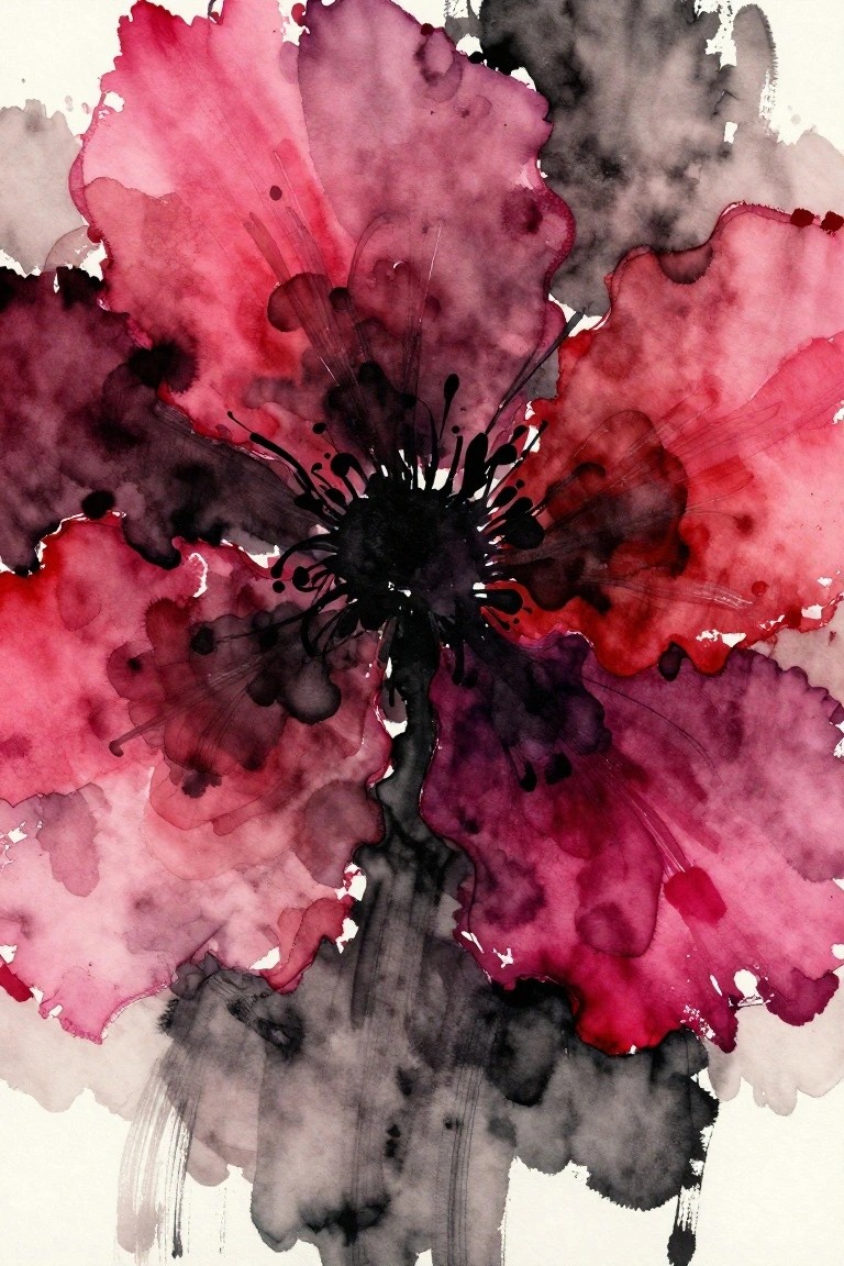
An abstract flower painting built around a dark central burst creates strong visual impact through contrast and loose petal shapes. Overlapping layers of pink, red, and purple form the main subject while the splattered marks add movement without requiring fine detail. This fits the abstract floral category by focusing on color blocks and spontaneous texture rather than realistic structure.
The composition does a lot of the work here because the dark center anchors everything and makes the surrounding petals read clearly even at a distance. You can adapt the idea by changing the palette to cooler tones or using it as a quick study on smaller paper before scaling up. For wall pieces, this approach stands out on Pinterest because the high contrast and simple layout translate well to prints or cards.
Radiating Swirl Floral Abstract
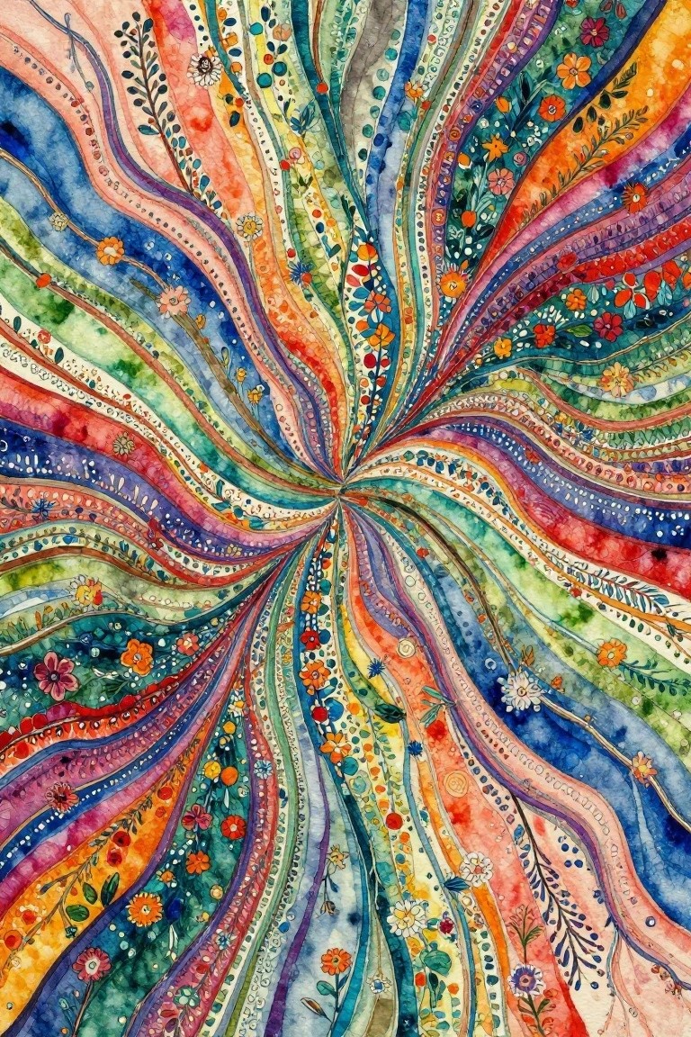
This painting idea centers on an abstract floral composition built from wavy lines that radiate outward from a single center point. Small flowers, leaves, and dot patterns are placed along the lines to fill the space and keep the eye moving. The result works as a decorative abstract piece that blends floral elements with strong directional movement.
What makes this idea useful is the built-in structure of the radiating lines, which makes it easy to start without worrying about perfect placement. You can swap in different flower shapes or shift the color palette to match whatever supplies you have on hand. For wall art, the bold center focus helps the piece stand out even at smaller sizes, and you can simplify the pattern by reducing the number of lines if you want a quicker version.
Frequently Asked Questions
What materials work best for beginners trying abstract flower painting ideas? Acrylic paints on canvas or heavy paper are ideal starting points because they dry quickly and allow easy layering. Gather brushes of various sizes, a palette knife for texture, and basic colors like blues, pinks, and greens. Begin with one of the simpler ideas from the list, such as loose petal shapes, and practice mixing colors on a separate sheet before applying them to your main piece. This setup keeps costs low while giving you freedom to experiment.
How can I adapt the 18 abstract flower ideas if I prefer watercolor instead of acrylic? Watercolor suits many of these concepts by emphasizing soft edges and fluid blooms. Dilute your paints more than usual to create translucent layers that mimic the light, airy feel of abstract flowers. Use the ideas involving overlapping shapes or negative space by letting colors bleed naturally on wet paper. Salt or plastic wrap techniques add interesting textures that elevate the final look without needing extra tools.
What steps help turn a basic flower sketch into an inspiring abstract painting? Start by drawing loose outlines rather than detailed petals, then block in large color areas inspired by the article ideas like bold centers or swirling backgrounds. Add depth with dry brushing or splatter effects to create movement. Step back often to assess balance, and refine only the areas that feel flat. This process transforms simple sketches into dynamic pieces that stand out.
How do I select colors that make abstract flower artwork more vibrant and cohesive? Choose a limited palette of three to five hues that complement each other, such as warm oranges paired with cool teals for contrast. Reference the article ideas that focus on monochromatic schemes or gradient transitions to keep things unified. Test combinations on scrap paper first, and incorporate neutrals like white or gray to let brighter tones pop without overwhelming the composition.
What common mistakes should I avoid when following abstract flower painting ideas? Overworking wet layers often leads to muddy colors, so allow drying time between steps. Stick closely to one main idea from the list at a time instead of combining too many elements, which can clutter the design. Pay attention to composition by leaving breathing room around focal points rather than filling every inch of the canvas. These adjustments keep your artwork fresh and professional.