
I have always liked painting flowers with watercolors because they feel light and easy to work with.
Sometimes I just sit with my paints and try out different shapes and colors without a plan.
Over time I put together a few ideas that turned out nicely for me.
These are some watercolor flower paintings that give a soft look without needing too much detail.
I hope you find one or two that you might want to try yourself.
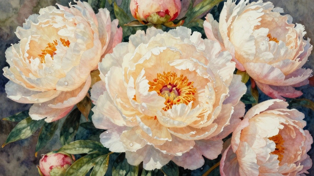
Soft Layered Peonies in Warm Pastel Hues
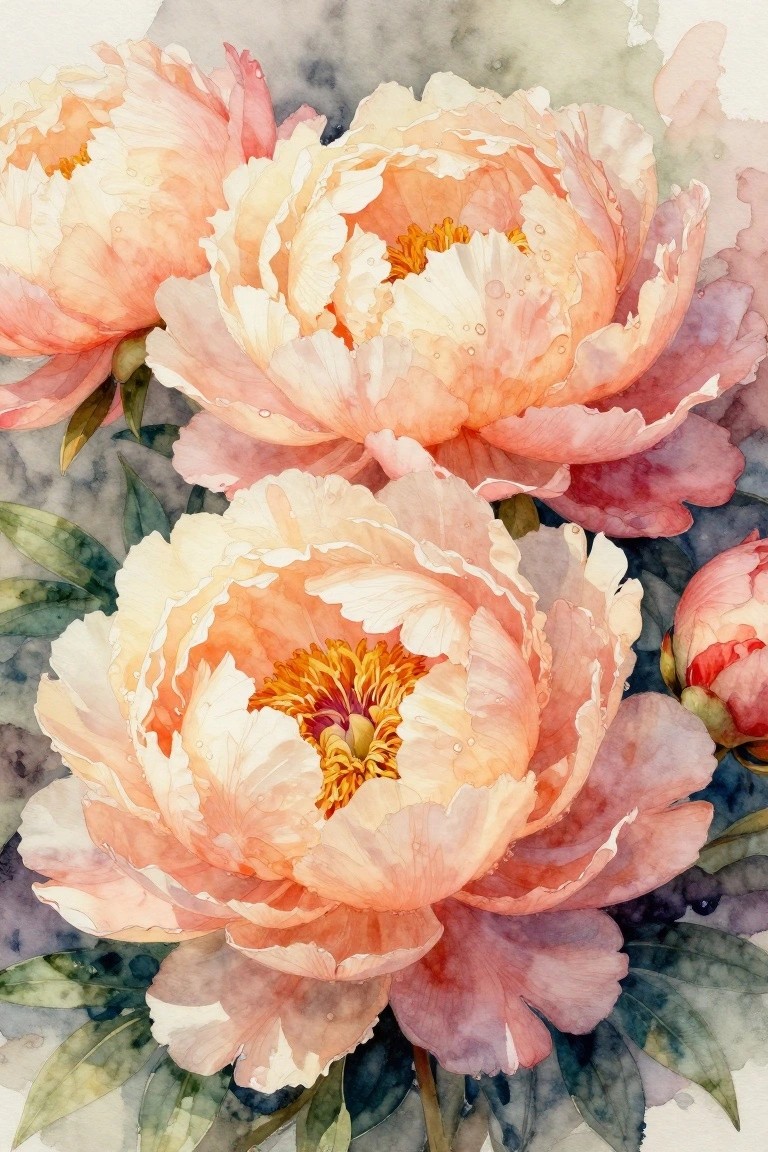
A close-up floral study of overlapping peonies works well when you keep the focus on building soft petal layers in a limited palette of peach, cream, and pale rose. The idea relies on letting the largest bloom sit lower in the frame while smaller ones tuck in behind it, which creates natural depth through simple overlap instead of complex perspective. This approach fits the watercolor floral category where loose edges and light color washes handle most of the form.
The composition does a lot of the work here because the flowers already fill the space and guide the eye without needing extra elements. You can easily shift the colors toward cooler pinks or warmer corals depending on what you have mixed, and the same layout scales down for a card or stays large for a wall piece. For practice this subject helps with controlling water flow so the petals stay soft rather than muddy.
Layered Wildflower Cluster with Soft Background
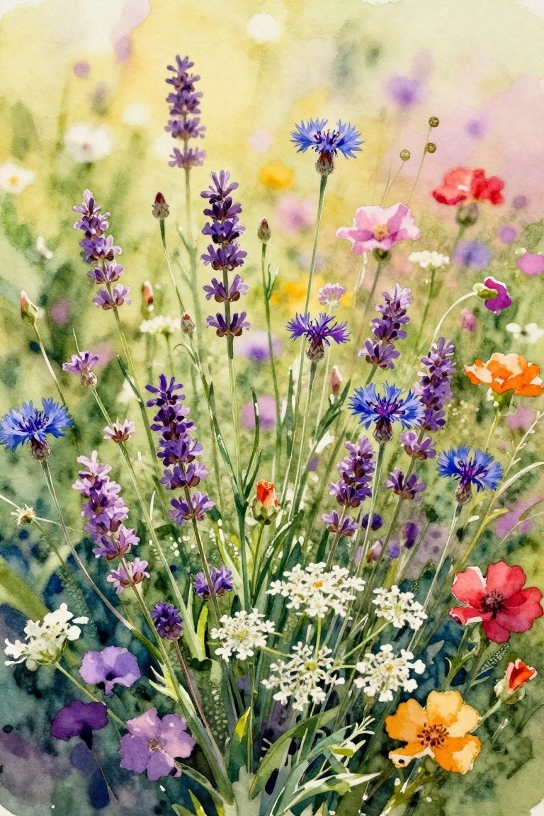
A mixed wildflower painting idea centers on grouping several different blooms with stems at varying heights to fill the page. The composition relies on overlapping shapes and a loose vertical layout that keeps the arrangement feeling natural rather than arranged. A light, unfocused background lets the stronger colors of the flowers stand out without competing details.
What makes this idea useful is how easily you can swap in whatever flowers you already know how to paint or have reference photos for. You can reduce the number of colors to three or four if you want a quicker version, or keep the full mix when you have more time. For wall art, a painting like this works especially well because the soft background keeps it from feeling too busy even at larger sizes. The simple shapes help this feel more approachable for practice while still giving you room to add small personal touches like a favorite bloom.
Rose with Red and Teal Petal Layers
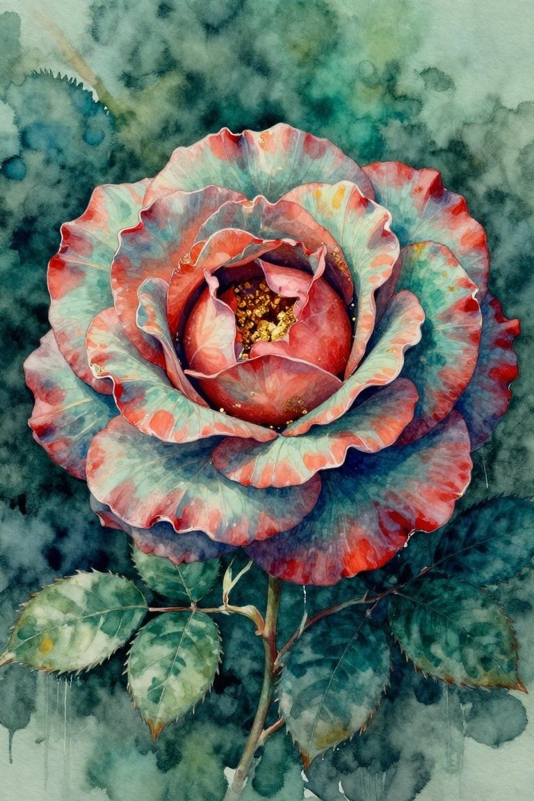
A rose painted with petals that shift from deep red to teal creates a strong focal point through color contrast. The idea centers on building overlapping petal shapes that draw the eye inward to a small, detailed center. This fits a floral category where the main interest comes from the color change rather than perfect realism.
What makes this idea useful is how the petal layering already gives structure, so you can focus on mixing those two color families without needing complex shading. The compact flower shape works well for smaller canvases or greeting cards, and you could swap the teal for other cool tones to match different seasons. For practice, start with the outer petals first and keep the background soft so the color shift stays the main feature.
Lotus Flowers with Water Reflections
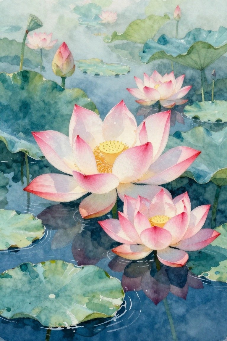
Painting several lotus blooms at different stages of opening creates a natural focal point when they sit among lily pads on still water. The idea uses overlapping petals and pads to suggest depth while keeping the color shifts soft between pale pinks, creams, and muted greens. Reflections under the flowers add another layer without requiring extra elements or sharp lines.
What makes this idea useful is how the water surface does most of the work for balance and interest. You can scale it down to two or three flowers for a quicker study or adjust the pink tones toward peach or lavender to match a room. For wall pieces the horizontal spread of pads keeps the composition calm and easy to frame.
Cherry Blossom Branches with Gold Flecks
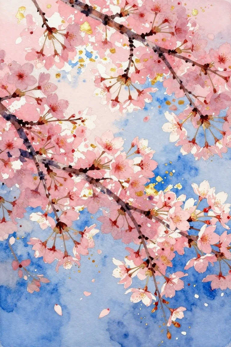
Painting loose cherry blossom branches across a soft blue and pink wash creates a light floral study that relies on overlapping limbs and scattered petals rather than tight detail. The idea centers on using negative space and simple color blocks to let the flowers stand out while the background stays minimal. Gold splatters add a single contrasting element that keeps the whole piece from feeling flat.
The composition does a lot of the work here by letting branches run diagonally and trail off the edges so you do not need to plan a perfect layout. You could swap the blue wash for a pale gray or warm beige to change the season without redrawing anything. This approach works especially well for quick practice pieces or small prints because the loose style hides minor brush mistakes and the gold keeps it from looking too plain on a wall.
Overlapping Sunflower Cluster

A dense arrangement of sunflowers with overlapping petals and visible seed centers creates a strong floral study focused on repetition and natural form. The idea centers on filling the frame with blooms so the eye moves across the yellow petals and textured middles without needing additional elements. This fits a classic still life approach that uses close cropping to emphasize shape and color variation.
The composition does a lot of the work here by letting the flowers support each other visually and reduce the need for background details. You could scale it down to three or four blooms for a quicker version or shift the yellows toward softer tones for a different mood. For practice, this subject helps with building layers in the centers and managing edges where petals meet. It would perform well on Pinterest as a recognizable flower subject that still feels fresh when kept tightly grouped.
Loose Bluebell Cluster with Forget-Me-Nots
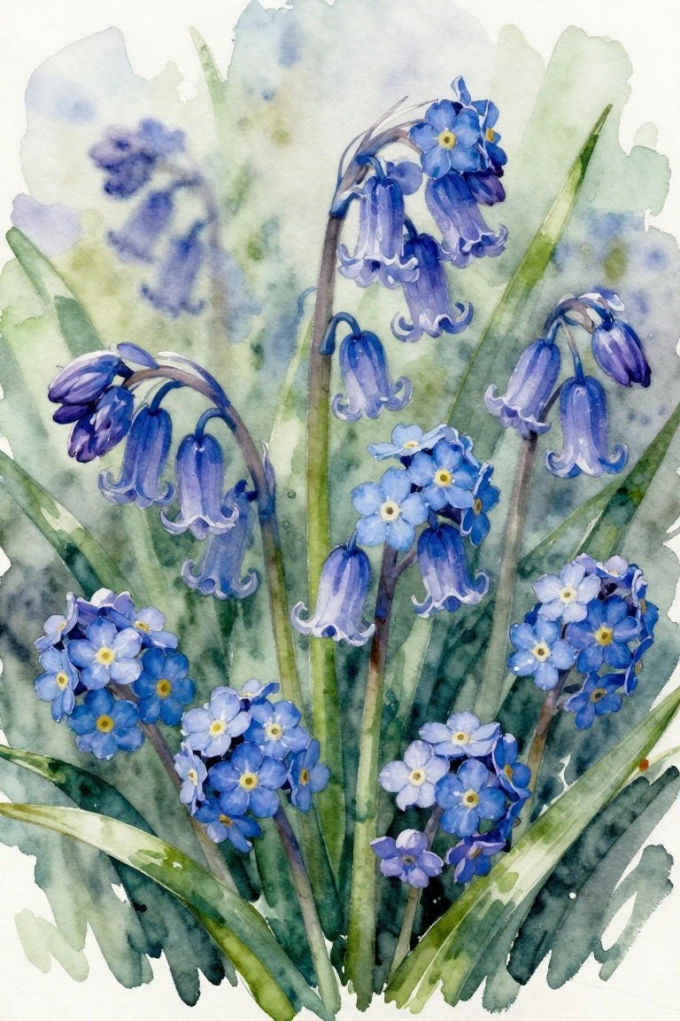
Pairing tall bluebells with smaller forget-me-not blooms creates a floral painting idea built around natural clusters and vertical stems. The composition works because the flowers sit at different heights and angles, letting the eye travel upward while the soft green foliage fills the lower space. A muted wash behind the blooms keeps the focus on the blue petals without adding extra detail.
What makes this idea useful is how the overlapping groups let you build the painting in stages instead of planning every stem at once. You can shrink it to three or four flowers for a quick study or add more foliage layers if you want a fuller page. The narrow color range also makes it simple to test different paper textures or swap the blues for other cool tones while keeping the same layout.
Magnolia Blooms Layered Over a Dark Background
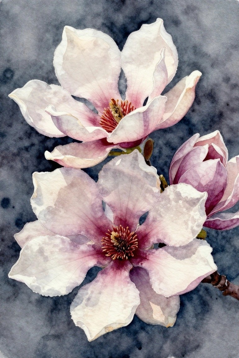
A close-up floral study of magnolia flowers works well when the main focus stays on overlapping petals that show soft color shifts from white edges into pink centers. The composition places two blooms at slightly different angles so one sits higher and partially behind the other, which creates depth without extra elements. Keeping the centers detailed while the background stays dark and simple makes the flowers the clear focal point.
What makes this idea useful is how the dark background handles most of the contrast, so you do not need complex shading on the petals themselves. You can scale the same layout down for a card or keep it large for a wall piece by adjusting how much of the stem shows at the bottom. For practice, repeat the same two-flower arrangement with any open-petaled bloom and change only the color mix in the centers.
Loose Red Poppies with Soft Background Contrast
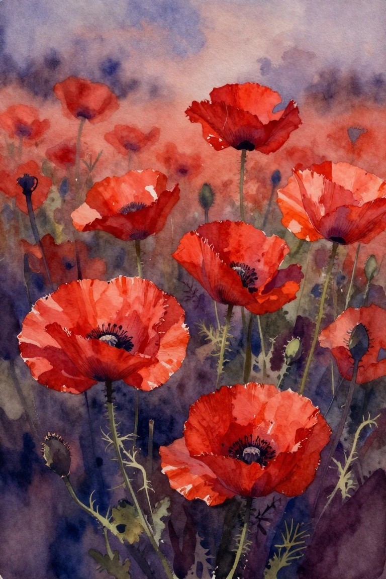
Red poppies painted in a loose cluster create a simple floral idea that relies on overlapping shapes and a limited red palette to build depth. The concept uses cooler background washes to push the flowers forward without needing sharp outlines or heavy detail work. Stems and buds placed at different angles keep the arrangement balanced while letting the viewer focus on the open blooms in front.
The composition does a lot of the work here by letting some flowers face forward and others turn slightly away, which makes the layout forgiving when you are still learning placement. You can easily scale this down to fewer blooms or change the background to cooler greens for a different season. For practice, this kind of subject helps with layering reds and testing how much white space to leave around the edges. A painting like this would stand out on Pinterest as a clean vertical piece that fits narrow wall spaces without extra framing.
Bold Poppy Close-Up with Layered Petal Washes
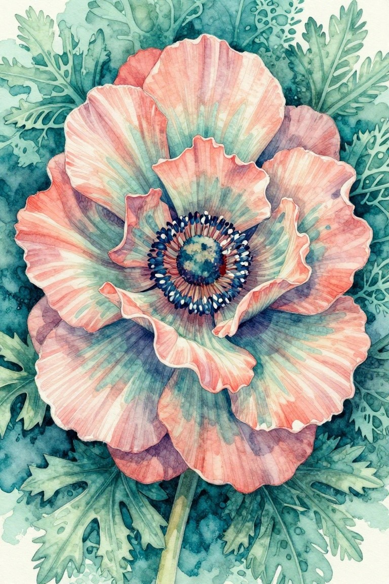
A single oversized poppy forms the core of this painting idea, using overlapping petals in blended peach and muted teal to show how soft color shifts can create depth without hard lines. The dark center with its small dotted ring gives the composition a clear focal point while the surrounding leaves stay loose and secondary. This type of floral work fits the category of a detailed study that plays with scale and gentle transitions.
What makes this idea useful is how the large bloom lets you focus on petal layering without needing a complex scene. The color palette adapts easily if you swap the peach tones for warmer pinks or cooler lavenders while keeping the same layout. For practice, this kind of subject helps build control over wet edges, and the loose leaf shapes around the edges make it simple to crop into a square format for prints or cards.
Watercolor Roses Layered Over Script Background
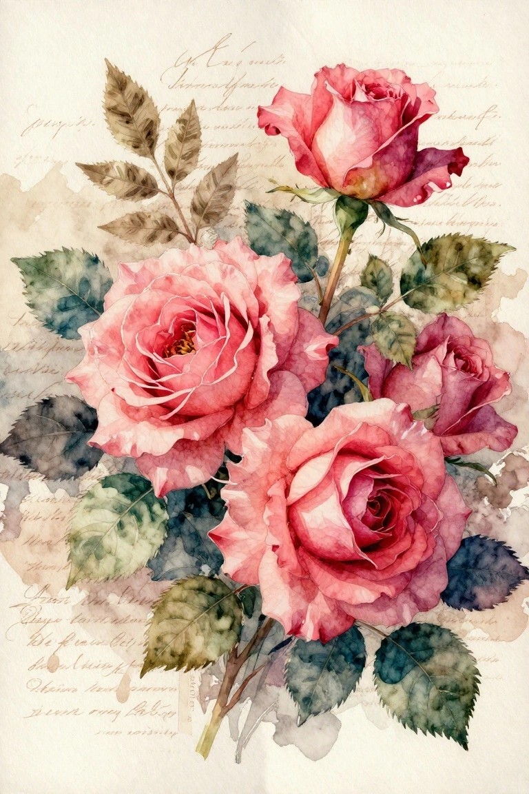
A cluster of pink roses painted in soft watercolor makes up the main subject here, with the blooms arranged at different angles and sizes to create natural overlap and depth. The idea combines a floral still life with a faded cursive script background that sits behind the flowers like old paper. The composition works because the roses stay in the foreground while the text and subtle color washes add texture without pulling focus away from the petals and leaves.
What makes this idea useful is how the background handles a lot of the visual interest on its own, so the flowers do not need perfect detail to look complete. You could swap the pink tones for other colors or simplify the number of blooms if you want a quicker version. For practice or small wall pieces, the layout is easy to adapt by changing the script to your own notes or using a printed page as the base layer.
White Lily Close-Up with Dark Background
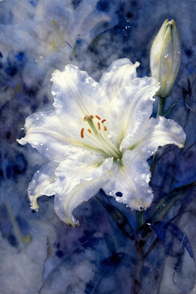
A single white lily paired with its bud creates a clean floral study that relies on strong contrast. The idea uses a loose cool-toned wash behind the flower so the white petals and orange stamens stand out without needing heavy detail everywhere. Keeping the background abstract and the petals softly edged gives the composition focus while still feeling light.
What makes this idea useful is how the dark background handles most of the visual weight, so you do not need perfect petal control to make it work. You can scale it down for cards or crop it tighter for a square format if you want something quick for practice. The same setup also adapts easily if you swap the blue wash for a different color or leave out the droplets.
Warm-Toned Floral Wreath
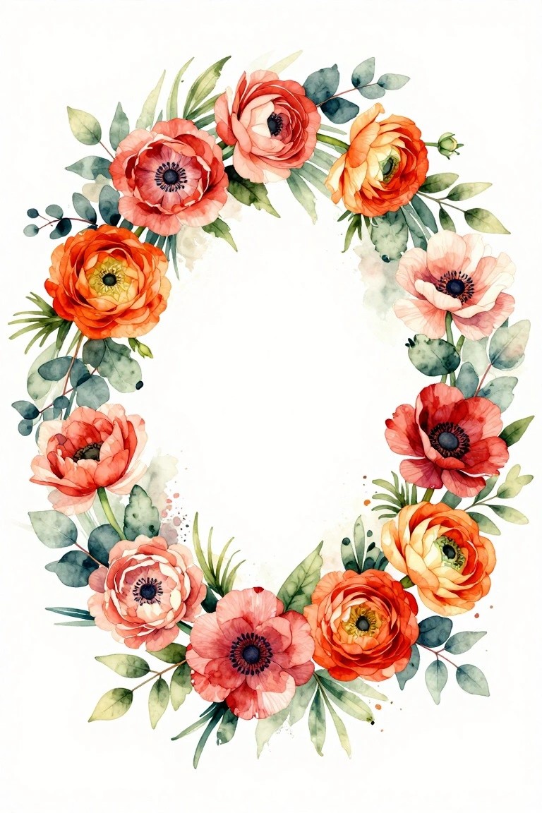
A floral wreath built from overlapping red, orange, and pink blooms creates a strong circular painting idea that stays balanced without filling the entire page. The open center and scattered green leaves let the arrangement breathe while the mix of open and partially closed flowers adds natural variety. This fits squarely into decorative floral work and works because the color shifts from deep red to soft peach keep the eye moving around the ring.
The composition does a lot of the work here since the circular layout already gives the piece structure. You can shrink it to a smaller scale for greeting cards or stretch the same flower mix into a full closed wreath for a larger canvas. Swapping a couple of the warmer tones for cooler ones changes the mood quickly without needing a new layout. For practice, this kind of subject helps you focus on petal shapes and leaf placement before worrying about backgrounds.
Wildflower Meadow with Morning Dew
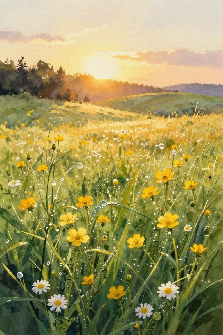
A loose watercolor approach to a wildflower meadow works by placing clusters of yellow blooms and a few white daisies in the foreground while letting the rolling hills and soft sunset sky fill the distance. The low angle keeps the flowers as the main focus and lets the dew drops add small reflective points that catch the light. This type of painting falls into the seasonal floral landscape category and relies on overlapping stems and varied heights to create natural depth without rigid structure.
The composition does a lot of the work here by keeping the sky and hills simple so the eye stays on the flower layer. You can adapt the idea by changing the yellows to other meadow tones or reducing the number of dew drops for a faster version. For practice, this kind of subject helps with layering washes and placing small highlights without requiring tight detail across the whole page. It also translates well to a vertical format for phone wallpapers or a wider crop for prints.
Peony Cluster with Fern Foliage
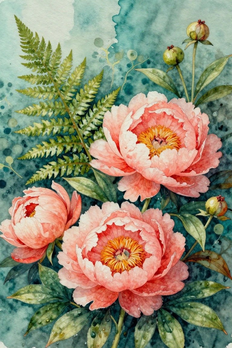
A floral painting idea built around several overlapping peonies in soft coral pink, paired with fern fronds and a few rounded buds. The flowers sit close together in the center with leaves fanning out below and to the sides, while the loose teal background keeps attention on the blooms. This approach works as a straightforward still life study that uses natural overlapping shapes rather than strict symmetry.
What makes this idea useful is how the clustered layout hides small mistakes in individual petals. You can simplify it by painting just two flowers and fewer leaves for a smaller card or journal page, or expand it by adding more buds for a larger wall piece. The teal background also makes the pink tones pop without extra layers, so the same idea adapts easily if you want to try different flower colors later.
Mixed Rose Bouquet Tied at the Stems
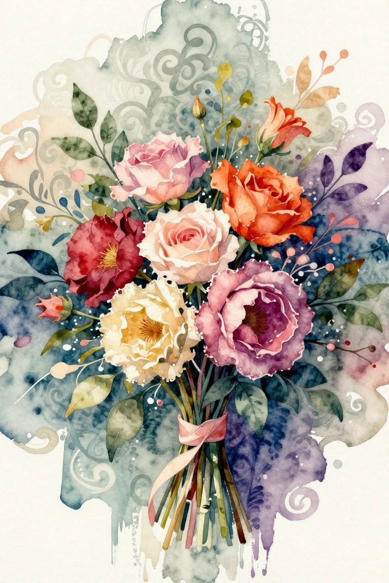
A tight cluster of roses in several shades forms the main subject, with stems gathered and secured by a single ribbon to create a finished bouquet shape. The idea works by balancing the density of overlapping blooms against a softer, open background that keeps the focus on the flowers themselves. This approach fits the floral category and lets the variety of petal shapes and colors carry the composition without extra props or details.
What makes this idea useful is the built-in structure of the tied stems, which removes the need to invent a base or container. You can swap in whatever rose colors you already have or reduce the background to one loose wash if time is short. The same layout scales down easily for cards or stays large for a wall piece, and the overlapping blooms give you room to practice color mixing without starting from a blank page.
Lavender Field Rows with Perspective
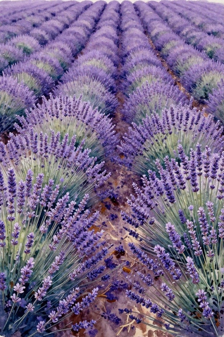
Painting rows of lavender stretching into the distance creates a strong sense of depth using simple repeated shapes. This floral landscape idea relies on converging lines from the rows and soft purple washes to suggest a full field without painting every stem. The color shifts from deeper violet in the foreground to lighter tones farther back keep the focus on the overall pattern rather than individual flowers.
What makes this idea useful is how the repeating rows do most of the compositional work once you set up the basic lines. You can scale it down by using fewer rows or simplify the brushwork to broader strokes if you want a faster version. The same layout adapts easily to other flower fields like poppies or sunflowers by changing just the color and bloom shape. For practice, this kind of subject helps with perspective and color layering at the same time.
Orchid Cluster in Soft Pink Tones
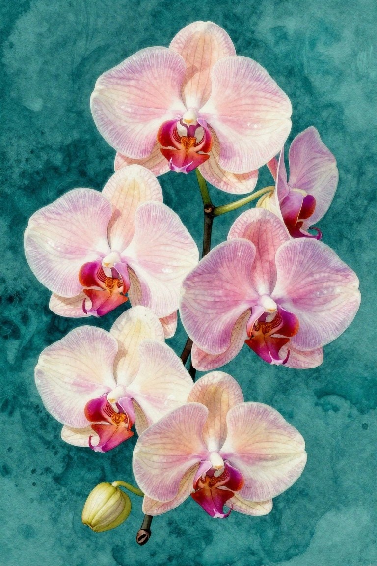
A tight grouping of orchids painted with overlapping petals in pale pink, cream, and magenta makes a strong floral still life idea. The composition relies on a single stem with blooms at different angles to create natural variety without adding extra elements. A dark teal background holds the flowers in place and gives the whole piece clear contrast.
What makes this idea useful is how the repeated flower shape lets you focus on petal edges and center details while keeping the layout simple. The vertical arrangement works well for tall formats like bookmarks or narrow wall prints. You can adapt it by reducing the number of blooms for quicker studies or shifting the background to a different muted tone if you want it to match specific decor.
Clustered Bouquet with Mixed Blooms and Berries
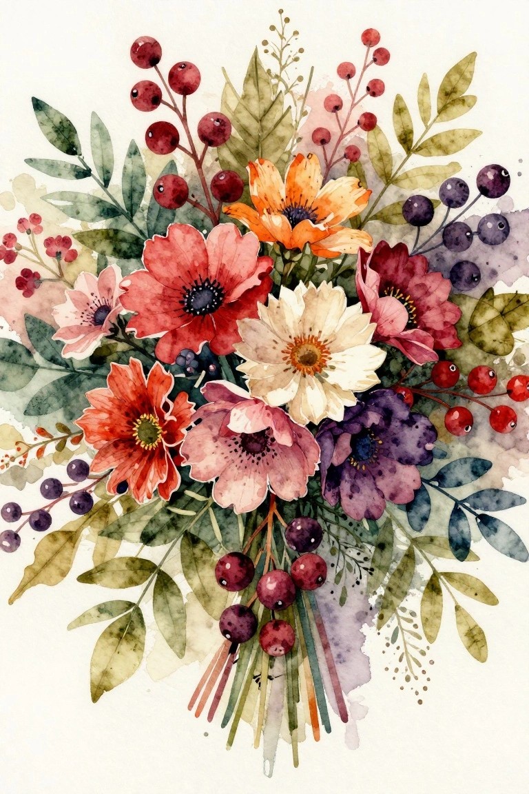
A dense floral arrangement groups several flower types together with berry stems and leaves to form one compact shape. The overlapping petals and scattered berry clusters create natural depth while keeping the focus on the center. This style fits a classic floral still life that uses color contrast between the brighter blooms and darker berries to hold the composition together.
What makes this idea useful is how the tight grouping lets you practice placing multiple elements without needing a detailed background. You could swap in different flower shapes or adjust the berry tones to fit a new color scheme. For practice, this kind of subject works well because the central mass gives you clear areas to layer and blend. A painting like this also translates easily to smaller formats for cards or prints.
Poppy Flower Close-Up with Soft Background
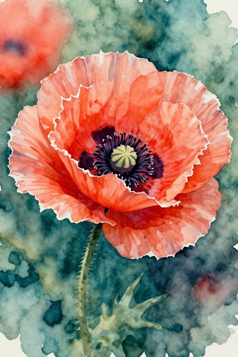
A single large poppy works well as a painting idea when you focus on its ruffled petals in warm red-orange shades and a dark center for contrast. The composition places the bloom slightly off-center with a thin stem and a few leaves below, while the background stays loose and blended in muted greens and blues. This approach fits the floral category and keeps the emphasis on shape and color rather than added details.
What makes this idea useful is how the soft background reduces the need for precise edges around the flower, letting you practice petal folds and center textures first. You can easily adapt the size for greeting cards or keep it larger for a framed piece. The limited color palette also makes it simple to swap in different flower hues if you want to paint a matching set.
Mixed Blooms in a Patterned Vase with Gold Backdrop
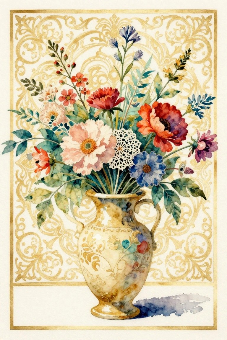
A mixed bouquet of different flower types in a single vase creates a full, layered still life. The idea centers on grouping several flower shapes and colors together while placing them against a detailed gold scroll background that frames the whole piece. This approach works well as decorative floral art because the busy background balances the loose flower cluster without overpowering it.
What makes this idea useful is the built-in contrast between the soft flower edges and the crisp gold patterns, so you can practice both loose and controlled brushwork in one painting. The color mix stays easy to adapt since you can swap in whatever flowers you have on hand or simplify the background to a single tone if the ornate details feel too much. For wall pieces or printable art, the vertical layout and central vase make it simple to resize without losing the main focus.
Morning Glories Climbing a Wooden Trellis
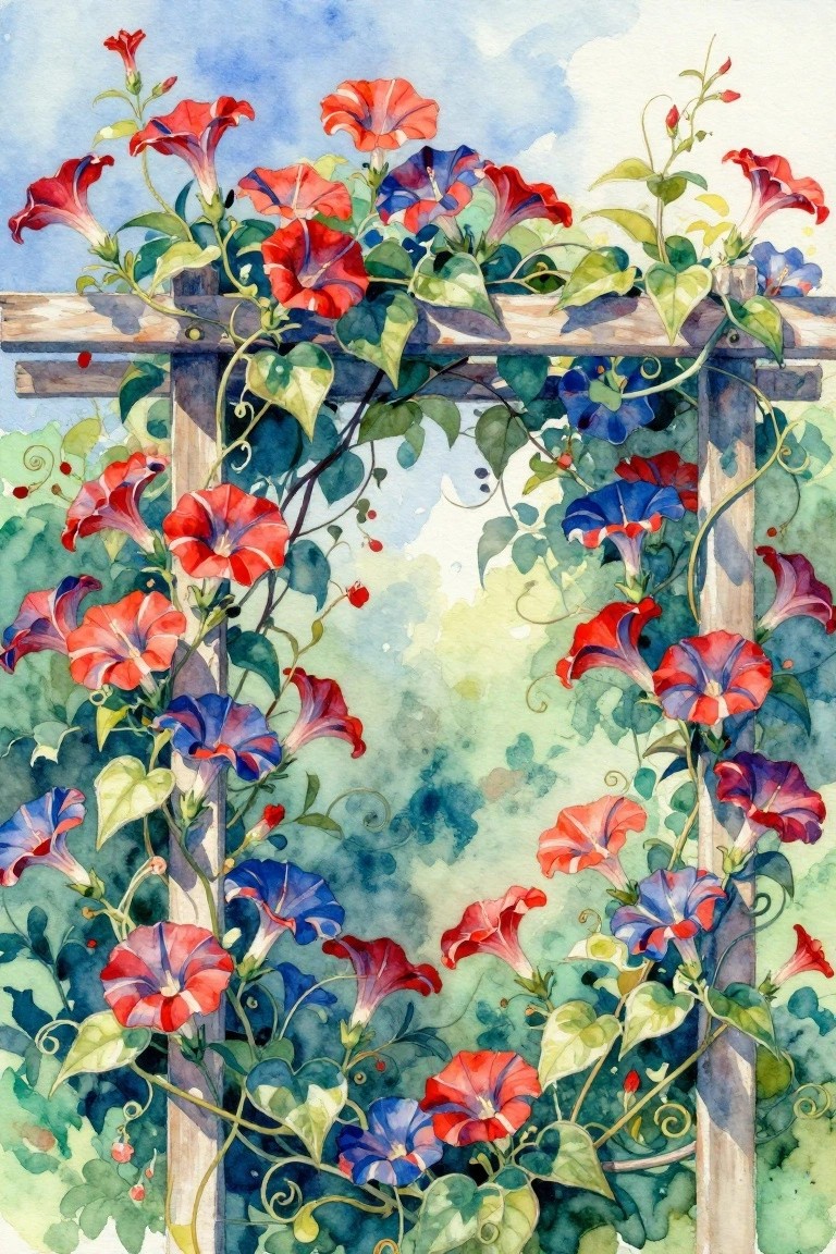
Painting climbing flowers wrapped around a simple wooden frame creates a strong vertical composition that fills the space without needing a complex background. The idea mixes detailed petals and leaves with loose vine lines that trail across the structure, letting the bright red, blue, and purple blooms stand out against the soft wash behind them. This type of floral setup works as both a full scene and a decorative border element.
The composition does a lot of the work here by using the trellis to guide the eye upward and give the vines something to hang from. You can easily adapt the color mix or swap in different flowers while keeping the same frame structure. For wall art or prints, this format scales well because the central opening keeps the piece from feeling too heavy. It would also translate nicely to a smaller card or journal page by tightening the vine placement.
Poppy Field Across Rolling Hills
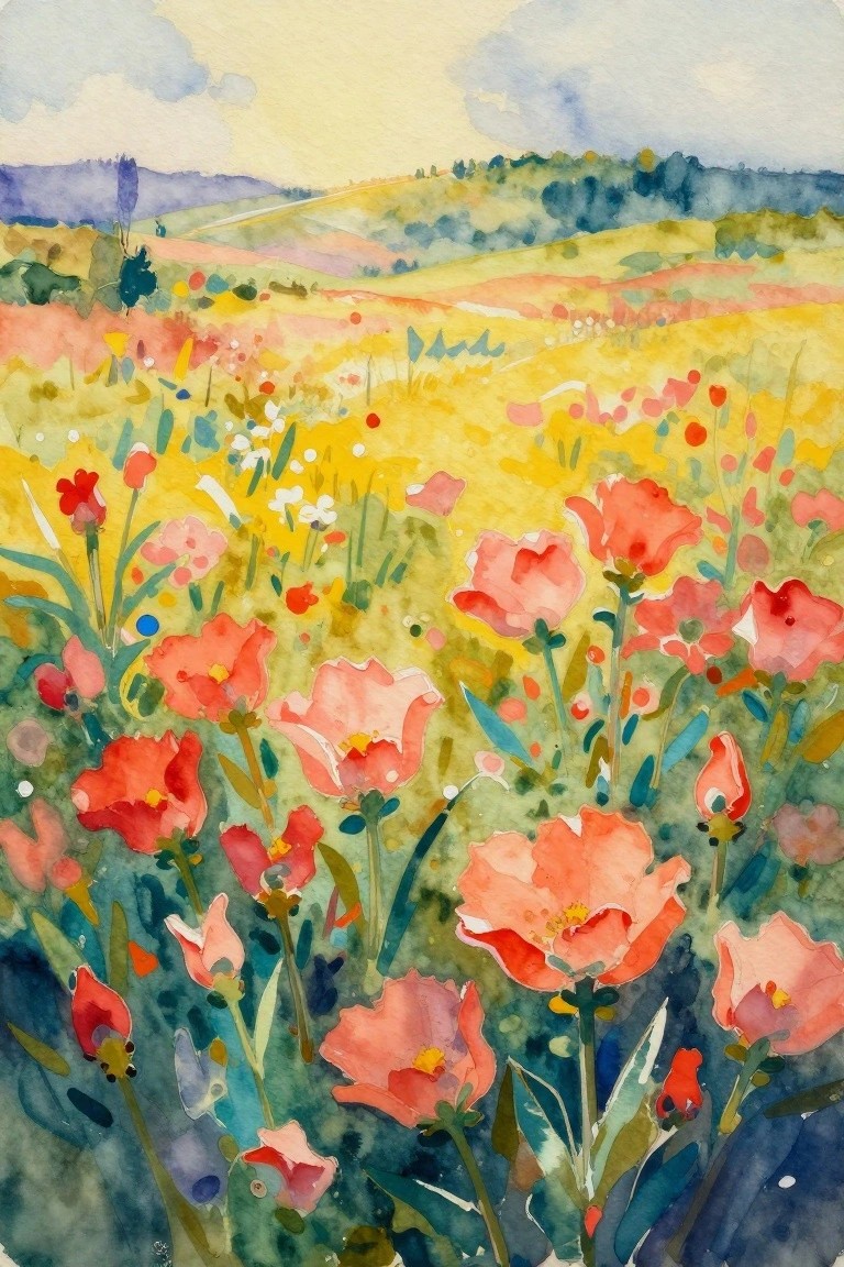
A meadow packed with red and pink poppies against layered hills forms a straightforward floral landscape idea. The main focus stays on the flowers in the lower half while the background hills recede with softer color blocks, which keeps the eye moving through the scene. This setup combines loose flower shapes with a simple landscape base, so it fits the category of open-field floral work.
The composition does a lot of the work here by using larger blooms up close and smaller marks farther back, which makes the depth feel natural without extra layers. You can adapt the idea easily by swapping the poppy colors for other bright wildflowers or cropping it tighter around just a few stems. For practice, this kind of subject works well because the shapes stay forgiving and the background can be kept minimal. A painting like this would stand out on Pinterest as a ready-to-try field scene that balances color without needing perfect detail.
Frequently Asked Questions
1. What supplies do I need to start painting soft watercolor flowers? You will want high-quality watercolor paper that is at least 140 pounds to prevent buckling, a set of transparent watercolor paints in soft hues such as rose, lavender, and sage green, and a variety of round and flat brushes. Keep a spray bottle handy for wetting the paper and a palette for mixing gentle washes. These basic items let you follow many of the 23 ideas without frustration and help colors blend naturally for that artistic charm.
2. How can I make the edges of my flower petals look soft and dreamy? Work on damp paper so colors spread gently on their own. Load your brush lightly with diluted paint and touch it to the wet surface instead of pressing hard. Lift the brush quickly to avoid hard lines and let the paint feather outward. This wet-on-wet approach appears often in the creative ideas and creates the delicate look most readers want.
3. Which color mixes give the softest artistic results for flowers? Combine a little ultramarine blue with rose to create muted lavender, or blend yellow ochre with a touch of green for pale sage tones. Always test mixes on a scrap first and add more water than pigment. These quiet combinations appear throughout the 23 ideas and keep the overall mood gentle rather than bright or bold.
4. What should beginners focus on when trying the flower painting ideas? Start with simple shapes such as loose circles or teardrops for petals and practice one idea at a time. Focus on light washes first and add details only after the first layer dries. Many of the suggestions work well even with limited experience, so choose ideas that use few layers to build confidence quickly.
5. How do I keep my finished watercolor flower paintings from fading? Frame each piece behind glass with a mat that lifts the paper away from the glass and hang it away from direct sunlight. Store extra paintings flat in acid-free folders. These steps protect the soft colors used in the ideas and let the artwork stay fresh for years.