
I have always found trees and foliage a bit tricky to paint in watercolor.
The shapes and colors can change so much depending on the season and light.
Over time I picked up some lessons that made it easier for me to get the look I want.
These ideas helped me practice without getting too frustrated.
I put together 19 of them here in case they are useful for you too.
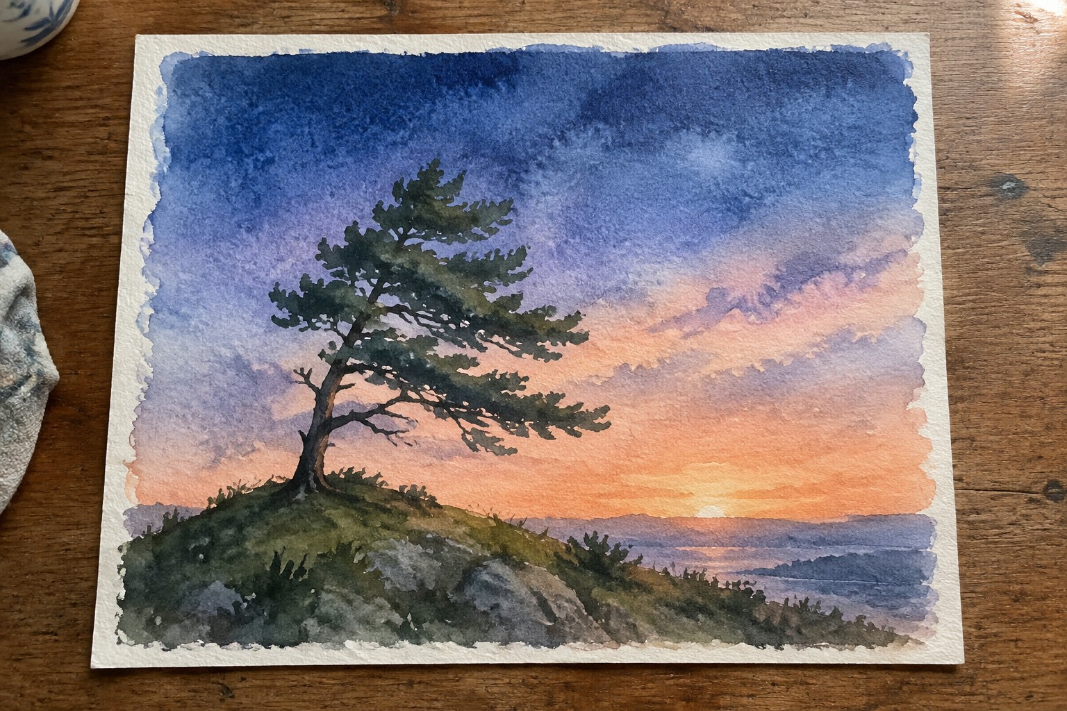
Lone Pine on a Rocky Hill at Sunset

A single windswept pine on a rocky slope creates a clear focal point in a landscape painting. The idea relies on placing the dark tree mass against a broad sky that shifts from deep blue to warm orange near the horizon, with the water below picking up the same colors. This layout keeps the composition balanced by letting the sky and water handle most of the visual weight while the tree anchors the left side.
What makes this idea useful is how the simple tree shape lets you practice large wet washes for the sky without getting stuck on tiny details. You can easily change the time of day by shifting the sky colors or move the horizon line higher or lower to adjust the mood. The same setup works well as a vertical piece for wall art and can be simplified further by reducing the foreground texture if you want a quicker study.
Autumn Leaf Studies Showing Multiple Watercolor Techniques
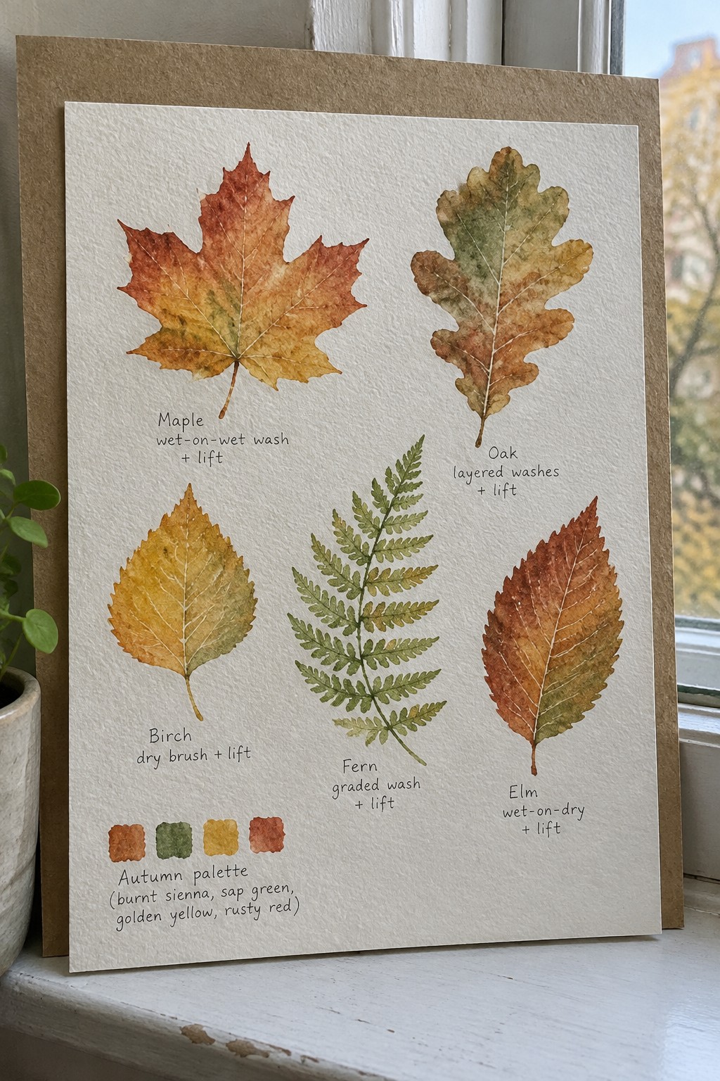
This painting idea focuses on painting individual autumn leaves to practice different ways of applying and lifting watercolor. Each leaf shape gets its own area so the techniques stay clear, from wet-on-wet washes on the maple to dry brush on the birch and layered washes on the oak. The small color palette of rusty reds, golden yellows, and muted greens keeps the studies consistent while letting the methods show through.
What makes this idea useful is that it turns common leaves into quick technique tests you can finish in one session. You could replace any of the leaves with ones from your neighborhood or shift the colors for a different season without changing the layout. For practice, this kind of page works well because the separate studies let you compare results side by side and decide which methods to use again when painting full trees.
Birch Grove with Vertical Trunk Rhythm

Painting a stand of birch trees works well as a landscape idea because the white trunks create strong vertical lines that contrast against loose layers of green foliage. The composition builds depth by overlapping soft washes in the midground and background while keeping the trunks crisp and light. This approach fits the category of woodland studies where repeated shapes and a limited green palette carry the scene.
The composition does a lot of the work here by letting the trunks guide the eye through the space. You can adapt it easily by changing the greens to autumn colors or tightening the crop to focus on fewer trees for a quicker study. For practice, this kind of subject helps you work on both controlled edges for the bark and loose wet-on-wet foliage without needing complex details. It would also translate nicely to a taller format for wall pieces or a set of smaller seasonal versions.
Painting Flowering Branches with Soft Layers

A painting idea built around clusters of pink blossoms along angled branches works well for practicing tree foliage because it combines clear flower shapes with loose leaf washes. The branches create natural lines that move the eye through the piece while the soft background wash keeps attention on the blooms rather than on precise details. Varying the flower sizes and letting some petals fall away adds life without adding extra elements.
What makes this idea useful is the limited palette of pinks, muted greens, and brown branches that stays easy to mix and repeat. You can simplify it by painting just one main branch or adapt it by changing the blossom color for different seasons. The open spaces between flowers also give room to practice wet-on-wet edges and soft color blending that translate to other tree studies.
Painting Trees with Mirror Reflections in Water
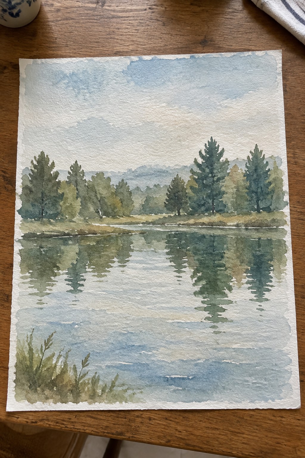
This landscape idea centers on a row of varied trees along a shoreline, their shapes doubled by calm water reflections that create a natural horizontal balance. The composition works by letting the water carry the visual weight of the foliage, so the trees themselves can stay loosely defined with soft color shifts rather than tight outlines. Layered greens and muted background hills keep the focus on the tree line without overcrowding the scene.
What makes this idea useful is how the reflection simplifies the lower half of the painting while still showing a full band of foliage. The same layout adapts easily by changing the greens to warmer fall colors or tightening the tree spacing for a denser forest feel. For practice, this kind of subject helps you work on shape variation and edge control without needing complex foreground detail.
Bare Winter Branches in Loose Watercolor

A simple winter tree study works well when the branches are clustered on one side with plenty of open space left on the other. The idea uses a limited brown palette and soft background washes to keep the focus on the twig structure and negative space. This approach fits into landscape painting practice where the goal is capturing bare trees without overworking the details.
What makes this idea useful is how the uneven branch placement creates natural balance without needing extra elements. You can adapt the same layout for spring buds or fall color by changing just the paint tones. The loose style also makes it easy to practice on smaller paper for quick studies or cards. For wall pieces, the light background and minimal color keep it from feeling heavy in a room.
Patterned Leaf Tree with Varied Shapes

A tree made from stacked oval leaves gives you a simple way to explore foliage without drawing individual branches or realistic details. Each leaf uses a different pattern like dots, stripes, hearts, or veins, which creates visual interest through repetition and contrast rather than complex shading. The warm oranges and yellows mixed with several greens keep the palette cohesive while letting the patterns stand out.
The composition does a lot of the work here because the leaves are arranged in a loose pyramid that feels balanced without perfect symmetry. This idea works especially well for practice since you can focus on brushwork and pattern variety instead of getting shapes exactly right. You could swap the colors for cooler tones or turn the same layout into a smaller version for cards. The white background keeps the focus on the patterns, so the finished piece adapts easily to prints or decor.
Winding Forest Path with Tall Trees

A path receding into the woods makes a strong landscape idea because it naturally creates depth without needing complex perspective rules. Tall trunks on either side act as vertical anchors while the curving trail and layered foliage pull the eye forward. The limited color range of greens, browns, and soft sky tones keeps the focus on the path and the way light moves through the trees.
The composition does a lot of the work here by using the path as a clear leading line and the trees as simple frames. You can adapt it easily by changing the greens to autumn colors or tightening the crop to focus on just the first few trunks. For practice, this subject works well for building washes and testing how much detail you actually need to suggest leaves and ground cover.
Painting Overlapping Palm Fronds

A foliage study built around several palm fronds that overlap at different angles works well for practicing color mixing in greens. The leaves shift from blue-green to yellow-green with soft edges where the washes meet, which keeps the focus on shape and light rather than precise lines. This approach fits the trees and foliage category because it shows how to suggest volume through layered strokes instead of outlines.
The composition does a lot of the work here by letting the fronds fan out naturally from the center. You can adapt it by reducing the number of leaves for a faster sketch or extending the same green mixes into cooler tones for a different mood. This would be easy to turn into a repeating pattern for fabric or a set of notecards. For practice, the subject helps you test how much detail you actually need before the painting feels finished.
Bonsai Form with Layered Foliage and Trunk Texture

A bonsai painting idea centers on the compact tree shape created by a curving trunk and separate clusters of foliage rather than a single full canopy. This fits a trees and foliage lesson because the shallow pot grounds the whole piece at the bottom while the trunk leads the eye upward through the rounded leaf groups. The limited palette of browns and greens keeps attention on the structure and the way the foliage sits in distinct masses.
What makes this idea useful is that the clear separation between trunk and leaf clusters gives you specific shapes to practice without needing a full scene. You can scale the tree smaller on the page or swap the pot for a different style to change the mood quickly. For wall pieces this format stays balanced and contained so it works at different sizes without losing its main lines.
Autumn Street with Layered Foliage

A strong perspective view of a road framed by trees on both sides makes this a clear seasonal landscape idea. The foliage shifts through oranges, yellows, and greens to show fall color change while the path and overlapping trunks create depth. This approach works well because the repeating tree shapes guide the eye without requiring precise leaf details.
What makes this idea useful is how the road and curb lines handle most of the composition, so you can focus practice on color mixing and edge control in the canopy. The same layout adapts easily by changing the leaf palette for early fall or late fall, or by cropping tighter to remove the distant houses. For wall pieces, the balanced sides and receding path give it a finished look even when the brushwork stays loose.
Fern Foliage Cluster with Seasonal Color Mix

Painting a dense group of fern fronds lets you focus on repeating leaf shapes while varying the greens to show light and depth. The idea works by overlapping the fronds at different angles and adding small patches of yellow and brown to suggest late summer or early fall without needing a full scene. This keeps the subject simple yet full enough to fill the page naturally.
What makes this idea useful is that the basic frond shape repeats, so you can practice placement and color mixing without starting from scratch each time. The layout adapts easily to a smaller sketchbook page or a taller vertical format by adjusting how many fronds you include. For practice, this kind of subject helps you test how far you can push a limited green palette before it starts to look flat.
Lone Tree Sunset with Converging Paths
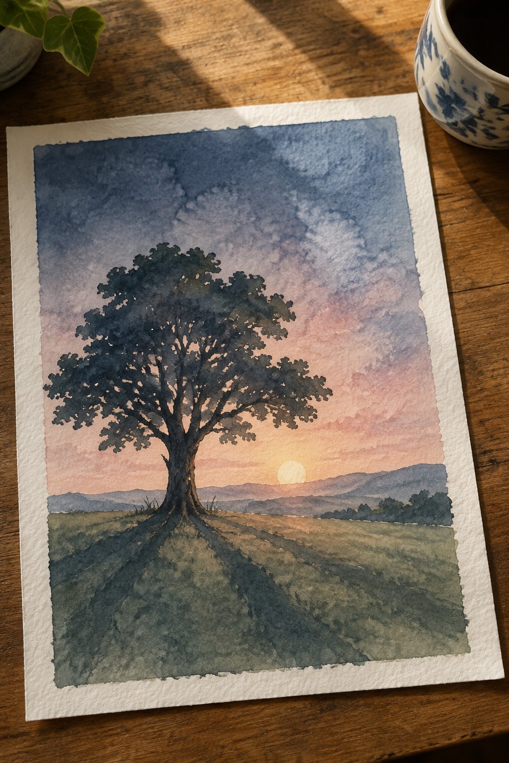
A single large tree placed dead center in an open field creates the core of this landscape idea, with two paths meeting at its base to pull the eye straight in. The low sun sits just behind the trunk, casting a warm gradient across the sky that shifts from orange at the horizon into cooler tones higher up. This setup keeps the focus tight on the tree while the distant hills and simple ground texture fill out the scene without competing.
What makes this idea useful is how the paths do most of the compositional work, so you can paint the tree as a dark mass and still get a strong result. You can swap the sunset for a clear midday sky or change the field color to match a different season without altering the layout. For practice, the subject works well because the main shapes stay bold and the background stays soft, letting you test washes and edges without getting lost in fine detail.
Row of Potted Lemon Trees
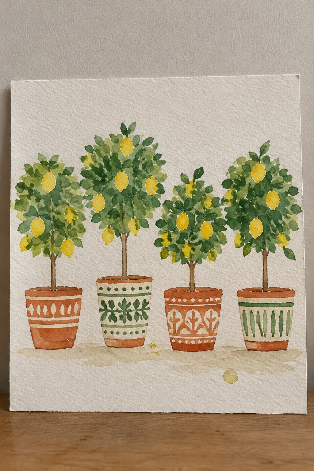
Painting several lemon trees side by side in different patterned pots gives you a clear structure for practicing both foliage clusters and small fruit shapes. The idea works as a decorative still life because the repeated tree forms create rhythm while the varied pot designs supply the main point of interest. Loose green layers for the leaves and simple yellow accents for the lemons keep the focus on overall shape and color balance rather than tiny details.
What makes this idea useful is that the same layout can be shortened to three trees or stretched to five depending on your paper size. You can change the pot patterns to match whatever colors or styles you already have on hand, which makes it easy to adapt for gifts or seasonal pieces. For practice, this kind of subject helps you work on consistent foliage shapes without needing a complex background.
Negative Painting for Layered Foliage

This painting idea focuses on defining leaf clusters through negative painting, where darker washes are built around the shapes instead of drawing individual outlines. The overlapping leaf forms emerge from multiple layers of cool greens and blues, with the white paper left to suggest light hitting the top surfaces. It fits the category of foliage studies that emphasize value shifts and soft edges over precise detail.
The composition does a lot of the work here by letting the white paper handle the highlights. You can adapt the idea by changing the leaf shapes to match different tree types or adjusting the blue-green balance for cooler or warmer scenes. For practice, this kind of subject works well because it trains control over wet washes and mid-tone values without requiring a lot of drawing accuracy upfront.
Windswept Trees on a Coastal Bluff
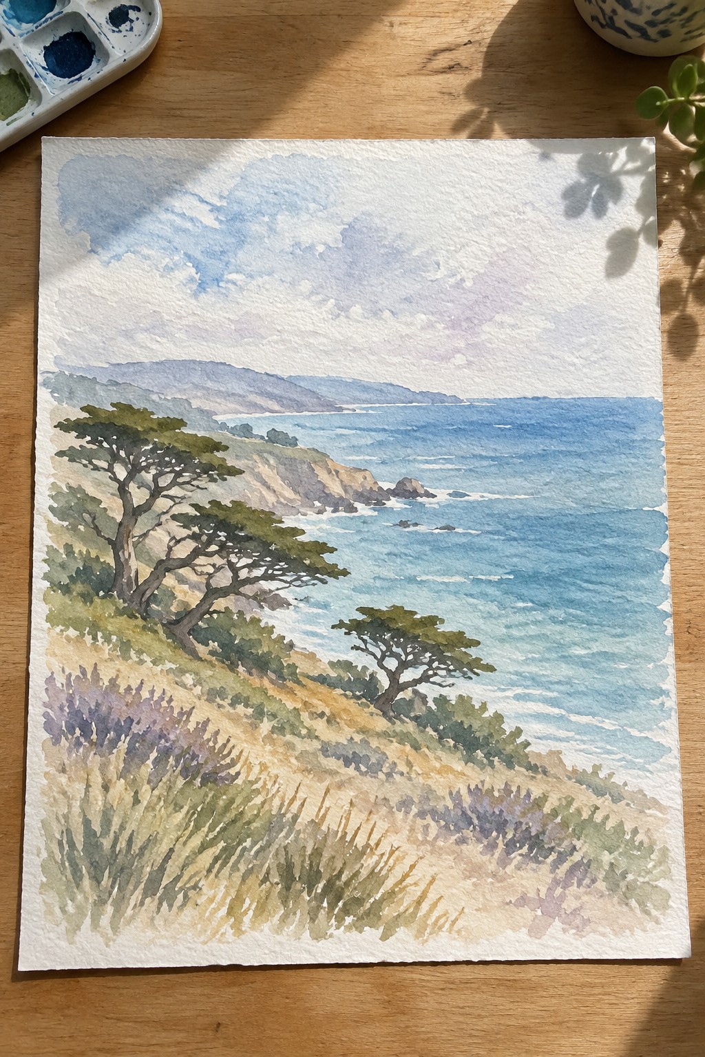
This landscape idea centers on placing clusters of trees along a sloping hillside that leads the eye out to a wide ocean view. The composition works because the trees sit at different heights and angles, creating depth without needing complex details, while the soft sky and water layers keep the focus on the foliage. It fits the classic landscape category where trees and bushes act as the main subject framed by land and sea.
The composition does a lot of the work here by using the hillside slope and shoreline curve to guide the eye naturally toward the water. You can adapt it by reducing the number of tree clusters for a simpler study or changing the foreground grasses to different seasonal colors. For practice, this kind of scene helps with learning how to vary tree shapes and values while keeping the background loose.
Treehouses Integrated into Layered Canopies
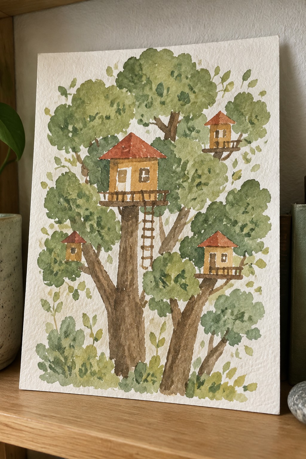
Painting several small wooden structures at varying heights inside one large tree creates a clear focal point while still emphasizing foliage. The idea centers on using the trunk and major branches to anchor the buildings and ladders, which helps separate the different levels without extra line work. This setup works well as a landscape study because the repeated green shapes around the structures build depth through simple overlapping rather than fine detail.
The composition does a lot of the work here by letting the tree itself organize the placement of each treehouse. You can adapt it easily by reducing the number of buildings to two or changing the roof colors to match a different season. For practice, this kind of subject gives you a chance to work on both foliage massing and small architectural shapes in the same piece.
Mossy Tree Bark Texture Study
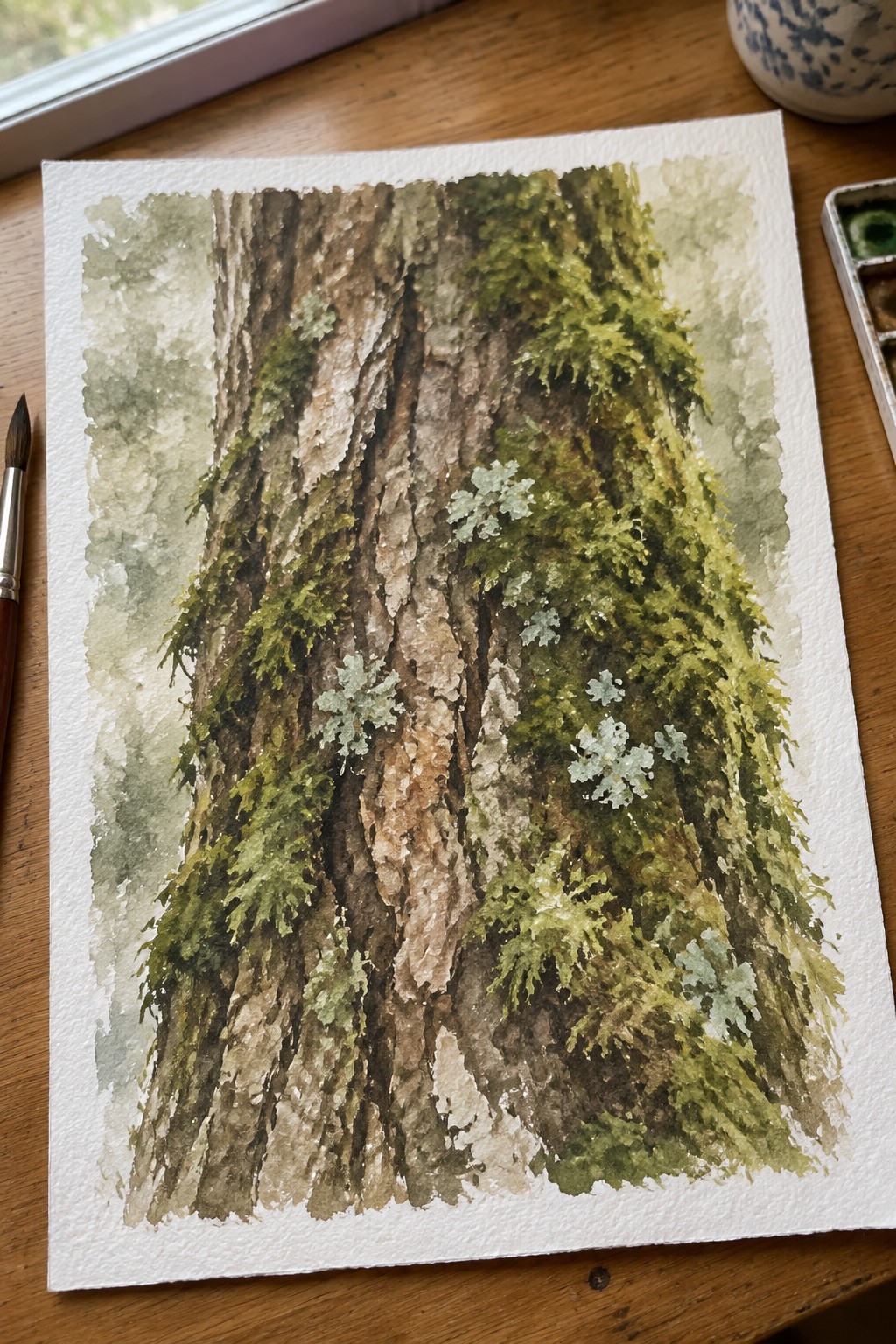
Tree bark studies like this focus on the contrast between rough, peeling brown surfaces and the layered greens of moss and lichen that grow across them. The vertical layout stacks multiple trunks to create height and depth while small pale lichen patches keep the eye moving through the greenery. It fits into a nature study or landscape detail category where texture and color variation carry the interest without needing a full scene.
What makes this idea useful is how the narrow color range of earthy browns and greens lets you practice layering and texture work with just a few paints. The same setup could be simplified by cropping to one trunk or expanded by adding more distant foliage behind it. For practice pieces or small wall art, this kind of subject translates easily to different paper sizes and works well when you want natural detail without complex composition.
Seasonal Tree Studies Using One Shared Palette

This painting idea focuses on painting the same tree form across all four seasons to practice how foliage density, color temperature, and silhouette shift with the weather. The grid layout places four variations per season side by side, showing clear progression from spring’s open, light shapes through summer’s full canopies, autumn’s warm color mixes, and winter’s bare branch structure. A single limited palette runs through the entire page, which forces the changes to come from value, edge softness, and leaf density rather than new colors.
What makes this idea useful is that it gives you sixteen quick studies from one basic reference instead of hunting for new scenes each time. You can adapt it by painting just one season per page in your sketchbook or by simplifying to two trees per season when time is short. The same layout works well for building a small series for wall art or for practicing how cool and warm tones affect the same shape.
Frequently Asked Questions
What materials are essential for completing the watercolor lessons on trees and foliage?
You will need a set of artist grade watercolor paints including yellows blues and reds for mixing greens, cold pressed watercolor paper in at least 140 pound weight, a variety of round and flat brushes from sizes 2 to 12, a palette for mixing, clean water containers, paper towels for blotting, and optional masking fluid for preserving highlights on branches or leaves.
How can I create depth and dimension when painting clusters of leaves in these lessons?
Start with a light wash of diluted color to establish the overall shape then build layers gradually using slightly stronger mixes on drier paper for foreground elements while keeping distant foliage softer and lighter to suggest recession. Add small negative spaces and varied edge qualities to avoid a solid mass appearance.
Which techniques work well for painting evergreen trees versus deciduous ones in watercolor?
For evergreens use a dry brush approach with short angled strokes to form needle clusters and build from the center outward while allowing some paper to show through for light effects. Deciduous trees benefit from wet on wet applications for soft rounded canopies followed by drier details to define individual branches and leaf groups.
How do I mix convincing green shades that do not appear artificial in foliage paintings?
Combine primary colors such as cadmium yellow with ultramarine blue for warm greens or add a touch of burnt sienna for muted tones suitable for shadows. Test mixes on scrap paper and adjust by adding more yellow for spring growth or blue for cooler distant trees while avoiding ready made greens that often lack subtlety.
What steps help avoid common problems like muddy colors when following the tree and foliage lessons?
Work from light to dark and allow each layer to dry fully before adding the next to prevent colors from blending unintentionally. Use clean water and rinse brushes between mixes while limiting the number of pigments in any single wash to two or three for clearer results. Practice on small studies before applying techniques to larger compositions.