
I often go for simple canvas paintings because they suit the way I like my home to feel.
They do not demand much attention yet still make the space look thoughtful.
Lately I have been trying out different minimalist designs that lean toward a designer style without being fussy.
These are some approaches that have worked for me and might give you a starting point too.
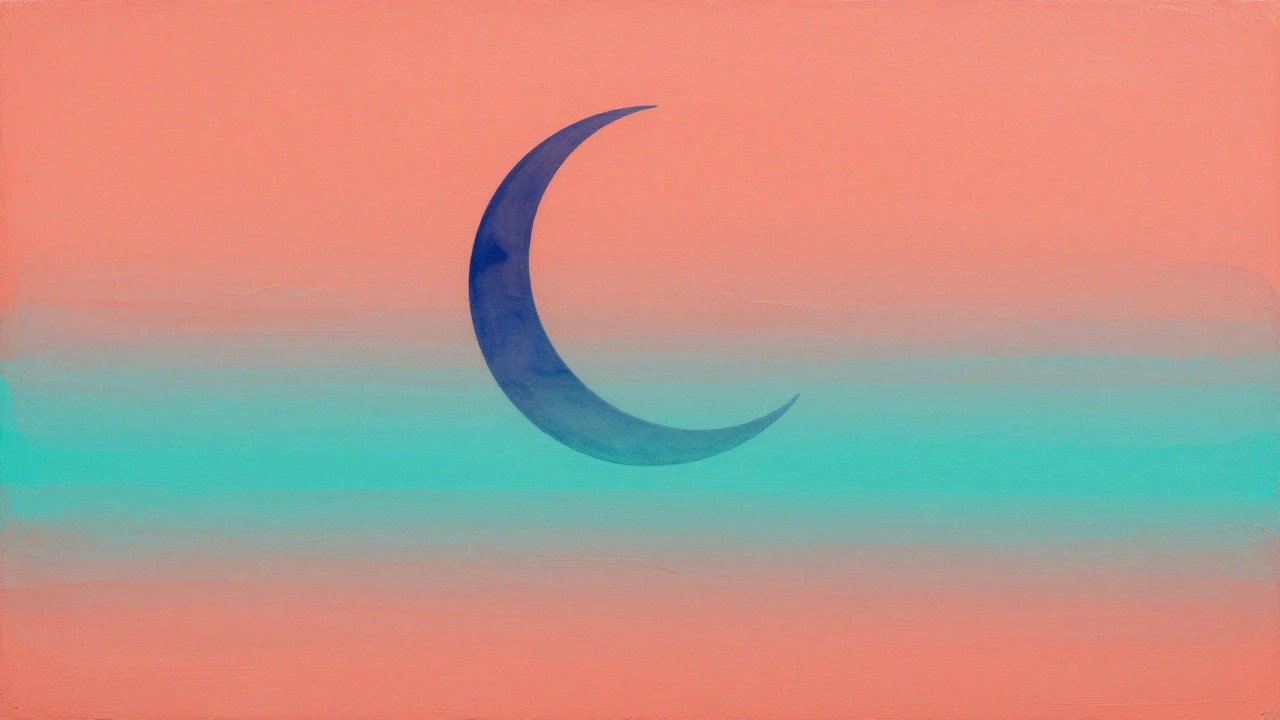
Minimalist Crescent Moon Over Ocean Layers
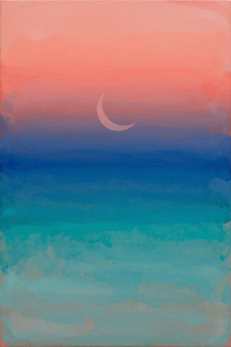
A landscape painting idea that uses wide horizontal bands of blended color to suggest sky meeting water at twilight. The only defined element is a small crescent moon placed slightly off center in the upper section, allowing the soft color shifts to carry the composition. This category of simple seascape relies on smooth gradients and restrained detail to keep the overall effect calm and uncluttered.
The composition does a lot of the work here because the horizontal bands require little drawing skill yet still read clearly as a horizon. You can easily adapt the palette by shifting the top tones toward cooler pinks or deeper purples depending on the room. For practice this idea works well as a quick study in color blending, and the same layout can be repeated with different moon phases or horizon placements to create a small series.
Layered Rounded Rectangles in Contrasting Colors
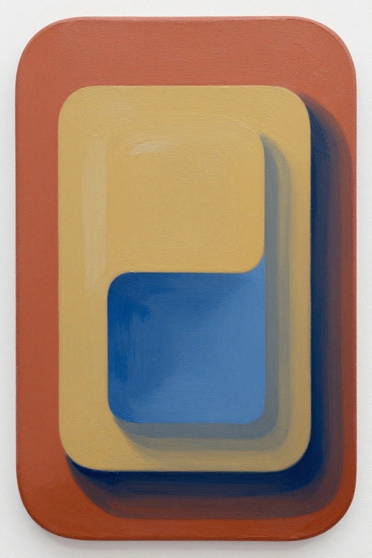
This painting idea uses a series of nested rounded rectangles to build a simple abstract composition. Start with a wide outer border in a warm terracotta tone, then place a large mustard yellow rectangle inside it, and add a smaller blue shape offset toward the bottom. The slight overlaps and soft edges between the shapes create a sense of depth using only flat color areas and minimal blending.
What makes this idea useful is how the basic geometric layout removes the need for drawing skills or fine detail. You can easily change the color order or shift the position of the inner rectangles to create different balances. For wall art the scale works well at medium sizes, and the same structure can be simplified further by reducing it to three shapes or adapted with any three colors that suit a room. The clean edges also make it a good practice piece for practicing brush control on larger areas.
Cool-Toned Portrait with Swirling Hair Lines
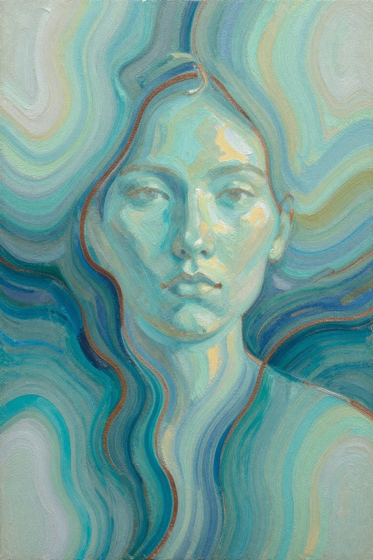
A minimalist portrait idea that centers on a calm face framed by broad, curving strokes meant to suggest long flowing hair. The limited palette of blues, teals, and soft greens keeps the focus on shape and line rather than detail, while the face stays simple with just enough shading to hold the composition together. This approach fits the portrait category but leans decorative because the hair is treated more like abstract patterns than realistic strands.
What makes this idea useful is how the swirling lines do most of the visual work, so you only need to get the face proportions roughly right. You can easily change the color scheme to match a room or swap in warmer tones if the cool palette feels too quiet. For practice, the idea works well because it lets you experiment with brush direction and blending without needing perfect realism. A painting like this translates quickly to a small canvas or even a sketchbook study if you want to test it first.
Fanned Leaves in Teal Gold and Green
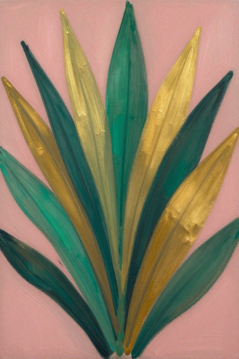
A set of pointed leaf shapes painted in overlapping layers gives this idea its structure, with cool greens and teals placed next to warmer gold tones for contrast. The painting relies on broad strokes and a simple radiating layout rather than fine outlines or shading, which keeps the focus on color blocks and edge variation. It works as a decorative botanical piece that stays abstract enough to suit modern spaces.
The composition does a lot of the work here because the upward spread fills the canvas without extra elements or perspective. You can adapt the idea by swapping the pink ground for a deeper neutral or shifting the gold to silver if you want a cooler result. For practice, this kind of subject helps you work on stroke direction and color placement while staying forgiving on exact leaf proportions, and it translates well to smaller canvases for quick wall pieces.
Minimalist Sailboat on a Gradient Horizon
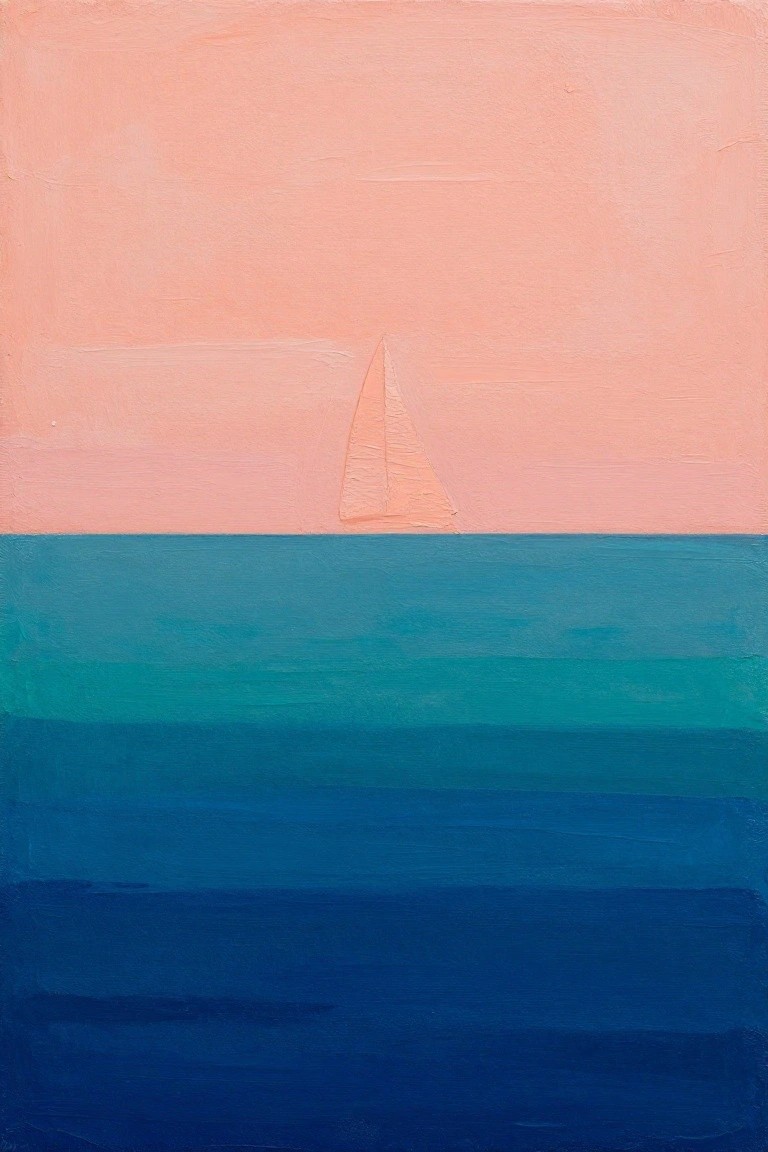
A small sailboat placed on the horizon line forms the core of this painting idea, turning a basic seascape into a clean minimalist landscape. Broad horizontal bands of color create the sky and water without extra details, letting the single boat shape carry the composition. The soft gradient from warm peach down through teal and deep blue keeps the layout balanced and easy to read from a distance.
The composition does a lot of the work here because the few elements leave room to experiment with color shifts or slight changes in boat placement. You can adapt the same idea to different canvas sizes by stretching the bands or shrinking the boat further for a more distant feel. For wall pieces, this setup works especially well when you want something recognizable but still simple enough to finish in one or two sessions.
Nested Arches in Warm and Cool Neutrals
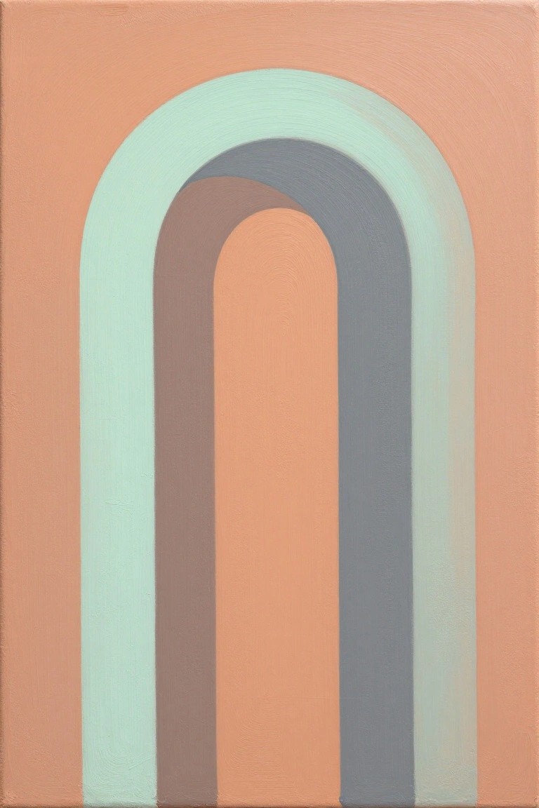
A painting idea built around nested arch shapes uses a handful of curved bands to form a centered composition that draws the eye inward. The concept relies on a tight palette of peach, mint, gray, and brown to keep the layers distinct while still harmonious. This type of abstract decorative art works because the simple repeated curves create visual rhythm without needing extra elements or fine detail.
What makes this idea useful is how easily the arches can be widened or narrowed to fit different canvas sizes. The color palette makes this easy to adapt by swapping in similar neutrals that already exist in a room. For practice, this kind of subject lets you focus on clean edges and even layering rather than complex drawing. The background keeps the focus on the shapes so the whole piece stays balanced even if the brushwork is not perfectly smooth.
Crescent Moon Over Gradient Hills
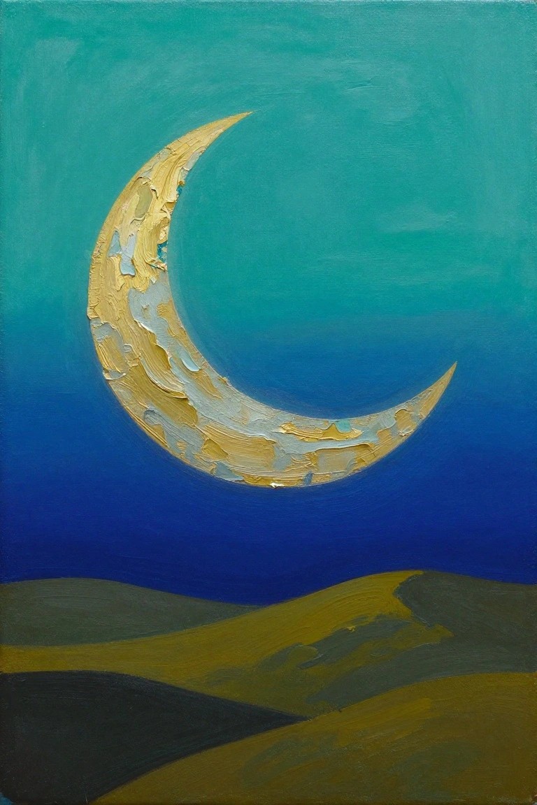
A crescent moon painting idea centers on a bold curved shape set against a simple two-tone sky that fades from teal into deep blue. The moon gets built up with layered brushstrokes that add texture while the hills stay flat and minimal below. This approach fits the landscape category but keeps everything reduced to a few strong shapes and a tight color palette.
The composition does a lot of the work here because the large moon automatically draws the eye without extra elements. You can scale it down for a small canvas or stretch the sky area for a taller piece. The same idea adapts easily by changing the moon color or softening the hill edges if you want a quicker version. It stands out on Pinterest because the limited shapes and clear contrast make the whole thing look finished even when kept loose.
Tropical Leaves in a Soft Grid Layout
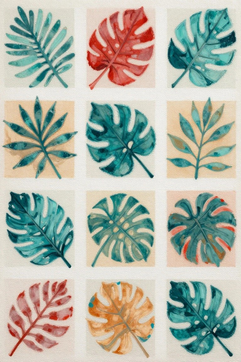
Tropical leaf shapes painted in loose watercolor create a simple but effective series for canvas work. Each piece shows a single leaf with natural splits and holes, using teal, green, red, and orange washes against plain backgrounds. The consistent format and limited detail make the set feel cohesive without needing complex composition.
What makes this idea useful is how straightforward it is to paint one leaf at a time and build a collection. You can swap colors to match a room or reduce the number of pieces to fit a smaller wall. The same approach works if you want to test different leaf types or simplify further by using just two or three tones across the whole set.
Curling Wave with Layered Brushstrokes
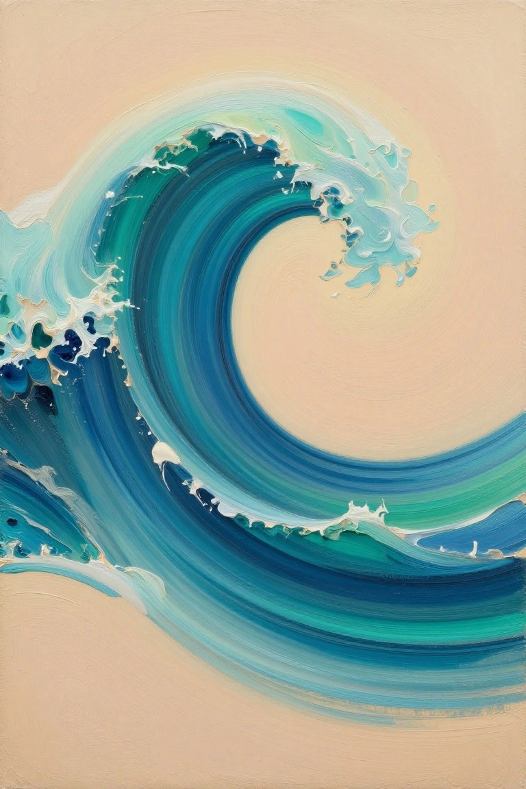
A curling wave forms the core of this painting idea, built from overlapping curved strokes that create a sense of motion across the canvas. It sits in the landscape category but functions as decorative art because of its simplified shapes and tight focus on a single element. The palette moves through several blue and teal tones with white highlights to show foam, while the empty background keeps attention on the wave’s form.
What makes this idea useful is how the circular layout guides the eye without requiring extra details or objects. The color shifts can be adjusted by mixing fewer shades if you want a quicker version, or you can stretch the wave across a wider canvas for a different proportion. For practice, this kind of subject lets you work on brush direction and blending in one contained area before trying larger scenes.
Concentric Circle Rings in Navy and Blush
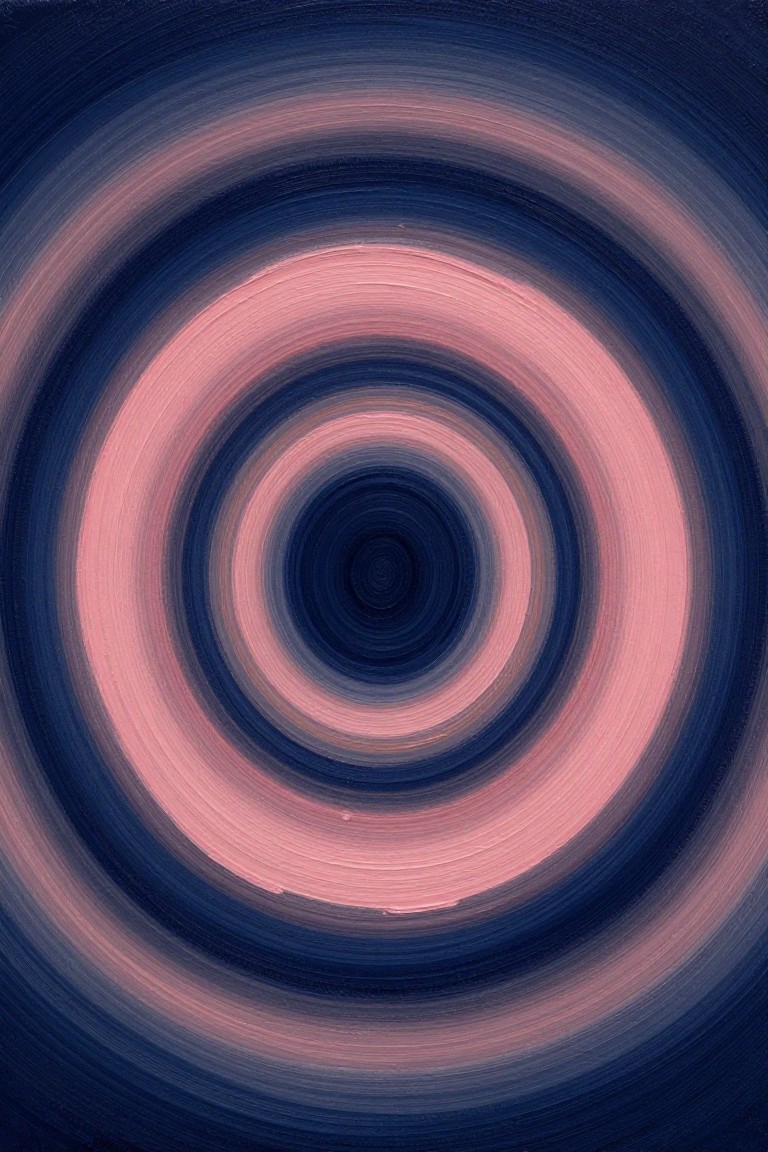
A minimalist abstract painting made from concentric circles gives you a clean focal point using only repeated rings and a limited palette. The rings shift between deep navy and soft pink with visible brushstrokes that add slight texture while keeping the overall look simple. This style works as abstract decorative art because the centered layout and gradual color changes create interest without extra elements or detail.
What makes this idea useful is how quickly it adapts to different canvas sizes by adjusting the number of rings. You can swap the navy and pink for any two colors that match your space, or keep the rings wider for a bolder version. The radial layout stays easy to paint yet looks intentional, which helps it perform well as a calm wall piece or quick practice study.
Lone Tree Over Layered Mist
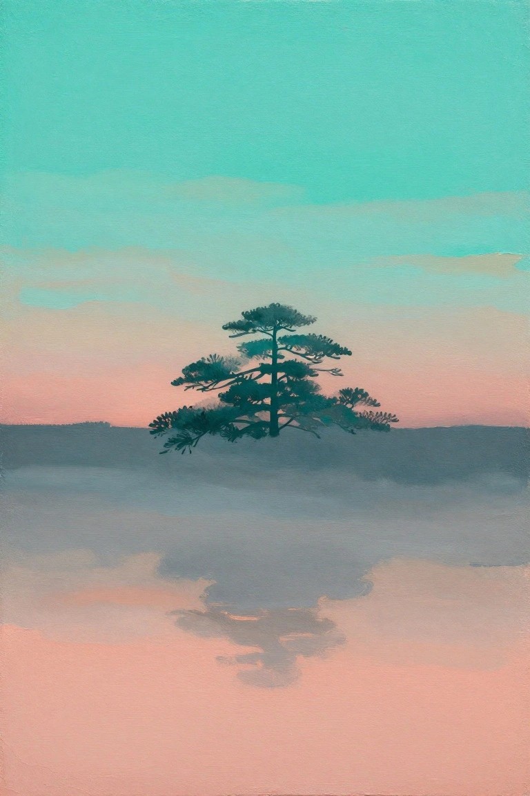
A single dark evergreen placed in the middle of the canvas creates a clear focal point against soft horizontal bands of color. This landscape idea relies on a simple silhouette and blended gradients rather than fine detail to suggest distance and atmosphere. The muted teal-to-pink sky combined with overlapping gray layers gives the composition its sense of calm space.
What makes this idea useful is how the tree can be swapped for other simple shapes like a bare branch or a small group of trees without changing the overall layout. The color bands are easy to adjust to different palettes while keeping the same misty effect. For wall pieces this format works well because the open space around the subject prevents it from feeling crowded even on smaller canvases. The same approach can be scaled down for quick studies by reducing the number of fog layers.
Gradient Arc Abstract on Cool Background
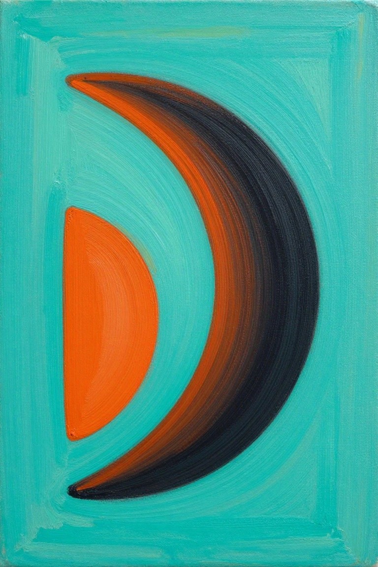
This painting idea centers on a simple abstract composition built from two curved shapes against a solid background. A large sweeping arc uses a smooth gradient from bright orange into deep black, while a smaller solid orange half-circle sits to the left, creating visual balance through contrast in size and tone. The clean layout and limited color palette make the idea feel bold yet restrained, fitting neatly into minimalist abstract work.
The composition does a lot of the work here by letting the curved forms and color shift carry the interest without extra details. You can easily adapt it by swapping the teal background for another cool tone or adjusting the gradient to match your room colors. For practice, this kind of subject helps you focus on blending and edge control on a small canvas. It would also translate well into a larger wall piece if you want something graphic but not busy.
Bold Oversized Flower in Red and Purple
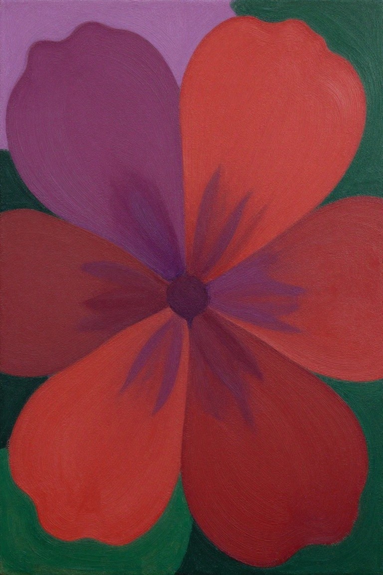
A large flower with broad overlapping petals forms the core of this floral painting idea. The petals use a shift from bright red to darker purple shades while the background stays simple with flat blocks of green and lavender. This setup keeps the composition focused on the bloom through strong color contrast and minimal surrounding detail.
What makes this idea useful is how the big petal shapes reduce the need for precise line work and let you practice color blending instead. You could change the red-purple mix to other complementary tones or crop the view tighter if you want a square canvas. For wall art, the high contrast and large scale help the piece read clearly from a distance without extra elements.
Stacked Organic Shapes
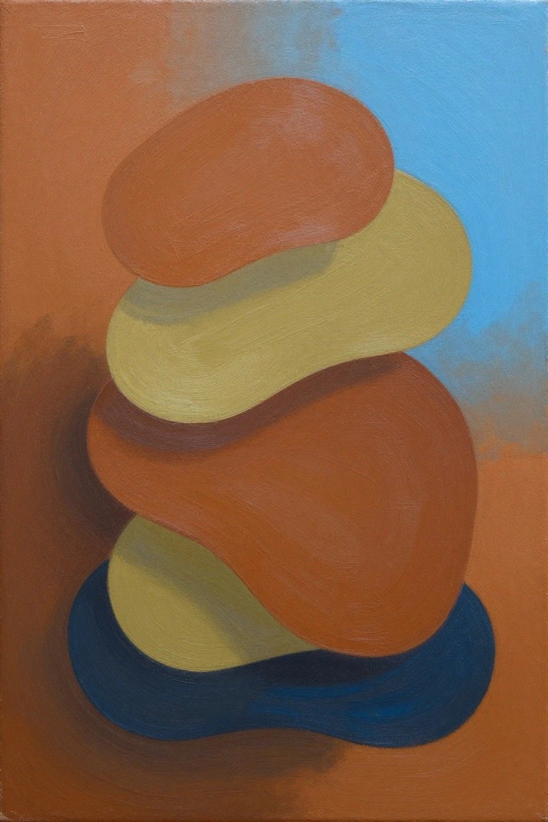
This painting idea uses a series of overlapping rounded forms stacked vertically to create a simple balanced composition. The shapes sit against a split background that shifts from warm orange to cool blue, letting the forms stand out through color contrast rather than detail. It fits into abstract decorative art where the emphasis stays on clean curves and limited color blocks.
What makes this idea useful is how the vertical stack can be stretched or compressed to suit different canvas sizes without losing its structure. The background split helps separate the subject from the edges, so the same layout works for both small practice canvases and larger wall pieces. You can swap the warm and cool tones or reduce the layers to two or three if you want a quicker version.
Swirling Abstract Oval in Layered Colors
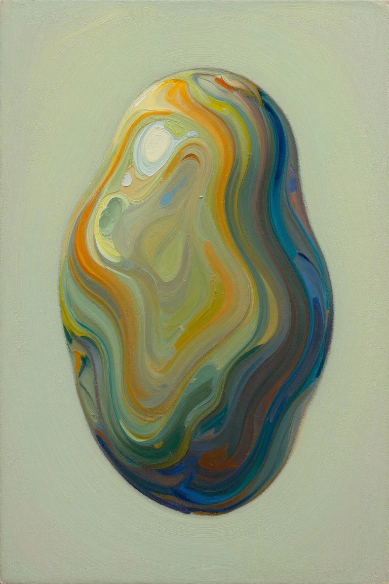
An abstract painting idea built around one central organic shape made from flowing color layers. The oval form sits centered on a plain background and uses blended transitions between greens, blues, and warm accents to create movement through brushwork alone. This approach fits decorative abstract work where the focus stays on texture and color flow rather than any specific subject.
The composition does a lot of the work here by keeping everything inside one contained shape, so the painting stays balanced even if the colors shift slightly. You can adapt it easily by changing the background to match a room or swapping in different muted tones while keeping the same oval layout. For wall art, this idea works well because it reads as finished without needing extra elements or fine details.
Layered Horizontal Shapes in Teal and Orange
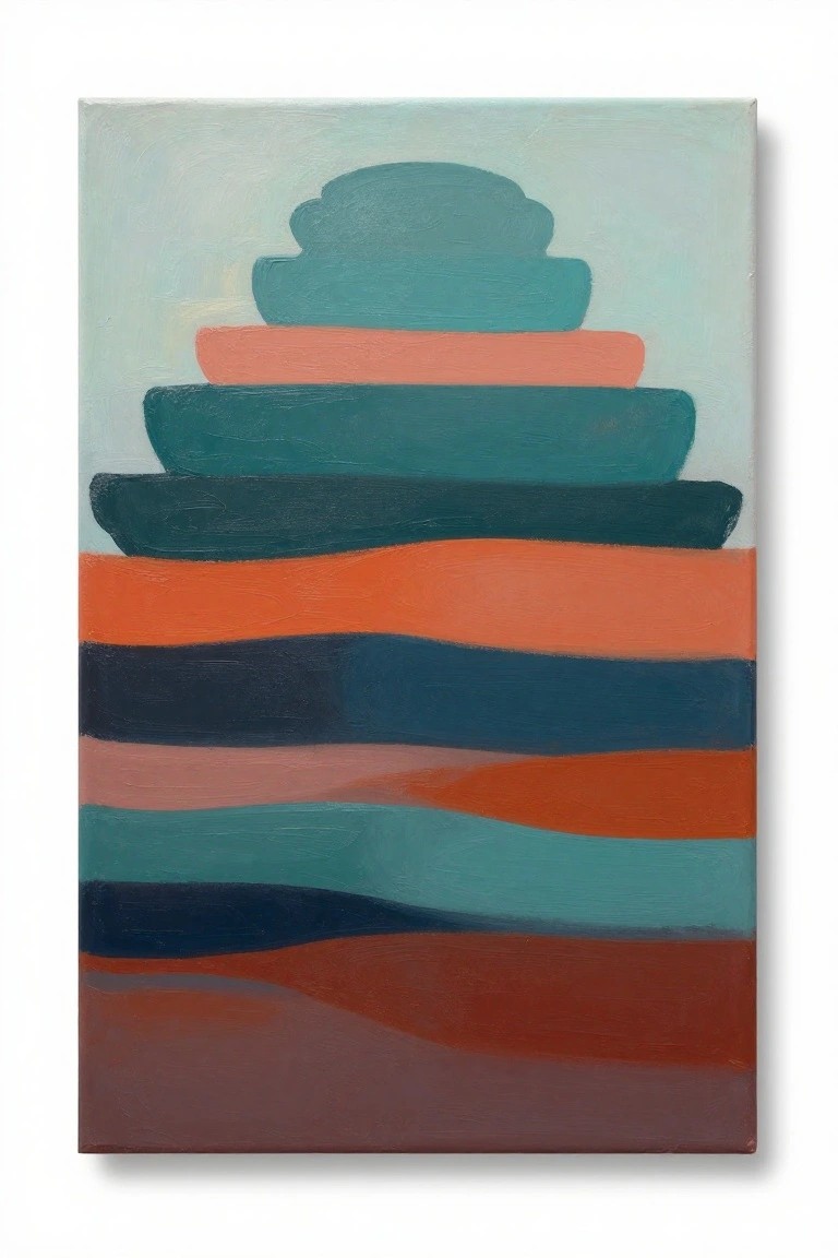
An abstract painting idea built from stacked, rounded shapes at the top and wide horizontal bands below creates a balanced composition using only color blocks and simple edges. The main concept relies on a limited palette of teal, coral, dark blue, and warm brown to separate each layer while keeping the overall arrangement clean. This approach fits the decorative abstract category where the visual weight comes from how the shapes sit against each other rather than from any added detail.
The composition does a lot of the work here by placing the smaller stacked forms near the top and letting the wider bands fill the lower space. You can adapt the idea by changing the teal to another cool color or swapping the orange tones for whatever fits your space. This would be easy to turn into a series by varying the number of bands or the height of the top cluster while keeping the same color relationships. For practice, this kind of subject works well because the shapes stay forgiving even if the edges are not perfectly straight.
Layered Rolling Hills in Limited Color Bands
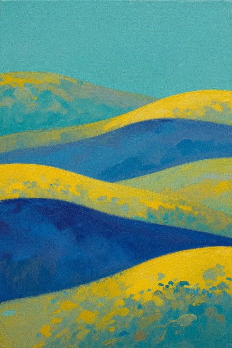
This painting idea centers on a minimalist landscape built from stacked, wavy horizontal shapes that suggest hills or fields. Broad color zones in yellow, teal, and deep blue overlap with soft edges, while a flat sky color fills the top. The approach works as abstract landscape painting because the composition stays simple and relies on shape repetition rather than detail or texture.
What makes this idea useful is how few elements you need to recreate it on any canvas size. You can change the color order or reduce the number of bands to fit a smaller space or match existing room tones. For practice, block in the main shapes first with a large brush, then soften the edges while the paint is still wet. The same layout also translates well to a horizontal format if you want a wider wall piece.
Single Plant with Layered Leaves
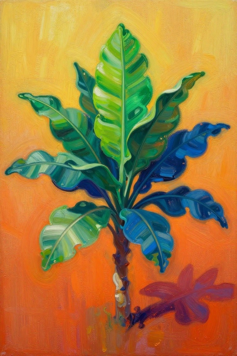
A botanical painting idea built around one central plant works by stacking large leaves around a simple stem and letting the shapes overlap. The strong color contrast between the foliage and the flat background keeps the focus tight without needing extra elements or fine detail. This approach fits into decorative art that relies on bold shapes rather than realism.
The composition does a lot of the work here by placing the plant slightly off-center so the empty space balances the leaves. You can adapt it by swapping the orange background for a muted tone or trimming the leaf count to make it even more minimal. For wall art, something like this stands out on Pinterest because the limited elements make it easy to match with different room colors.
Large Oval on Split Neutral Background
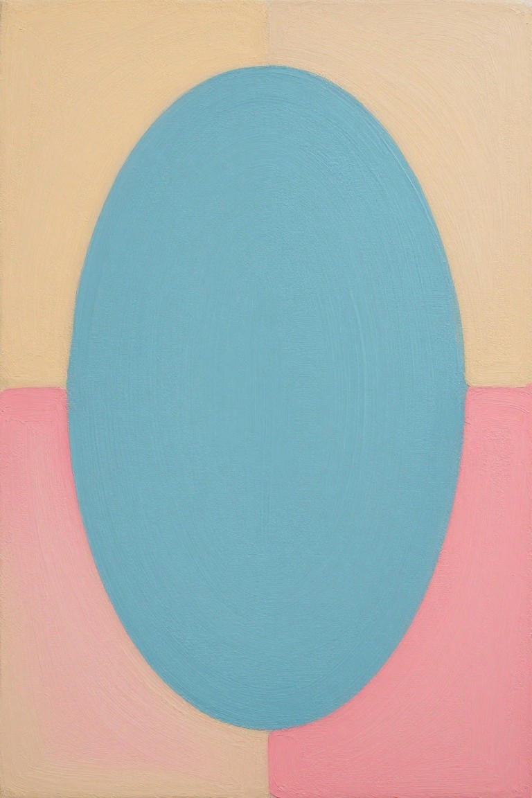
A single oversized oval painted in solid blue serves as the core idea here, placed against a background split between a soft beige upper area and pink lower sections on either side. The approach uses basic color blocking and one dominant shape to create balance without extra elements or details. Brushwork stays visible but even, keeping the overall effect clean and graphic.
The composition does a lot of the work here because the oval’s scale and central placement make the piece readable from a distance. You can easily adapt it by changing the blue to another saturated color or shifting the background split higher or lower. This kind of painting works especially well for quick practice pieces or small wall accents where a simple form needs to hold its own.
Frequently Asked Questions
Question 1: What basic supplies are needed to start creating these minimalist canvas paintings?
Answer: You will need stretched canvases in various sizes, acrylic paints in a limited palette of neutral tones like soft grays, beiges, and muted blues, a few brushes of different sizes, and painter’s tape for clean lines. Start with a primer if your canvas is not pre treated, and have water and paper towels on hand for blending. These items keep the process simple and focused on calm designs.
Question 2: How can I choose colors that best support a calm designer vibe in my paintings?
Answer: Stick to a restrained palette with three to four soft shades such as warm off whites, sage greens, and dusty pinks. Test small swatches on paper first to see how they interact under your room’s lighting. Avoid bright or high contrast hues since they can disrupt the serene feel, and layer thin washes for subtle depth instead of bold blocks.
Question 3: Are these ideas suitable for beginners with little painting experience?
Answer: Yes, most of the concepts rely on simple shapes, lines, and negative space rather than detailed skills. Begin with the easiest ones like single color fields or geometric divisions using tape. Practice on small canvases to build confidence, and remember that imperfections often add to the handmade minimalist charm without needing perfection.
Question 4: What are good ways to display these paintings to enhance a calm designer atmosphere?
Answer: Hang them in groups of odd numbers at eye level on a neutral wall, leaving plenty of empty space around each piece. Use slim floating frames in wood tones or black to keep the focus on the art itself. Position them near natural light sources but avoid direct sunlight to prevent fading, and consider rotating them seasonally for fresh looks.
Question 5: How can I adapt the ideas if I want to match a specific room’s existing decor?
Answer: Measure your space first and select canvas sizes that fit the wall proportions without overwhelming it. Pull accent colors from nearby textiles or furniture for subtle ties, but limit additions to one or two elements like a thin line or dot. This maintains the minimalist balance while making the pieces feel integrated and personal.