
Some days I want to paint something beautiful without overthinking it, and that is exactly why everyday practice matters to me.
Watercolor has this magical way of turning simple moments into something calming and creative, even when I only have a little time.
If you are into painting regularly but want ideas that feel inspiring instead of intimidating, this list was made with you in mind.
I pulled together designs I genuinely enjoy practicing, the kind that let my brush relax and my mind wander a bit.
My hope is that these ideas make painting feel less like a task and more like a cozy creative habit you actually look forward to.
Sunlit Window With Flowing Curtains
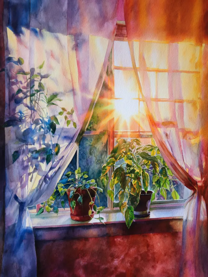
This watercolor design shows a glowing window scene filled with warm afternoon light, sheer curtains drifting softly to each side, and leafy houseplants resting along the sill. The colors move from cool purples and blues on the shadowed fabric to rich oranges and golden yellows where the sunlight breaks through. Brush strokes feel loose and fluid, especially in the curtains, while the plants have gentle layered greens that add depth without feeling stiff. Everything feels balanced and calm, with the light acting as the natural focal point.
I love this kind of painting for everyday practice because it feels peaceful without being boring. Playing with light through fabric is so satisfying, and I always enjoy letting the colors bleed naturally instead of controlling every detail. It is the sort of scene that lets me relax, trust my brush, and enjoy the process rather than stressing about perfection. Plus, painting cozy indoor moments like this always feels comforting and very Pinterest worthy.
Glowing Lake Sunset With Silhouetted Trees
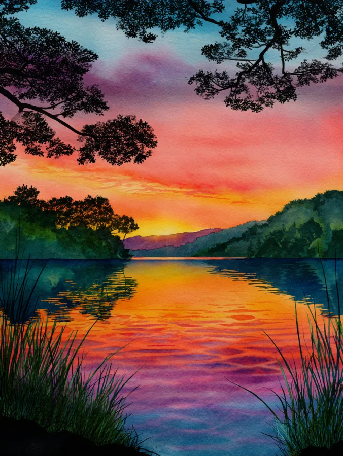
This watercolor design captures a calm lake at sunset, framed by dark tree branches and tall grasses that gently guide the eye toward the glowing horizon. The sky melts from soft blues and purples at the top into fiery oranges and warm pinks near the waterline, with those colors reflected beautifully across the rippling surface. Brush strokes feel smooth and layered, especially in the water where gentle horizontal lines create movement without feeling busy. The darker foreground shapes balance the bright center and give the whole scene a peaceful, storybook feel.
I always find scenes like this so soothing to paint because they let me play with bold color blends while keeping the details simple. Watching the sky and water mirror each other is oddly relaxing, and I love how forgiving watercolor can be when the colors softly mix on their own. This kind of painting feels perfect for unwinding after a long day, with just enough drama to keep it exciting but not so much that it feels stressful.
Colorful Books And Cozy Coffee Moments

This watercolor design features a cheerful stack of books paired with two warm coffee mugs, all painted in bold rainbow hues that feel playful and expressive. The colors blend beautifully into each other, moving from deep blues and purples into bright yellows, greens, and pinks, creating a lively layered look. Brush strokes are loose yet confident, especially along the book pages where fine lines suggest texture without getting fussy. The background feels dreamy and speckled, which helps the brighter shapes pop and keeps the whole composition feeling cozy but energetic.
I think this is such a fun painting to try because it mixes comfort with creativity. Painting everyday objects like books and mugs feels familiar and relaxing, while the bold color choices let me loosen up and forget about realism. I love using this kind of subject when I want to experiment with color blending and still end up with something that feels warm and inviting. It is the kind of painting session that pairs perfectly with a quiet afternoon and a real cup of coffee nearby.
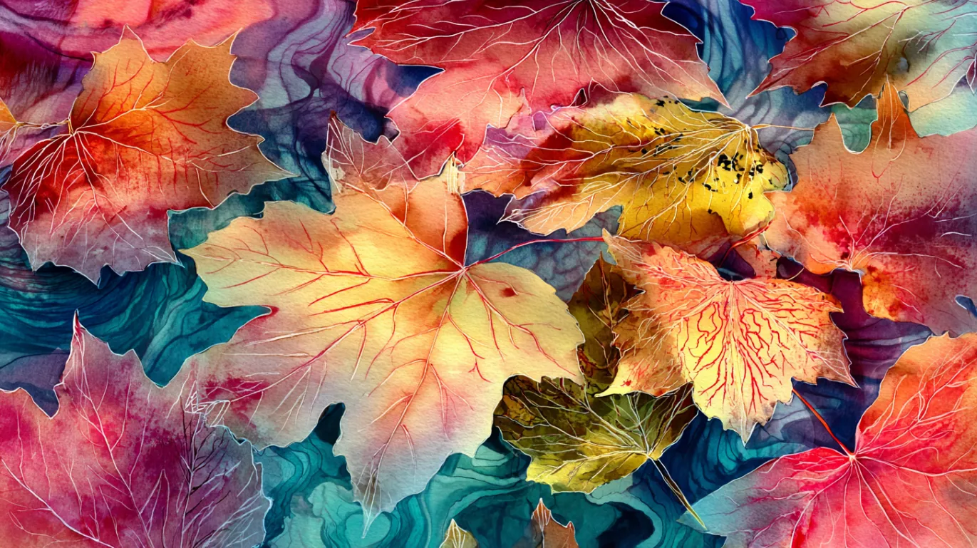
Dreamy Layered Botanical Leaves
This watercolor design is filled with overlapping botanical leaves painted in soft yet vibrant shades of mint, blush, lavender, and warm gold. The leaves float and weave through each other, creating a lush layered effect that feels both airy and full. Brush strokes are gentle and controlled, with delicate veins and subtle color transitions that give each leaf its own personality. The background blends deep purples and teal tones, helping the lighter shapes stand out while keeping the whole composition rich and immersive.
I love painting botanicals like this because they feel calming without being repetitive. Focusing on leaf shapes and soft color blends helps me slow down and enjoy each brush stroke. It is also a great excuse to play with layering and transparency, which watercolor does so beautifully. This kind of design feels perfect for an everyday practice session when I want something relaxing but still visually rewarding.
Colorful Forest Path In Soft Light
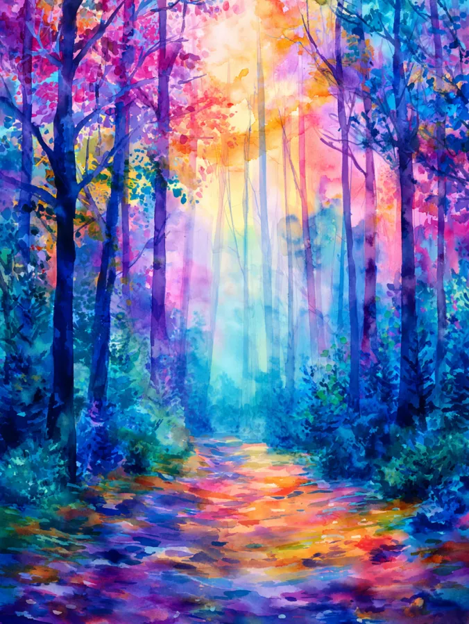
This watercolor design shows a dreamy forest scene where tall trees rise on both sides of a winding path that glows with reflected light. The colors are rich and playful, blending deep blues and teals in the shadows with bursts of pink, gold, and violet filtering through the canopy above. Brush strokes feel loose and layered, especially in the foliage where soft dabs suggest leaves without overdefining them. The path pulls your eye forward, giving the whole painting a gentle sense of movement and depth.
I find paintings like this incredibly relaxing to work on because they let me focus on color and mood rather than tiny details. Letting the forest feel a little abstract makes the process feel freeing and forgiving. I also love how this kind of scene naturally encourages layering, which is perfect for everyday practice. It feels like painting a quiet walk through the woods, which is always a good way to unwind.
Soft Ocean Waves At Golden Hour
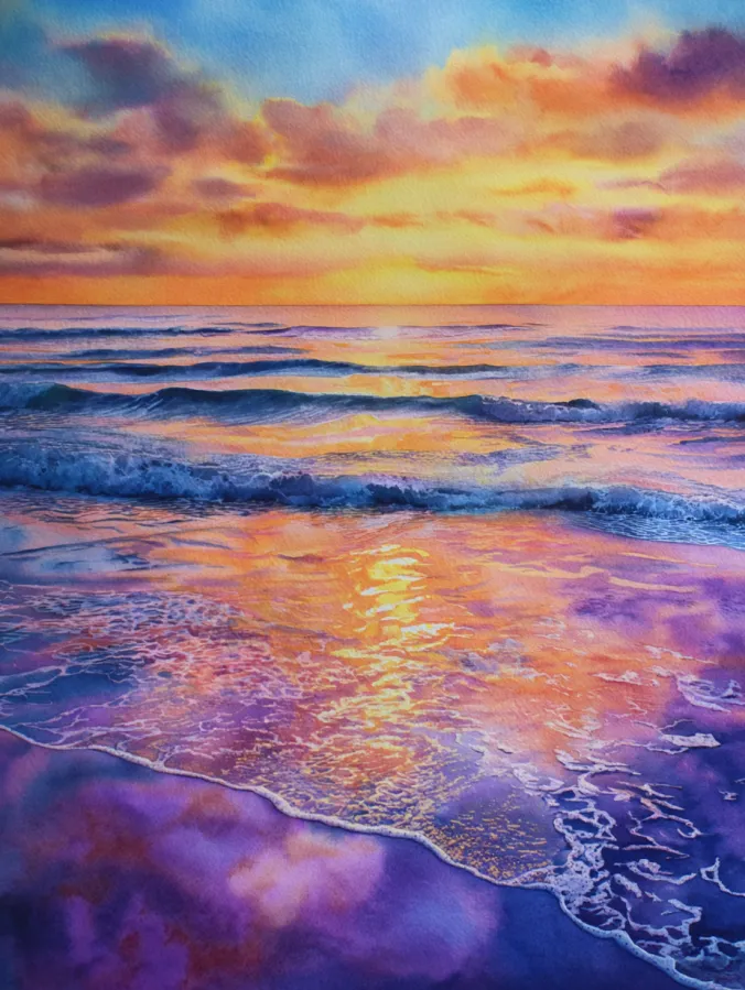
This watercolor design captures gentle ocean waves rolling toward the shore under a glowing sunset sky. Warm oranges and soft golds blend into purples and cool blues, creating beautiful reflections that shimmer across the wet sand. The brush strokes feel smooth and flowing in the water, with lighter foamy textures near the shoreline that add movement and depth. The horizon stays calm and balanced, letting the color transitions and reflections do most of the visual storytelling.
I love painting scenes like this because they feel instantly calming and familiar. Playing with reflections on water is oddly satisfying, especially when the colors melt into each other naturally. It is the kind of painting where I can relax, enjoy the rhythm of brush strokes, and not worry too much about perfect details. This makes it a lovely choice for everyday practice when I want something peaceful that still feels rewarding to finish.
Stacked Colorful Ceramic Bowls
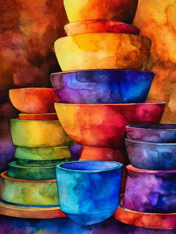
This watercolor design features a playful tower of ceramic bowls stacked at slightly different angles, each one painted in rich blended shades of blue, teal, gold, coral, and violet. The colors flow softly into each other, with visible watercolor textures and gentle blooms that give every bowl a handmade feel. Loose but confident brush strokes define the rounded shapes, while the darker background helps the vibrant layers stand out. The overall layout feels cozy and balanced, with just enough imperfection to keep it interesting.
I love painting subjects like this because they feel relaxed and creative at the same time. Simple shapes take the pressure off, which lets me focus on color mixing and soft edges instead of perfect proportions. It is also a great way to practice light and shadow without overthinking it. This kind of painting always leaves me feeling calm and a little proud, especially when the colors come together in unexpected ways.
Colorful City Skyline At Sunset
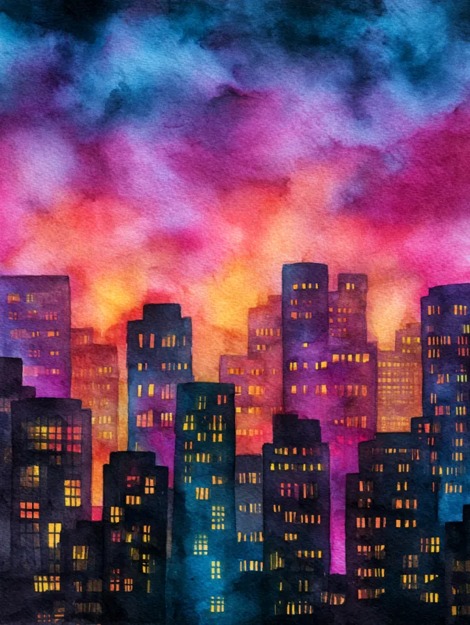
This watercolor design shows a lively city skyline glowing under a dramatic sunset sky. Tall buildings rise in layered silhouettes, painted in deep blues and purples, while tiny window lights sparkle in warm yellows and oranges. Above them, the sky swirls with bold washes of pink, coral, violet, and hints of teal, blending softly into each other with visible watercolor texture. The brush strokes feel loose and expressive, especially in the sky, while the buildings stay simple and graphic, creating a strong contrast that keeps the composition eye catching.
I love painting city scenes like this because they feel bold and relaxing at the same time. Blocking in simple building shapes takes the pressure off, so I can focus on color and atmosphere instead of tiny details. Playing with glowing windows is oddly satisfying and makes the whole scene feel cozy and alive. This kind of painting is perfect when I want something creative and expressive without needing total silence and laser focus.
Layered Mountain Ranges In Soft Hues
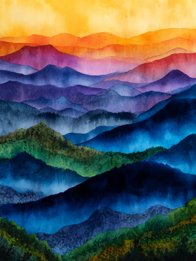
This watercolor design features rolling mountain layers stretching into the distance, each ridge painted in flowing bands of blue, teal, violet, green, and warm sunset tones. The colors gently fade from darker shades in the foreground to lighter pastels near the horizon, creating a beautiful sense of depth. Brush strokes are smooth and slightly textured, with soft edges that let the layers melt into one another. The warm golden sky above balances the cooler mountains below, making the whole composition feel calm and expansive.
I love painting mountain layers like this because it feels almost meditative. Repeating simple shapes helps me relax while still giving me room to play with color transitions. It is also great practice for learning how to build depth without stressing over tiny details. This kind of painting always feels satisfying to finish and looks lovely even if the shapes stay loose and imperfect.
Vibrant Abstract Color Bloom
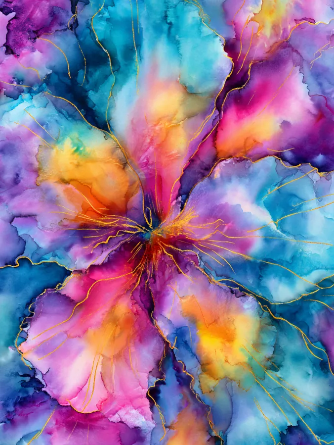
This watercolor design bursts with layered washes of turquoise, magenta, violet, coral, and sunny yellow, all radiating outward from a glowing center. The colors blend and bleed into each other with soft organic edges, creating petal like shapes that feel both floral and abstract. Fine gold line details weave through the composition, adding movement and a touch of elegance without overpowering the loose watercolor textures. The overall layout feels energetic and balanced, with every section flowing naturally into the next.
I love paintings like this because they feel completely freeing. There is no pressure to make anything look realistic, which makes it perfect for everyday practice. Playing with wet on wet techniques and watching the colors spread is so relaxing and a little magical every time. This kind of piece always reminds me that watercolor is supposed to be fun, expressive, and full of happy surprises.
Rainy City Street With Glowing Reflections
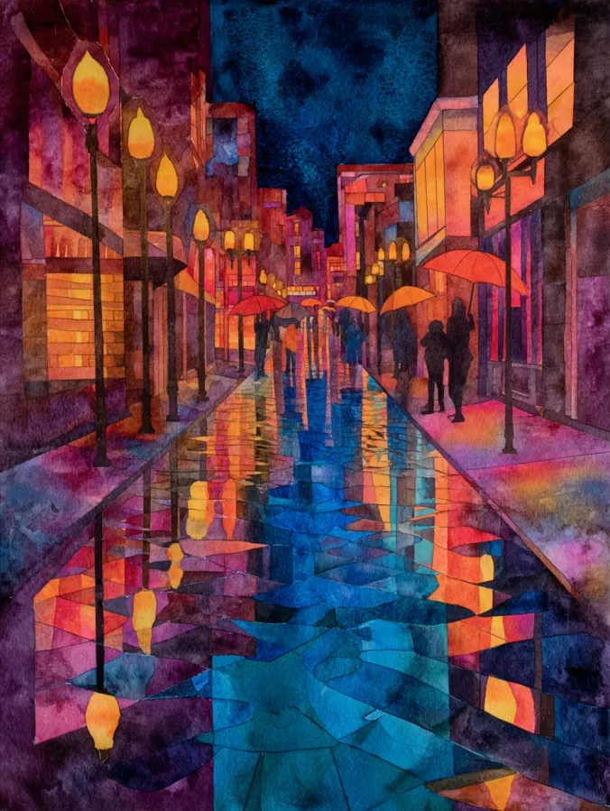
This watercolor design shows a cozy city street at night, glowing under warm streetlights and colorful shop windows. The buildings rise on both sides, painted in rich purples, blues, and deep reds, while the wet pavement reflects those colors in soft, broken shapes. Loose brush strokes and layered washes give the scene a dreamy feel, especially in the reflections that stretch down the center of the street. Silhouetted figures and umbrellas add life without taking over the composition, keeping the focus on light and mood.
I love painting scenes like this because they feel atmospheric and comforting at the same time. Playing with reflections on wet streets is such a fun challenge, and watercolor makes it feel forgiving instead of stressful. I also enjoy keeping people loose and shadowy so the painting stays relaxed. This kind of scene always feels like a little escape, perfect for an evening practice session when I want something creative and cozy.
Bright Fruit Still Life With Reflections
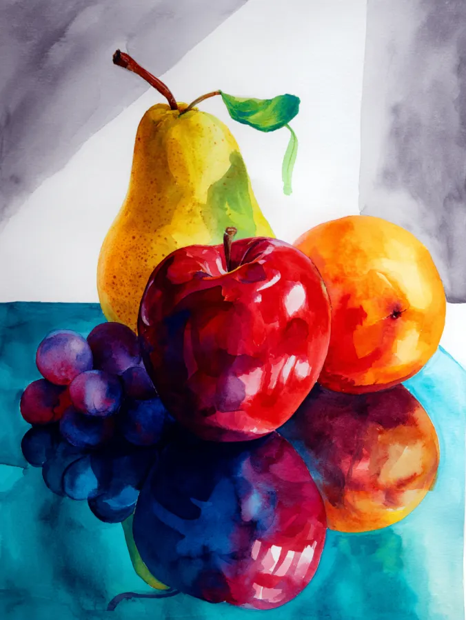
This watercolor design features a simple yet striking still life of fresh fruit arranged on a reflective surface. A golden pear, a glossy red apple, and a warm orange sit alongside deep purple grapes, all painted with rich, saturated color. The brush strokes feel smooth and intentional, especially in the fruit where highlights and soft shadows create a juicy, dimensional look. Below them, the reflections blur and blend into cool blues and purples, adding depth and a calm sense of balance to the composition.
I love painting still lifes like this because they feel both grounding and playful. Focusing on everyday fruit makes the subject feel approachable, while reflections give me something fun to experiment with. It is also a great way to practice light and color without getting overwhelmed by complex backgrounds. This kind of painting always feels like a quiet creative reset that fits perfectly into an everyday practice routine.
Dreamy Night Sky With Glowing Moon
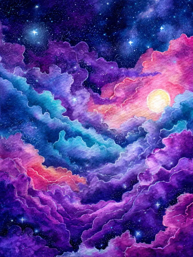
This watercolor design captures a magical night sky filled with swirling clouds in rich purples, blues, and soft pinks. The clouds curl and layer across the page, creating a sense of movement that gently leads the eye toward a glowing moon tucked between them. Tiny star details sparkle throughout the darker areas, adding contrast and depth. The brush strokes feel fluid and loose, with soft edges and blended washes that give the whole scene a dreamy and slightly otherworldly feel.
I love painting skies like this because they feel calming and expressive at the same time. Letting the colors blend and flow naturally takes the pressure off and makes the process feel almost meditative. Adding stars and a glowing moon at the end is always my favorite part since it instantly brings the painting to life. This kind of piece is perfect for everyday practice when I want something soothing that still feels magical and fun.
Crashing Ocean Waves On Rocky Shore
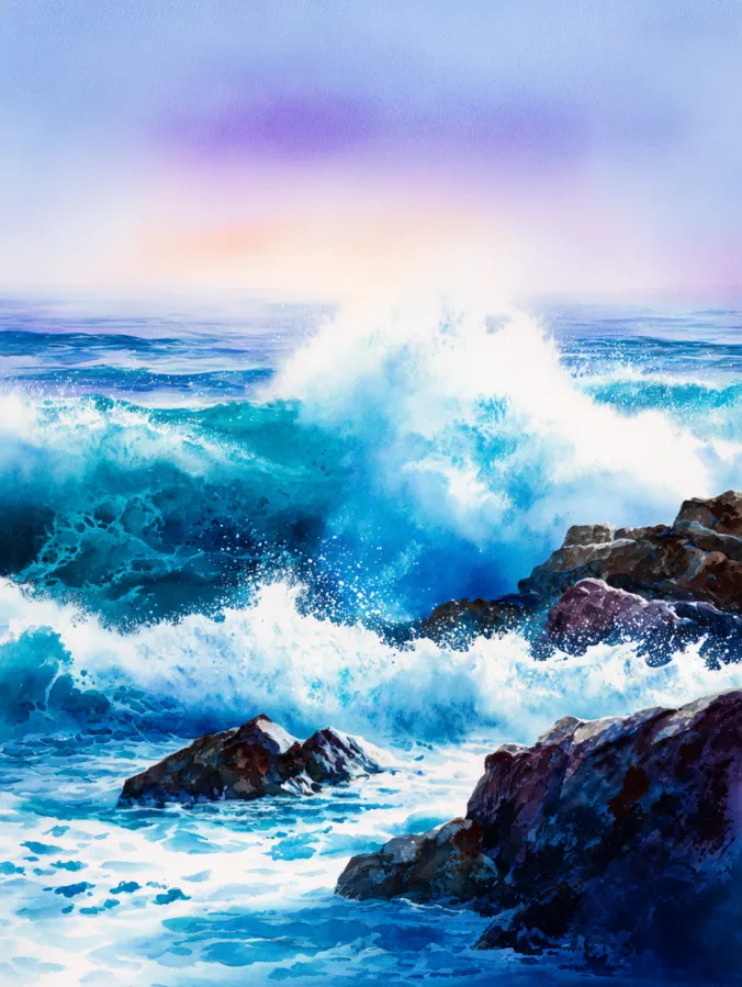
This watercolor design captures powerful ocean waves breaking against dark rocky edges, with bright turquoise and deep blue water exploding into soft white foam. The movement feels energetic yet fluid, with layered brush strokes that suggest motion without overworking the details. Lighter pastel tones in the sky balance the intensity of the sea, while splashes of white add texture and drama. The composition pulls the eye toward the center where the wave crests, making the scene feel alive and refreshing.
I love painting waves like this because they feel expressive and freeing. Letting the water splash and blend naturally takes away the pressure of precision. It is also a great way to practice contrast between light foam and deeper water tones. This kind of painting always leaves me feeling energized, like a breath of fresh air, even if I am just painting at my kitchen table.
Flowing Abstract Color Layers
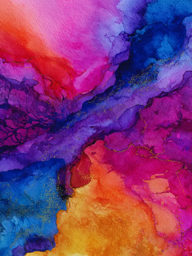
This watercolor design is a bold abstract composition filled with flowing layers of pink, violet, cobalt blue, and warm orange. The colors melt into each other with soft organic edges, creating the look of natural movement across the page. Fine gold like details trace through the color transitions, adding subtle structure and visual interest without feeling heavy. Brush strokes feel loose and expressive, and the overall layout feels balanced yet spontaneous, like the colors found their own path.
I love painting abstracts like this because it feels completely pressure free. There is no right or wrong outcome, which makes it perfect for everyday practice. Playing with wet washes and watching the colors blend is relaxing and a little addictive. This kind of painting always helps me loosen up and enjoy the process instead of worrying about how the final piece will turn out.
Overhead Garden Paths And Greenery
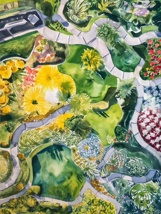
This watercolor design shows a top down view of a lush garden filled with winding paths, blooming plants, and layered shades of green. The composition feels playful and organized at the same time, with curved walkways guiding the eye through clusters of yellow flowers, leafy textures, and soft shadows. Brush strokes are loose and expressive, especially in the greenery where different greens blend and overlap. The lighter paths create contrast and structure, making the whole scene feel fresh and inviting.
I love painting overhead scenes like this because they feel a little unexpected and really fun to explore. There is something relaxing about filling in organic shapes and letting the greens mix naturally. I also enjoy how forgiving this style is, since plants do not need to be perfect to look beautiful. This kind of painting always puts me in a calm, creative headspace and works so well for everyday practice.
Soft Pastel Clouds In Motion
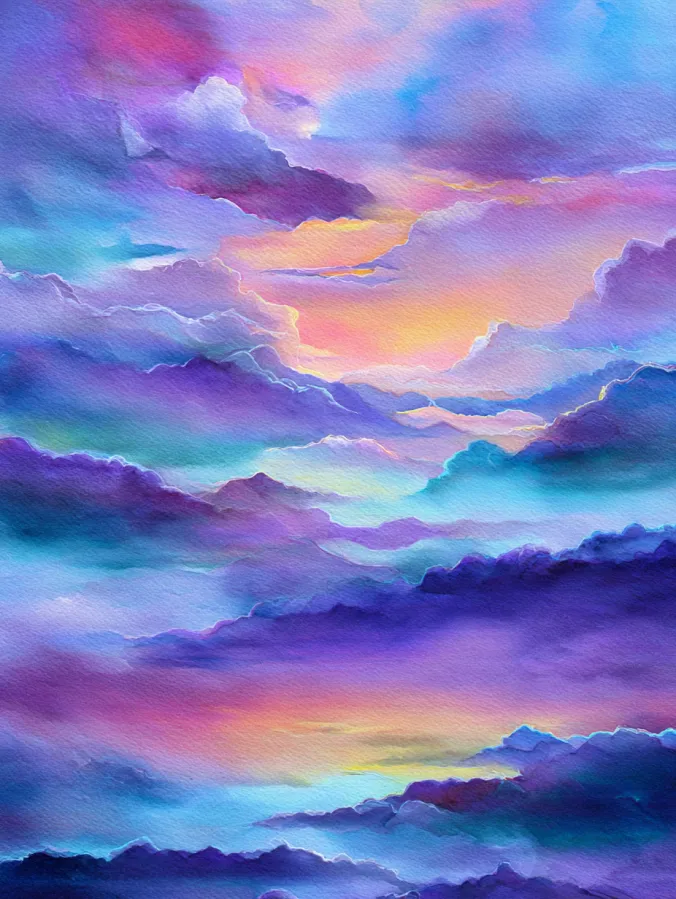
This watercolor design features layers of fluffy clouds drifting across the sky in dreamy shades of lavender, teal, peach, and soft blue. The colors blend gently into each other, with smooth brush strokes that create depth and a sense of movement. Lighter highlights peek through the cloud edges, giving the scene a glowing, airy feel. The overall layout feels balanced and calm, with no hard lines, just flowing shapes that invite the eye to wander.
I love painting clouds like this because it feels incredibly relaxing and forgiving. Letting the colors melt together takes the pressure off and makes the process feel playful instead of precise. It is also a great way to practice soft blending and layering without worrying about strict shapes. This kind of painting always puts me in a peaceful mood and feels perfect for an easygoing practice session.
Winding River Through Lush Hills
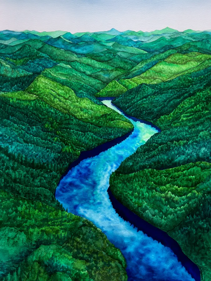
This watercolor design shows a winding blue river cutting through layers of rolling green hills that stretch into the distance. The landscape is built with repeated organic shapes, each hill painted in varied shades of emerald, teal, and soft forest green. Brush strokes are textured and rhythmic, giving the hills a lively but calm pattern. The river creates a strong focal point as it curves gently through the center, adding contrast and guiding the eye across the composition.
I love painting landscapes like this because they feel soothing and structured at the same time. Repeating hill shapes helps me relax, while the river gives the scene a sense of flow and direction. It is also a great way to practice depth and color variation without stressing over tiny details. This kind of painting always feels satisfying and peaceful, making it perfect for a regular practice session.
Flowing Fabric Folds In Soft Color
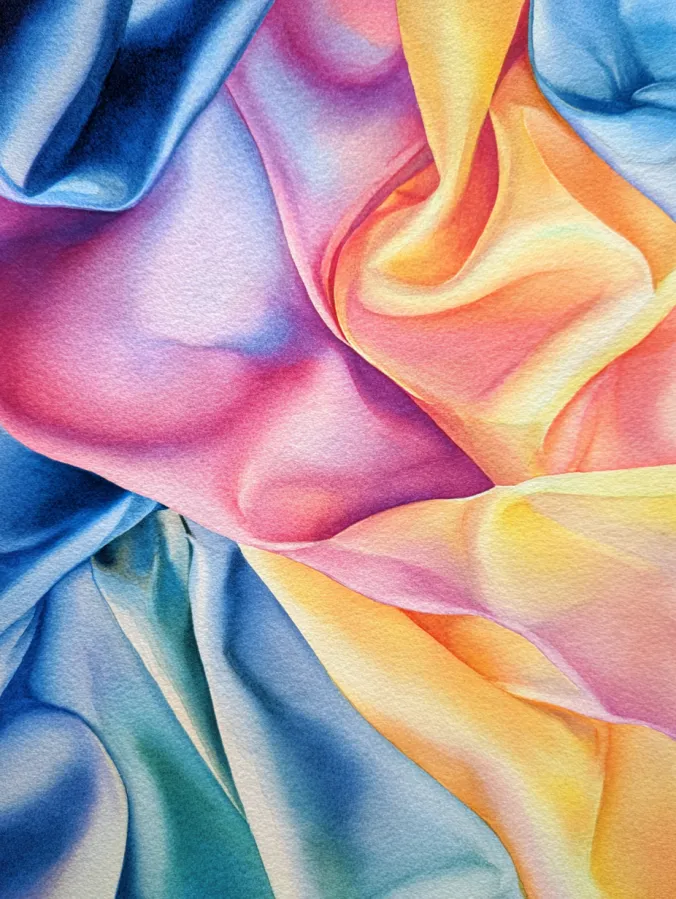
This watercolor design focuses on flowing fabric folds painted in smooth gradients of peach, pink, buttery yellow, teal, and soft blue. The colors blend gently into one another, creating a silky layered look that feels almost touchable. Brush strokes are subtle and controlled, with soft transitions that suggest movement and depth without harsh lines. The composition feels close and immersive, filling the frame with curved shapes that guide the eye naturally from one fold to the next.
I love painting fabric studies like this because they feel calming and oddly satisfying. Watching the colors shift and blend makes the process feel slow and mindful. It is also a great way to practice light and shadow without worrying about complex subjects. This kind of painting always helps me relax and trust my brush, which makes it perfect for everyday practice when I want something soothing but still creative.
Cozy Café Interior With Warm Lights
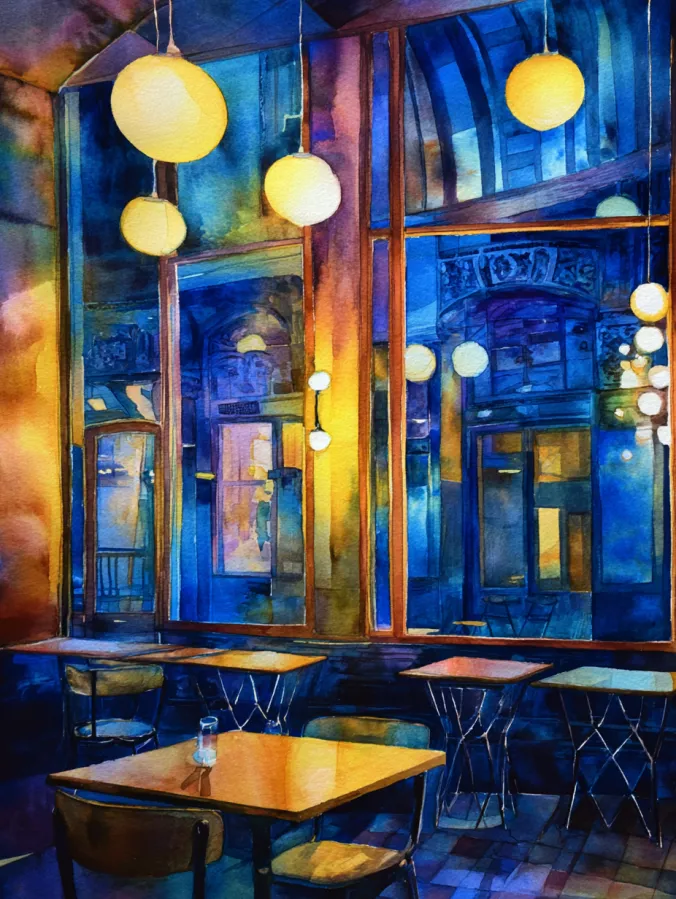
This watercolor design captures an inviting café scene filled with glowing hanging lights, tall windows, and quiet tables waiting for company. Deep blues and indigos dominate the background, while warm golden yellows and soft ambers from the lights create a beautiful contrast. The brush strokes feel loose and layered, especially in the reflections on the windows and tabletops, giving the space a cozy evening mood. The composition feels balanced and intimate, with vertical lines from the windows guiding the eye and round lights adding softness throughout.
I love painting café scenes like this because they feel comforting and full of atmosphere. Playing with warm light against cool shadows is so satisfying, and watercolor makes those transitions feel natural instead of forced. I also enjoy that nothing has to be perfectly detailed for the scene to work. This kind of painting feels like a quiet creative break, perfect for everyday practice when I want something cozy and inspiring.